
The most repeated advice in photography for social media is also the least useful for premium brands: just be authentic.
That works if your only goal is to look casual, frequent, and familiar. It fails when the image has to sell design quality, communicate trust, and hold up under scrutiny from clients, investors, tenants, editors, or buyers. Architecture firms, hospitality groups, developers, and corporate brands don't need random candor. They need images that feel immediate without looking careless.
The stronger approach is constructed authenticity. The frame still feels fresh. The moment still feels real. But the photographer has already made disciplined choices about angle, light, spacing, gesture, and what the image needs to do once it lands on a phone screen. That is the difference between content that earns a quick like and content that builds brand value over time.
Beyond "Authentic" The Case for Intentional Social Photography
The phrase "be authentic" has been flattened into "don't think too much." That's a mistake.
Smartphones captured 91% of all photos globally in 2022, with that share projected to rise to 94% by 2026 according to camera statistics compiled here. That matters because nearly every audience now consumes images in a fast, vertical, mobile environment. A polished image isn't enough on its own. It has to feel native to the way people scroll.
Why casual isn't always credible
For high-end brands, casual often reads as underconsidered. A luxury interior photographed like a rushed phone snap loses the very qualities the designer worked to create. A corporate portrait that feels sloppy doesn't look approachable. It looks low-stakes.
That is where intentional social photography separates itself from generic platform advice.
Social photography for serious brands should feel unforced, not unplanned.
A well-made social image can still include movement, loose framing, and a lived-in atmosphere. But those choices need to support the brand story. If the goal is to show craftsmanship, the light has to reveal material detail. If the goal is to show hospitality, the frame needs visual warmth and room for narrative context. If the goal is to position a firm as credible, the exposure and composition can't drift.
What constructed authenticity looks like
Editorial photographers have worked this way for years. Magazine images often feel spontaneous, but very little in the frame is accidental. The same discipline works in photography for social media.
A practical version looks like this:
- Natural, but directed: People appear relaxed, but they are placed where the light is flattering and the background supports the story.
- Fresh, but edited: The image keeps texture and realism, yet distracting clutter, bad color, and weak crops are removed.
- Mobile-first, but not cheap-looking: The photograph reads quickly on a phone without abandoning professional standards.
The real trade-off
The trade-off isn't authenticity versus polish. It's purpose versus drift.
Brands that only chase "raw" usually end up posting forgettable work. Brands that over-style everything often feel cold and dated. The middle ground is stronger. Use editorial rigor to create images that feel current, but never disposable.
That's the standard worth aiming for. Not perfection. Intent.
Develop Your Visual Strategy and Creative Brief
The shoot usually succeeds or fails before the camera comes out.
A useful brief for photography for social media doesn't start with "we need content." It starts with editorial thinking. What story is this brand telling right now, and what does the audience need to understand in a few seconds?

For luxury and design markets, overly casual imagery can dilute brand value. A more disciplined approach keeps the image fresh while maintaining magazine-level composition and exposure, as noted in these photography guidelines for social media teams.
Build the brief like an editor, not a content manager
Magazine editors don't assign "some nice pictures." They assign a visual story with hierarchy.
Your brief should define three things before anyone starts scouting props or locations:
The business objective
Is the content meant to attract tenants, support a launch, position leadership, show craftsmanship, recruit talent, or document a built project?The audience point of view
A developer, hotel guest, architect, and procurement lead don't read the same image the same way. Decide who the frame is for.The desired impression
Calm and refined. Warm and human. Precise and modern. Layered and editorial. These aren't mood-board clichés. They are shooting instructions.
Define asset types before the shoot
A good social shoot creates a library, not a single hero image. The most useful briefs separate assets by function.
Try working with categories like these:
Hero frames
The signature images. These are the strongest compositions and the ones most likely to anchor a campaign, a carousel cover, or a profile grid.Detail vignettes
Material finishes, signage, hands at work, table settings, product textures, corners of a room, and close crop design moments.Context frames
Wider scenes that explain place, flow, scale, or environment.Human presence
Not necessarily full portraits. Sometimes a shoulder in frame, a staff member adjusting a setting, or a guest interaction is enough to create life.Process and behind-the-scenes
These often become the bridge into motion content later, even if the main assignment is still photography.
Editorial test: If you removed the caption, would the image still tell the right story?
Create a mood board that gives direction
Mood boards fail when they're just a pile of references. A working board should include notes on why each image is there. One reference might be about pacing, another about color temperature, another about negative space, another about posture.
Useful mood board notes include:
- Lighting intention: soft daylight, directional window light, controlled strobe, mixed ambient with subtle fill
- Framing preference: centered symmetry, restrained asymmetry, layered foreground, vertical crop potential
- Styling tolerance: minimal props, lived-in details, no visual clutter, limited brand colors
- Emotional tone: composed, energetic, intimate, elevated
The brief should also specify what to avoid. That's often more valuable than inspiration. If the brand shouldn't feel trendy, don't reference trend-heavy gestures. If the space depends on clean lines, don't overfill it with lifestyle props.
The result is a clearer day on set and a much stronger image library afterward.
Mastering Composition and Lighting On Set
Most social images fail for a simple reason. The camera goes where a person naturally stands, and the light is accepted as-is.
That produces record shots. Not persuasive ones.
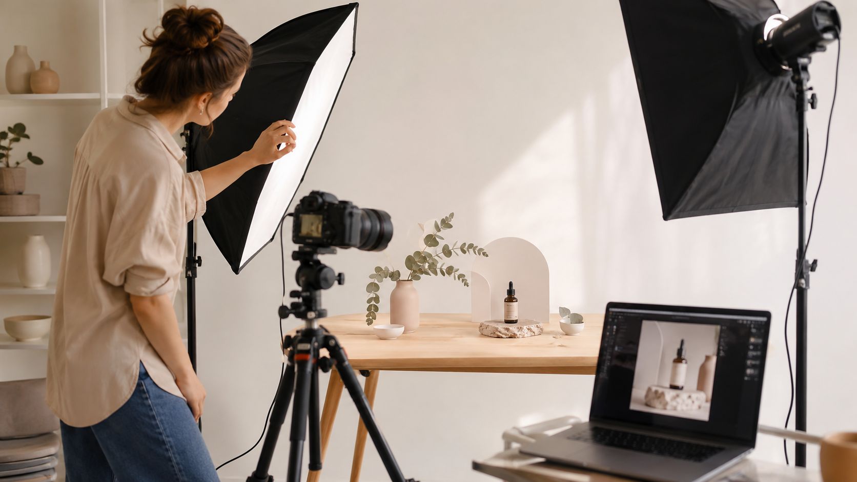
A common pitfall is eye-level shooting, which can reduce perceived subject authority by 25%, according to this discussion of social campaign photo mistakes. Moving the camera 45 degrees higher or lower changes depth, creates stronger leading lines, and gives the frame more intention.
Stop standing where everyone stands
Eye-level is convenient, but convenience rarely creates memorable photography for social media.
In architecture and interiors, a slight shift upward can clarify geometry and layering. A lower camera position can make furniture, fixtures, products, and people feel more grounded and more important. In corporate work, changing height also changes power dynamics. The frame either flattens the subject or gives it presence.
Use a simple on-set rule:
- If the frame looks descriptive, change height
- If the room feels flat, move off-center
- If the product disappears, get closer
- If the image feels busy, remove one element before adding light
Compose for story, not just balance
Balance matters. Story matters more.
A good social frame usually needs one clear visual message. That may be scale, material richness, human use, craftsmanship, or atmosphere. Once you know the message, composition becomes easier. Everything that doesn't support it can leave.
For architecture and brand work, I usually want a mix of these frame types during the same setup:
| Frame type | What it does | Best use |
|---|---|---|
| Hero wide | Establishes place and design intent | Carousel opener, campaign lead |
| Mid-frame | Shows interaction or function | LinkedIn, website banners, brand storytelling |
| Tight detail | Highlights finish, quality, and texture | Instagram carousels, product storytelling |
| Environmental portrait | Connects people to the space or brand | Team features, leadership, BTS content |
Light for shape and credibility
Good social photography doesn't require elaborate production. It requires control.
Natural light is often the right base, especially for interiors, hospitality, and lifestyle brand work. But natural light alone can collapse quickly when the shadows go dead or the brightest surfaces pull too much attention. That's where restraint matters. A subtle fill, bounce, or controlled artificial source keeps the frame believable while restoring shape.
If you're building a more controlled setup, a useful primer on artificial lighting in photography can help you think through direction, fill, and what kind of light best suits the subject.
This short visual breakdown is useful if you want to see on-set decisions in practice.
On-set habit: Shoot the clean frame first. Add people, props, and motion only after the base image works.
That order prevents the most common production mistake. Teams start styling and directing before the composition is stable, then spend the rest of the shoot solving problems that should have been handled in the first minute.
Frame and Format for Maximum Platform Impact
A strong photograph can still fail after capture if it wasn't framed for where it will live.
This is one of the least discussed parts of photography for social media. Teams obsess over camera choice, presets, and captions, then ignore the crop, interface, and text-overlay needs of the final post. That is usually where the image loses power.
A major failure point is ignoring aspect ratios and text-safe areas. With 60% of social media users scrolling vertically, images that don't account for platform UI often lose key visual impact, as outlined in Canva's guidance on mobile photography and platform framing.
Frame for the destination, not the camera preview
The camera preview is not the final composition. The final composition is the image as seen in-feed, under a profile name, above a caption block, beside interface icons, or under headline text.
That changes how you shoot.
For example:
- A beautiful interior with a chandelier near the top edge may lose that focal point under platform interface elements.
- A portrait with the face centered too low may compete with caption overlays.
- A product shot with no negative space becomes difficult to use in paid social, website banners, and carousel education slides.
Leave room for the crop before you think you need it. Tight framing feels efficient in camera and restrictive in layout.
Social Media Image Spec Cheat Sheet 2026
Use this as a practical guide when planning crops and exports.
| Platform | Placement | Recommended Dimensions (px) | Aspect Ratio |
|---|---|---|---|
| Portrait feed post | 1080 x 1350 | 4:5 | |
| Square feed post | 1080 x 1080 | 1:1 | |
| Story / Reel cover | 1080 x 1920 | 9:16 | |
| Feed image | 1080 x 1350 | 4:5 | |
| Feed image | 1080 x 1350 | 4:5 | |
| Standard pin | 1080 x 1350 | 4:5 | |
| Website banner | Custom by layout | Exact required crop | Varies |
The exact platform interface will change over time. The core principle won't. Vertical-first composition gives the image more authority on a phone screen.
What to protect inside the frame
When shooting, identify the essential visual elements. Then protect them from future crop problems.
Common protected zones include:
- Faces and eyes kept away from cluttered interface areas
- Brand details such as logos, signage, and packaging that need breathing room
- Architectural lines that break if the crop gets too aggressive
- Text-safe space for headlines, calls to action, or promotional overlays
Many polished shoots often underperform. The photographer creates a great horizontal image. The social team then forces it into a vertical environment and sacrifices the strongest part of the composition.
A better workflow starts with the end use. If the image may need feed, story, website, email, and paid placements, shoot with those destinations in mind from the first frame.
Create a Cohesive Look with Your Editing Workflow
Editing is where brand discipline becomes visible.
The mistake isn't using presets. The mistake is using presets as substitutes for judgment. A strong workflow creates consistency without making every image look identical. That distinction matters, especially for architecture, interiors, products, and corporate environments where surface quality and color accuracy carry meaning.
Build a repeatable visual language
Start by defining what should remain consistent from image to image.
That usually includes:
Contrast behavior
Decide whether shadows stay open and airy or richer and more sculpted.Color direction
Warm neutrals, cooler modern tones, restrained saturation, or cleaner whites. Pick a lane.Exposure tolerance
Determine how bright skin, walls, windows, metals, and wood tones should read.Retouching standards
Remove distractions, yes. Erase the character of the space or subject, no.
A preset in Adobe Lightroom, Capture One, or similar software should only get you to a baseline. From there, adjust each image for local issues such as mixed lighting, reflective surfaces, skin tone shifts, window pulls, and competing highlights.
A more structured photo editing workflow helps teams keep those decisions consistent across a campaign instead of improvising shot by shot.
Keep the image clean without making it generic
The best social edits still look like photographs. They don't look filtered.
That means watching for a few common problems:
- Over-corrected verticals that make interiors feel strained
- Heavy clarity or sharpening that turns surfaces brittle
- Aggressive desaturation that drains hospitality and lifestyle scenes
- Inconsistent white balance across a carousel, which makes the sequence feel disjointed
A recognizable look doesn't come from one dramatic edit. It comes from the same judgment repeated well.
Export for platform compression
For expert-level results, export as JPEG with a longest edge of 4096 pixels at 77% quality, based on this detailed explanation of social media image dimensions and compression behavior. That setting gives Instagram a better file to downscale, which helps preserve fine detail in commercial and architectural imagery.
If you're posting a portrait-oriented feed image, 1080 x 1350 remains the practical display target within the platform ecosystem, but the export method above gives the file a better starting point before Instagram processes it.
That is the difference between an image that merely arrives online and one that still holds texture, edge detail, and tonal separation after upload.
Your Social Media Photography Workflow Checklist
Social photography gets easier when the process is fixed. Not rigid, fixed.
The goal is to make sure every shoot produces images with a job to do, a look that belongs to the brand, and enough variation to support both static posts and motion-led publishing.
Instagram reached approximately 2 billion monthly active users by February 2025, and the platform now prioritizes video, Reels, and engagement signals such as shares and saves. That shift has pushed brands toward hybrid content, including carousels that mix static images with educational material and shoots repurposed into mini-documentaries, as summarized in these Instagram and social media marketing statistics.
The working checklist
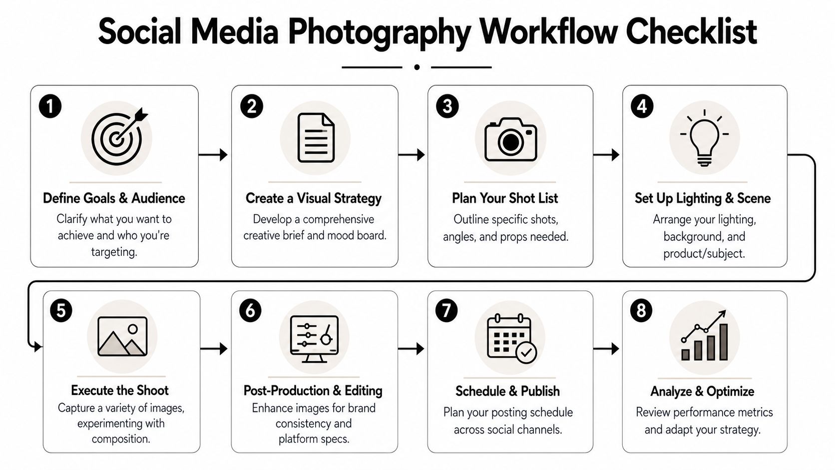
A team-friendly photo shoot checklist is useful, but the essentials for photography for social media fit into a straightforward sequence:
Define the communication goal
Decide what the post needs to achieve. Awareness, credibility, launch support, recruitment, leasing, sales support, or editorial visibility all require different image choices.Write the brief
Set the narrative, audience, asset categories, mood references, and exclusions. Clarify whether the brand should feel restrained, energetic, refined, technical, warm, or human-centered.Plan deliverables before the shoot
Think in terms of hero images, details, environmental frames, human presence, and behind-the-scenes moments. This is what makes later repurposing possible.Design the set and light intentionally
Control clutter, shape the frame, and decide where the eye should go first. If the scene doesn't read clearly before people enter it, solve that problem first.Capture with crop flexibility
Leave room for vertical applications, overlays, and alternate placements. Protect critical visual information away from likely interface zones.Edit to a standard, not a mood
Match tone, color, density, and finishing choices across the set. The viewer should feel one visual voice even when the subject matter changes.Export for platform behavior
Prepare files so they survive compression cleanly and still look sharp on mobile screens.Publish as a content system
Don't treat stills as isolated posts. Turn one assignment into a carousel, a Reel cover, a process clip, a before-and-after sequence, quote graphics, and cropped detail posts.
How still photography feeds video strategy
Many brands overcomplicate things. They think a video-first platform requires abandoning still photography. It doesn't.
A well-planned still shoot already contains the ingredients for motion-led publishing:
- Behind-the-scenes clips gathered during setup become Reel material
- Sequential stills become narrative carousels
- Detail images plus voiceover become educational posts
- Location footage paired with final images becomes a concise mini-documentary
That approach respects what social platforms currently reward without reducing the brand to trend-chasing. The still image remains the foundation. Video becomes the wrapper that expands reach and context.
The smartest social workflow doesn't choose between photography and video. It plans both from the same shoot.
If the content feels coherent from brief to crop to edit to post, the audience notices. Not as a technical achievement. As trust.
If you need social imagery that carries editorial discipline into brand content, Jimmy Clemmons Photographer creates architectural, commercial, and portrait photography designed to build trust, show value, and feel as intentional as the spaces and teams being photographed.