
You're standing in front of a finished building, or inside a newly styled interior, and the problem feels simple. You need to show the whole thing. Then the camera comes up, the walls start leaning, the corners stretch, the room looks bigger but less believable, and the image stops feeling like design photography and starts feeling like a lens demo.
That's the central tension in wide angle architecture photography. A wide lens gives you access, but not automatically clarity. The photographer's job isn't just to fit more into the frame. It's to decide what the space should say, what should feel calm or dramatic, and how far perspective can bend before the image stops serving the architecture.
The best architectural photographs are editorial in the best sense of the word. They select. They prioritize. They guide the eye. They respect the designer's intent while still making a strong visual argument. That's where wide-angle work becomes interesting. Not when it captures everything, but when it captures the right things in the right relationship.
Strategic Planning The Blueprint for Your Shoot
You arrive on site with a 16 mm lens, a clean building, and a short window before the light turns flat. That sounds workable until the parked cars stay put, the best corner is blocked by a delivery truck, and the room that looked generous in drawings feels tight once furniture, styling, and reflections enter the frame. Wide-angle architecture photography is usually won before the first exposure. The plan decides whether the lens clarifies the design or records obstacles.
I start by defining the editorial point of view. What should a design director, architect, or editor understand first? It might be the building's public face, the transition from compressed entry to open volume, or the way daylight moves across a material palette. If that idea is vague, the shoot drifts toward coverage, and coverage rarely makes a persuasive set.
Start with the building before the gear
The first scout is often digital. Site plans, project renderings, maps, and the architect's drawings reveal orientation, approach routes, neighboring buildings, and constraints that will affect camera position. That work saves time because it shows where the building will read clearly and where it will fight back. A narrow setback, overhead utility lines, dense planting, or an awkward property edge can force a wide lens into doing too much.
Then I walk the site with no pressure to shoot. I want to see how the project unfolds at eye level, not just how it diagrams on paper. Exterior work depends on approach and setback. Interior work depends on sequence, thresholds, and where the space opens or compresses. Small camera movements are critical because they can dramatically affect balance and symmetry, especially in wide frames.
One sentence helps here. Write down the building's strongest idea before the shoot starts.
If that sentence is clear, shot selection gets faster. If it is not, the camera tends to chase every possible angle, and the final edit gets weaker.
Find the frame that sets the rest of the day
The hero image is the frame that explains the project with the least confusion. Sometimes it is front-on and restrained. Sometimes it is an oblique view that shows depth, circulation, and context in one read. The key question is not how much fits in the frame. The question is which viewpoint makes the architect's intent legible while still giving the image shape and momentum.
That decision affects the rest of the schedule. Once the lead frame is established, supporting images fall into place more naturally because each one has a purpose. Some provide orientation. Others isolate material, joinery, site elements, or lighting design. A few can be more dramatic, but they still need to stay loyal to the space a visitor would experience.
A scout should answer a few specific questions:
- What is the client commissioning: publication-ready storytelling, portfolio documentation, award submissions, or a mix of all three?
- Which viewpoints stay clean under a wide lens: corners, edges, reflections, signage, furniture placement, and adjacent structures can either support the geometry or break it.
- What time gives the architecture depth: raking light can separate planes and texture, while flat midday light can make even strong work feel generic.
- What needs to be moved, styled, turned on, or hidden: wide shots are unforgiving, and small distractions become structural problems.
For larger productions, a written photo shoot checklist for production planning keeps access, styling, room order, and shot priority from slipping once the day gets busy.
Story beats matter more than coverage
A strong architectural set reads like an editorial sequence. Exterior context. Arrival. Entry. Main volume. Secondary spaces. Detail. Material close-up. A dusk frame if the lighting design changes the project after sunset.
That order matters because viewers do not experience a building as isolated stills. They build understanding shot by shot. Wide-angle images are especially powerful here because they establish relationships between spaces, not just dimensions. Used with intent, they show how one room leads to another, how structure directs the eye, and how the project sits in its site.
That is the planning standard. Each frame needs a job, and the job needs to be clear before the camera goes up.
Mastering Lenses and Perspective Control
A wide lens isn't one thing. A frame made at the wider end of the range behaves very differently from one made at the longer end, and those differences aren't abstract. They change scale, edge behavior, subject emphasis, and how believable the architecture feels.
Choosing width without losing credibility
For architecture, lenses in the 15 to 35 mm range are considered essential, and many professionals carry 5 to 6 lenses so they don't default to wide-angle distortion. Standard practice also favors F8 to F11 for depth of field and ISO 100 to 200 for clean files that can hold up in high-resolution print and billboards, according to Tamron's architectural photography guidance.
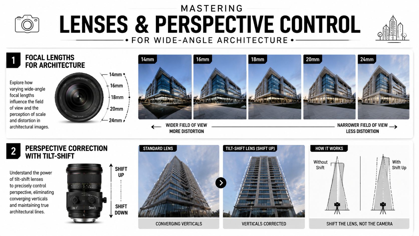
The practical breakdown looks like this:
| Lens type | Where it works best | Main advantage | Main risk |
|---|---|---|---|
| 24 to 35 mm | Exteriors, larger interiors, editorial details with context | Natural proportions | May not be wide enough in tight rooms |
| 16 to 24 mm | Compact interiors, tight exteriors, dramatic spatial read | Strong sense of depth and scale | Edge stretch and exaggerated perspective |
| Tilt-shift | Tall façades, precise interior work, controlled commercial commissions | Perspective control without tilting camera upward | Slower setup and more deliberate workflow |
The mistake I see most often is choosing the widest possible lens before solving the composition. Wider isn't automatically better. It often weakens the image by making foreground elements too dominant and pushing the subject away.
The camera position matters more than the lens label
The single most important habit in perspective control is keeping the camera sensor parallel to the subject when the goal is an accurate architectural rendering. Architectural photography depends on vertical and horizontal alignment, and tilt-shift lenses help maintain that control without introducing converging lines, which is one reason they remain so valuable on demanding shoots.
A full-frame body also gives wide lenses room to behave the way they were designed to behave. If you're comparing options for interiors, this guide on the best lens for interior design photography is a useful reference point for matching focal length to room size and design intent.
Keep asking one question before every frame: does this perspective describe the architecture, or does it describe the lens?
What works and what doesn't
What works is matching focal length to the story. A controlled 24 mm view can feel expansive without shouting. A 16 mm interior can be effective when the room is tight and the composition has disciplined edges. A tilt-shift lens shines when the assignment demands geometric fidelity.
What doesn't work is using an ultra-wide lens as an all-purpose solution. The farther you push width, the more carefully you have to manage corners, camera height, and anything near the frame edge. Good wide angle architecture photography isn't about collecting square footage. It's about preserving proportion while still giving the viewer a sense of space.
Composing with Intent Inside and Out
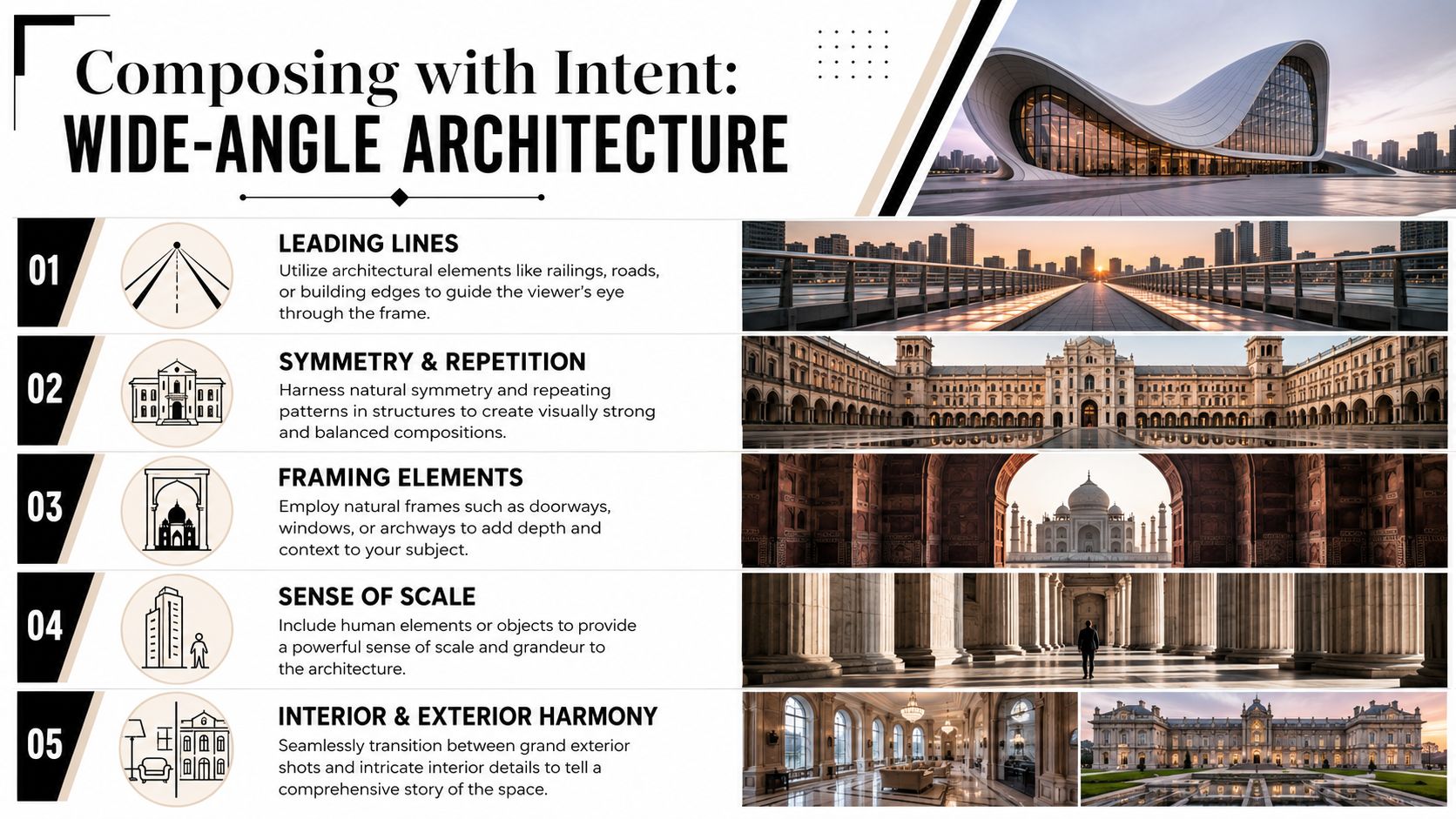
The strongest wide-angle architectural images don't just describe dimensions. They direct attention. They tell the viewer where to enter, where to pause, and what matters first. That's why composition in this genre is less about decoration and more about control.
A wide lens exaggerates relationships. Near objects feel closer. Lines travel faster. Empty floor can become either elegant negative space or dead weight. If you don't shape those effects, the lens shapes them for you.
To keep those choices visible, it helps to think in visual cues rather than camera settings.
One-point and two-point views change the tone
A one-point perspective is often the cleanest choice for interiors. Hallways, kitchens, hotel corridors, and symmetrical living spaces all benefit when the central vanishing point reinforces order. The image feels composed, calm, and architectural.
A two-point perspective often works better outside. It lets you describe volume rather than just surface. Instead of flattening the building into a façade, you show two planes meeting, which usually gives the structure more presence. On corner buildings, that can be the difference between a record shot and a publishable image.
Here's the judgment call. If the design is about procession, use one-point. If the design is about massing, use two-point.
Leading lines should serve the subject
Good wide-angle work uses existing geometry instead of forcing it. Stair edges, paving joints, mullions, handrails, soffits, and shadow lines can all move the eye toward the key element. But they only help if they converge on something important.
I often see compositions where every line is dramatic and nothing is clear. That usually happens when the photographer falls in love with the lens effect and forgets the architecture. The cure is simple. Decide what the frame is about, then make every line answer to that decision.
A short demonstration of this mindset in motion is worth watching:
Tight spaces need strategy, not just width
Interiors are where discipline shows. Bathrooms, compact hospitality spaces, narrow offices, and tight residential rooms tempt photographers to go as wide as possible and hope post-production fixes the rest. That's where many images start to break.
When shooting interiors or tight exteriors where moving back isn't possible, ultrawide lenses under 24 mm can suffer a 40 to 60 percent increase in edge distortion if the subject is too close. A practical solution is angular repositioning, shifting the camera 15 to 20 degrees off-axis to pull distorted elements away from the edge and toward the center, according to PhotoEphemeris field guidance on fixing wide-angle distortion.
That technique matters because it changes how you solve the room. Instead of backing into a corner and accepting stretched cabinetry or warped furniture, you rotate slightly and rebuild the composition around cleaner edges. You still get the breadth of the room, but the image feels more believable.
A room doesn't have to look bigger than it is. It has to look coherent.
Interior and exterior examples that hold up
For interiors, I usually start by asking where the room “settles.” In a dining room, that may be where the table aligns with the pendants and the window rhythm. In a lobby, it may be where the seating group stops fighting the structural grid. The final frame often comes from subtle lateral movement, not dramatic repositioning.
For exteriors, the challenge shifts. Sky, landscaping, parked cars, and neighboring buildings all start competing with the architecture. A wide lens can unify those elements, but only if the edges are watched closely. The corners of the frame should never feel accidental. If a tree branch, signpost, or cropped balcony enters the image without purpose, the composition weakens immediately.
That's the editorial side of wide angle architecture photography. You're not just recording available information. You're deciding which visual facts deserve emphasis, and which ones need to stay out of the frame.
The Technical Workflow for Flawless Exposures
A strong architectural frame can still fail in capture. The composition may be resolved, the perspective may be disciplined, and the light can still break the image if the file does not hold window detail, material color, and shadow separation at the same time. Wide-angle work raises the pressure because one frame often contains the brightest and darkest parts of the project.
The goal is not just a correct exposure. The goal is a file with options.
I build that file on a tripod and expose for editability first. In practice, that means protecting highlights, keeping ISO low, and choosing an aperture for the room rather than for convenience. Aperture Priority is often the fastest way to work because depth of field usually drives the decision, while shutter speed can extend safely on a stable support. Exposure compensation then becomes a precise control for bright glazing, polished stone, and white walls that want to drift into clipping.
Night exteriors need even more restraint. Bright signage, interior lights, and specular highlights can collapse quickly if the exposure is too generous. I often bias the frame darker and let the tripod handle the longer shutter speed, then open the shadows later from a cleaner file. The result feels calmer and more editorial. Highlights keep their shape instead of blooming into vague white patches.
A practical sequence helps, especially when the room has mixed light or reflective finishes:
- Set aperture first: Choose the f-stop that gives the depth you need from foreground to background.
- Keep ISO as low as the schedule allows: Clean files hold color and surface detail better in post.
- Bracket with purpose: Capture separate frames for highlights, midtones, and shadows so you are blending information, not repairing mistakes.
- Inspect the entire frame: Check corners, edge stretch, clipped fixtures, reflections, and anything bright enough to pull the eye off the architecture.
- Focus stack if the lens-to-subject distance demands it: A nearby chair, countertop, or door pull can fall apart fast on a wide lens if you rely on one focus point.
That last check is where many sets are won or lost. Wide-angle images ask the viewer to travel through the whole frame, not just the center. If the edges are soft, a mirror catches the camera, or a sconce clips into a hot patch, the picture stops reading as intentional.
I also review the histogram and the brightest practical surfaces, not just the overall preview. Camera screens flatter files in ways the raw capture will not. A window frame with no tonal separation, or a glossy cabinet with color contamination from a nearby wall, usually becomes expensive to repair later. Careful exposure work on site saves far more time than aggressive cleanup in post, especially if you are doing any post-production for structural photo correction.
Clients rarely describe this part of the process in technical terms. They respond to the outcome. Materials appear true to life. Views through the windows feel believable. Shadows hold depth without turning muddy. The image has drama, but it also has control, which is what editors, architects, and designers trust when they are deciding whether a photograph really represents the space.
Correcting Distortion The Art of Post-Processing
The old rule says every architectural line must be perfectly straight. That advice is useful up to a point, then it starts damaging the image. A building seen by a human standing on the ground doesn't present itself as a mathematically flattened object. If you force every tall structure into total parallel correction, the result can look stiff and oddly compressed.
Why perfect correction can look wrong
That's the trade-off many photographers learn late. Severe keystoning needs correction, but overcorrection can strip away scale. In practice, forcing 100 percent parallel verticals on tall buildings can create an unnatural “squashed” effect, while a slight correction of 2 to 5 degrees preserves a more authentic human-eye perspective and still fixes the distortion that distracts viewers, according to Fstoppers' discussion of natural perspective correction.
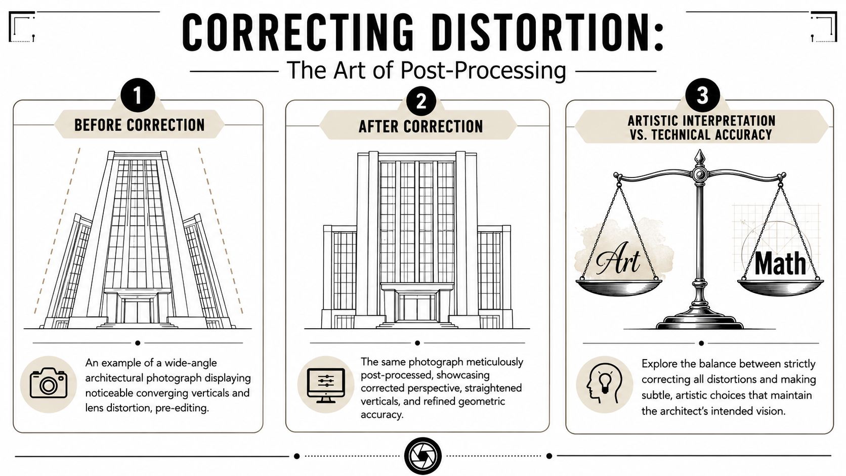
The phrase I use is natural correction. Straight enough to feel intentional. Not so straight that the building loses presence.
A clean Lightroom and Photoshop workflow
A reliable workflow in Adobe Lightroom and Photoshop usually follows this order:
| Stage | What to adjust | Why it matters |
|---|---|---|
| Lens profile correction | Remove baseline lens distortion and vignetting | Starts from a more neutral file |
| Perspective adjustment | Use Guided Upright or manual transforms | Correct major convergence without flattening character |
| Crop and edge review | Rebuild framing after transforms | Prevents awkward dead space and clipped geometry |
| Local tonal work | Balance windows, ceilings, dark corners | Keeps attention on the architecture |
| Color refinement | Neutralize casts, protect material realism | Wood, stone, concrete, and paint need to read honestly |
If the file needs heavier reconstruction, Photoshop gives more control for layered blending, edge cleanup, and selective corrections. But the philosophy should stay the same. Edit to reveal the design, not to advertise the software.
For a more detailed production-oriented look at using post-production to fix structural photos, that workflow is worth studying alongside your own capture habits.
What to preserve and what to remove
Remove distractions that came from the camera or the lens. Barrel distortion, obvious leaning verticals, sensor dust, uneven color casts, and reflection problems all belong on the correction list.
Preserve the things that belong to the building's experience. A slight sense of height in a tower. The tension of a long corridor. The atmospheric contrast between warm interior light and a cooler exterior. Those are not flaws.
The edit should feel like good architectural language. Precise, restrained, and clear about what deserves emphasis.
Color grading deserves the same restraint. Architectural work usually benefits from subtle contrast control and selective color balancing rather than dramatic global stylization. The best finishing work makes materials feel more articulate, not more processed.
Wide angle architecture photography matures. The photographer stops asking, “How straight can I make it?” and starts asking, “What correction best respects both the design and the way a person would encounter this space?”
Curating and Delivering Your Final Gallery
The shoot isn't finished when the retouching is done. Delivery is part of the authorship. A loose folder full of near-duplicates tells the client you captured a lot. A tightly edited gallery tells them you understood the project.
Edit the gallery like a publication
Architects, developers, and editors don't need every competent frame. They need the strongest sequence. Start with the defining exterior or interior image. Then build the story with supporting views that reveal arrival, circulation, materiality, and detail. If two images say the same thing, choose the stronger one and cut the other.
That restraint adds value. A concise gallery is easier to review, easier to pitch to publications, and easier for marketing teams to deploy across proposals, websites, and social channels.
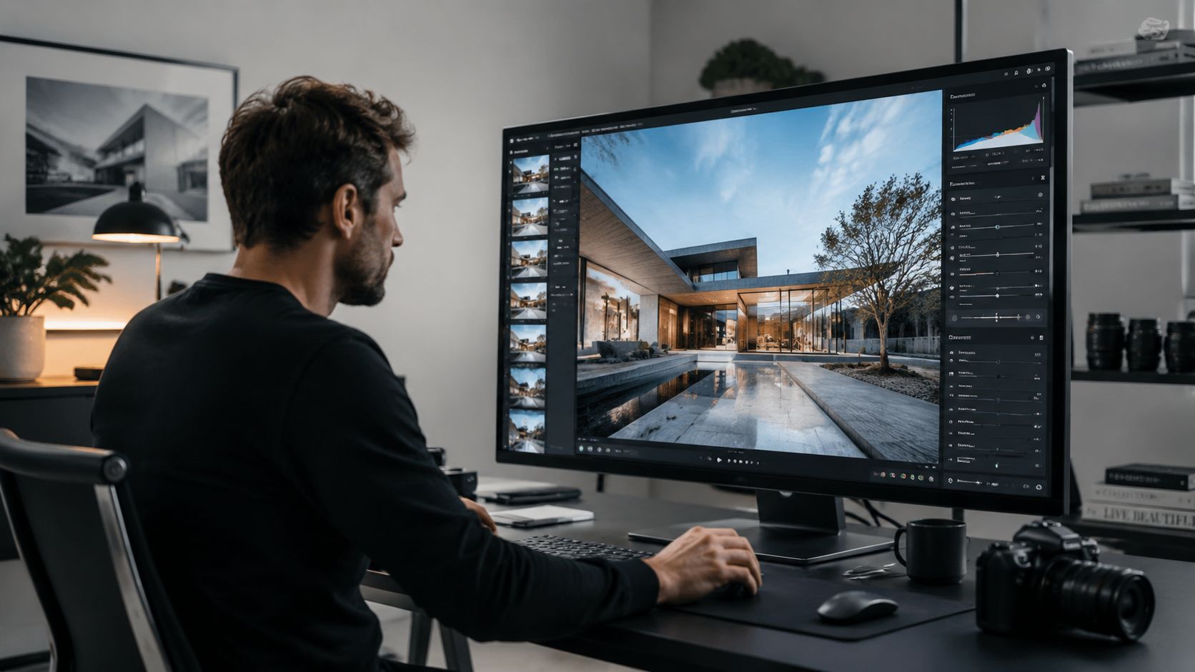
Deliver for use, not just for archive
A polished delivery usually includes separate file sets for different purposes:
- High-resolution print files: For publications, large-format output, presentations, and signage.
- Web-ready files: Optimized dimensions and compression for fast loading and clean display.
- Social and marketing crops: Versions that adapt well to vertical, square, and banner formats.
- Clearly named selects: File names that help teams find hero images quickly instead of guessing.
Presentation matters almost as much as image quality. A well-organized gallery reinforces confidence. It tells the client the same care that went into the composition also carried through to the handoff.
Why the final presentation affects future work
People remember how easy your files were to use. They remember whether the hero images surfaced quickly, whether the web team had what they needed, and whether the architect could send publishable files without a round of clarification. That operational clarity often matters as much as the image itself.
Wide angle architecture photography asks for precision all the way through the process. Not just at the tripod. At selection, sequencing, export, and delivery too. The final gallery should feel as intentional as the building it represents.
If you need architectural images that balance technical accuracy with an editorial sense of story, Jimmy Clemmons Photographer brings that discipline to interiors, exteriors, and commercial spaces. The studio's approach is built around careful scouting, precise composition, controlled lighting, and polished delivery so the final gallery feels as considered as the design itself.