

A client once showed me two photos of the same conference room. One looked like a furniture catalog. The other made you feel the next pitch, review, or board decision was about to happen there, and that second image was the one that sold the space.
Beyond the Empty Chair The Goal of a Great Meeting Room Image
A few years ago, I photographed two meeting rooms in the same building on the same afternoon. One was finished with better materials, cleaner lines, and more expensive furniture. The other was smaller and less showy, but it photographed better because the room made sense the moment you looked at it. The screen was visible from every seat. The circulation was clear. The table shape suggested discussion instead of hierarchy. One image showed a room. The other showed how work would happen there.
That difference is the job.
A weak meeting room photo records surfaces. A strong image meeting room photograph shows what the space helps people do. It should tell a prospective tenant, client, employee, or investor whether the room supports decision-making, hybrid communication, privacy, speed, or high-stakes presentations. Those are brand signals, not styling details.
Meeting rooms carry more weight now because they often serve both the people in the building and the people joining from elsewhere. Analysts at Microsoft have reported that meetings increased sharply after 2020 in their global workplace data, which matches what many clients now ask me to show in a frame: display clarity, camera placement, clean sightlines, and a room that feels ready for both in-person and remote collaboration (Microsoft Work Trend Index findings on meeting volume and hybrid work).
When I walk into a room, I assess it like a user before I assess it like a photographer. Can people see the screen without twisting in their chairs? Does the room feel confidential or exposed? Is the technology integrated cleanly, or does it look added on at the last minute? Those answers shape the image far more than a polished tabletop ever will.
Clients often focus on furniture because furniture is easy to point to. Buyers respond to function because function lowers uncertainty. A law firm may need the room to project control and discretion. A tech company may need it to read as fast, connected, and adaptable. A developer marketing shared amenities may need the image to reassure future tenants that the building supports serious work, not just attractive finishes.
A meeting room image should answer a buyer's silent question: “Could our people work well here?”
Small choices carry that message. A restrained presentation slide on the display. A chair position that suggests a conversation is about to start. A camera angle that shows the far wall, the screen, and enough of the table to explain how the room operates. Before the shoot, I also ask clients to handle site details that break credibility in photos, which is why a solid project site preparation checklist for a professional photoshoot pays off.
The goal is not to make an empty room look expensive. The goal is to make it look useful, capable, and aligned with the brand that occupies it. That is what gives the image staying power.
Planning the Shot Before You Arrive
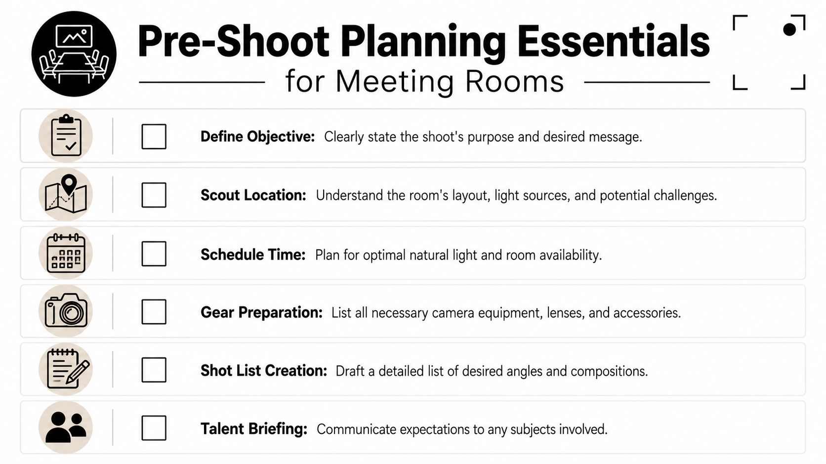
I've had more than one meeting room look perfect in the architect's PDF and fall apart the minute I walked in. The table was oversized, the screen threw a hard reflection into every useful angle, and the view that sold the room in person disappeared on camera. That kind of miss usually starts before shoot day, not during it.
Good architectural photography starts with a clear brief and a realistic read on how the room will behave under a lens.
Build the brief around use, not decor
The first question is simple. What does this room need to prove?
A boardroom for investor meetings has a different job than a training room built for hybrid calls. A client-facing conference room may need to show discretion, polished technology, and controlled sightlines. A project room may need to show adaptability, writable surfaces, and easy screen sharing. The finishes can be similar. The story cannot.
Ask the client questions that force useful decisions:
- Primary audience: Is the image for tenants, investors, prospective employees, hospitality guests, or editorial use?
- Primary use: Does the room host leadership meetings, creative reviews, client presentations, training sessions, or hybrid collaboration?
- Brand tone: Should the room feel reserved and executive, or open and contemporary?
- Must-show elements: Which technology, material details, architectural lines, or branded features need to appear?
- Must-hide elements: Which vents, access panels, cable runs, or awkward adjacencies should stay out of frame?
A sharp brief protects the shoot from becoming a catalog of furniture. It gives every frame a job and keeps the final set tied to the client's business goals.
Scout for light, geometry, and friction
Meeting rooms often hide their problems until you stand in the doorway with a camera. Glass walls reflect exit signs, hall traffic, and your own lighting. Mixed fixtures can turn white walls muddy. A glossy display can wipe out the one angle that explains how the room works.
During scouting, I check five things first:
Window orientation
East light, west light, and overcast light all shape the room differently. The timing affects glare, contrast, and whether the room feels open or heavy.Artificial lighting mix
Daylight, LEDs, pendants, and screen glow rarely agree with each other. If the color temperatures fight, the room loses polish fast.Reflections
Glass partitions, framed art, stone tops, lacquered tables, and large displays all need a plan before the tripod goes up.Power and gear access
Extra lighting, tethering, and practical adjustments only help if cables can run safely and stay out of the frame.Furniture mobility
Small moves matter. A slight shift in a chair, side table, or credenza can clean up perspective and make circulation read clearly.
Scout in person whenever you can. Rooms with glass on two sides and a screen on the third are usually harder than they look.
Check whether the room works on camera
Some rooms photograph poorly because they are hard to use, not because the finishes are weak. Tight circulation, low ceilings, and a display wall pushed too close to the table all show up in the image. Wide lenses can hide only so much.
Archie's conference room sizing guide notes common planning benchmarks such as 20 to 25 square feet per person, 9 to 12 foot ceilings for larger rooms, 56 inches or 1.5 meters between the table and display, 36 inch or 91 centimeter doorways, and 24 inches or 61 centimeters of table space per person (https://archieapp.co/blog/conference-room-size/). I do not use those numbers as a design review. I use them as a warning system before the shoot. If the room is undersized, the photos will usually show that pressure in the seat spacing, the camera angle options, and the relationship between people, table, and screen.
That matters for more than aesthetics. A cramped room looks less capable. A screen wall with poor stand-off distance weakens the story of hybrid collaboration. A low ceiling can make an otherwise expensive room feel ordinary.
If you are coordinating with the client before shoot day, send a short readiness note early. Cover access, cleaning, screen content, furniture reset, and room availability. A practical project site preparation checklist for a professional photoshoot helps everyone solve those issues before the schedule gets tight.
Create a shot list that has a job
Build the list around outcomes, not just viewpoints.
| Shot type | What it needs to communicate |
|---|---|
| Hero wide | Scale, finish quality, and overall tone |
| Functional medium | Technology, display relation, and seating logic |
| Entry view | Arrival experience and openness |
| Seated perspective | What a participant actually sees |
| Detail vignette | Materials, controls, craftsmanship, and brand cues |
A good shot list also protects the room's bigger story. The final image set should show how the space supports discussion, presentation, privacy, and brand character. If the photos only show a clean table and matching chairs, they miss the room's actual value.
Staging the Space for Story and Function
I have walked into plenty of meeting rooms that looked expensive in person and flat on camera. The usual cause is bad staging, not bad design. A room with great finishes can still photograph like a catalog page if nothing in the frame explains what happens there, who it serves, or how the technology supports the work.
The goal is readiness with intent. The room should feel prepared for a real conversation, presentation, or decision. That shift matters because clients are rarely buying furniture alone. They are selling leadership, collaboration, privacy, technical capability, and brand confidence.
Remove what weakens the room
I start by clearing friction out of the frame. Loose handouts, tangled charging cords, stained coasters, dented trash bins, extra side chairs, and random desk phones pull attention away from the room's purpose. On camera, those details read as poor management.
Then I add back only what helps tell the truth about the space.
An executive boardroom usually needs restraint. One closed notebook, water service, and polished screen content often say more than a table covered in props. A creative review room can carry a marked-up board or a display with an active concept slide because process is part of the story. A hybrid room needs its camera bar, microphones, acoustic treatment, and seating pattern to read clearly. If those elements disappear, the image stops explaining why the room exists.
Use signs of work, not decorations
Meeting room photography is crowded with generic empty-space imagery, as noted earlier. The stronger image avoids that sameness by showing evidence of competent use.
A pen near the seat that would lead the meeting helps. So does a glass of water near the presentation position. A title slide on the screen is usually better than a blank input screen or a default video-call home page. These details do a quiet but important job. They show that the room supports action.
I treat props as proof, not ornament.
The room should look used by competent people, not decorated by a stylist who has never sat through a client meeting.
Stage the technology like part of the architecture
Technology dates a room faster than millwork or seating. If the space is meant for hybrid collaboration, the AV layer needs the same care as the furniture and finishes. That means the camera should feel placed with intention, microphones should not dominate the table line, and the display content should support the client's brand rather than distract from it.
A few choices make a visible difference:
- Use clean screen content: Show a branded title slide, agenda, or simple chart. Avoid inboxes, desktop wallpaper, and default conferencing screens unless the interface itself matters to the assignment.
- Control cable paths: Remove temporary cords where possible. If a cable must stay, route it so it reads as planned infrastructure.
- Protect sightlines: Reposition tabletop microphones or accessories that block the visual connection between seating and screen.
- Show fair participation: A layout that gives every seat a relationship to the display and camera photographs better because it suggests inclusion, not hierarchy.
For larger projects, clients usually respond best when staging is handled as selective editing. The room already contains the story. The job is to protect it from noise. This guide to staging interiors for high-end photography reflects that approach well.
A quick visual reference can help teams think about room readiness before the camera comes out:
Lighting and Camera Settings for Interior Shots
A meeting room can look bright to the eye and still photograph like a cave. The failure usually shows up in the wrong places first. Faces go flat, the screen blooms, the corners sink, and the room stops reading as a place where decisions happen.
Good lighting for this kind of space has a job beyond exposure. It needs to describe how people use the room. The table has to hold texture. The display wall has to stay legible. The vertical surfaces behind participants need enough shape to suggest presence, technology, and brand control, not a dim box with chairs.
Light the room for use, not just appearance
Conference rooms are built for communication, so I light them around communication cues. That means balancing three competing priorities at once: surfaces, faces, and screens.
The published targets many AV teams use are a helpful reference point. Florida International University's conference AV standards call for 400 lux minimum at the room level, with 500 lux preferred, a 3000 to 4000 K color temperature range, 40 foot-candles minimum at tabletop height, and 50 to 70 vertical foot-candles for faces and backgrounds in conference spaces (FIU Conference AV Standards PDF).
Those numbers matter because they match what the camera struggles with. Horizontal light records the table, finishes, and hardware. Vertical light gives shape to faces, chairs, wall panels, and the background a participant sees on video. If the room has plenty of downlight but weak frontal or side illumination, the tabletop may look fine while the rest of the image falls apart.
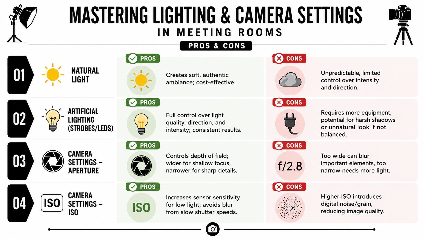
Natural light versus controlled light
Daylight can give a meeting room credibility. It can also make a set of images impossible to match.
Here is the trade-off:
| Approach | What works | What tends to fail |
|---|---|---|
| Natural light only | Soft window side, believable atmosphere, lower setup load | Fast-changing exposure, flat corners, bright window clipping |
| Added strobes or LEDs | Better balance, cleaner surfaces, stronger shape on walls and chairs | Poor placement can create harsh reflections or an artificial look |
| Mixed ambient with correction | Preserves architectural mood while controlling problem areas | Requires discipline with white balance and reflection management |
I rarely treat this as a style decision alone. It is a brand decision. A law firm may need steadiness and restraint. A tech company may want the room to feel brighter, more connected, and screen-ready. The light should support the story the client wants the room to tell.
If daylight is carrying the frame, I usually control it first, then supplement it. A shade dropped a few inches can save a window line and reduce glare on a table. A soft LED bounced or diffused into the dark side of the room can restore depth without making the space feel staged. If the installed fixtures are mixing green, amber, and cool white tones, I prefer to take command of the color with my own lights instead of repairing muddy files later.
A polished table creates its own trap. It reflects the ceiling, not the room. Before blaming the finish, change the overhead light pattern or lower the camera slightly and watch the surface come back.
Camera setup that keeps the room credible
Architectural interiors reward patience. Meeting rooms reward precision.
My baseline setup is simple because simple works:
- Tripod first: It keeps framing repeatable and lets me refine verticals, reflections, and screen brightness without rushing.
- Low ISO: Cleaner files hold subtle transitions in paint, veneer, fabric, and acoustic materials.
- Moderate aperture: I usually work around f/8 to f/11. That range often gives enough depth for interiors without giving away sharpness to diffraction on many systems.
- Longer shutter speeds: With the camera locked off, slow exposures are useful. They let ambient light do honest work.
- Exposure bracketing: Bright windows, dark millwork, matte walls, and illuminated displays often need separate source exposures if the final image is going to feel natural.
The goal is not a heroic HDR look. The goal is a file with options. Clients want to see the room as capable and well considered. If highlights are blown and shadows are blocked, the image stops describing capability and starts documenting compromise.
Lens choice and perspective control
Wide lenses are helpful, but they punish carelessness fast. If the room only feels impressive at an extreme focal length, the photograph is overselling the space. That usually hurts the client later, especially when visitors, tenants, or buyers walk in and realize the proportions were stretched.
I would rather use a slightly tighter focal length and preserve the geometry. Honest proportions build trust. In a meeting room, trust matters because the photograph is often doing double duty. It is selling architecture, and it is signaling how well the organization communicates inside that architecture.
Three habits keep perspective under control:
Choose camera height on purpose
A height that is too high makes the table dominate. Too low makes seating bulky and compresses the room. Start where both the tabletop and the far wall keep their importance.Keep the sensor plane level
Tilting up to cram more into the frame usually creates more correction than the composition is worth.Leave margin at the edges
A little extra frame gives space for perspective correction and cleaner cropping around mullions, door frames, and display edges.
Start post-production before you press the shutter
The strongest interior files feel calm from the start. Stable white balance, controlled reflections, level lines, and bracketed exposures reduce rescue work and improve decision-making later.
That is the practical advantage. Better capture gives the client better images of what the room is for: focus, collaboration, presentation, and the kind of work their brand wants to be associated with.
Composing a Narrative with Angles and Shots
I have photographed meeting rooms that looked polished, expensive, and completely useless in the final gallery. The furniture was perfect. The lines were clean. Yet the images said nothing about how decisions happen there, how teams share a screen, or how the room supports people in the building and people dialing in from somewhere else.
That is the difference between coverage and narrative. A strong meeting room image shows what the room is built to do.
Start with the hero, then build the sequence
The hero frame still matters. It gives the client the headline image for a website banner, brochure spread, or leasing page. It should establish the room's identity in one shot. Scale, finish quality, circulation, technology, and brand cues all need to read quickly.
Then the sequence has to do the harder work. Supporting frames answer the questions a hero shot cannot: Can everyone see the display? Does the room feel private or transparent? Is the technology integrated or added as an afterthought? Does the layout support collaboration, presentation, or formal review?
A practical gallery usually includes a mix like this:
| Shot | Narrative job |
|---|---|
| Hero wide | Establishes the room's character and overall purpose |
| Three-quarter functional view | Shows display, camera, microphones, and table relationship |
| Seated eye-level frame | Puts the viewer in the participant's position |
| Entry or threshold angle | Shows approach, openness, and connection to adjacent space |
| Material detail | Confirms craftsmanship, finish quality, and brand tone |
| Human-use frame | Suggests scale, collaboration, and real working conditions |
Show the room as a working system
A meeting room is no longer just a table surrounded by chairs. For many clients, the room's business value sits in what happens during the meeting: remote participation, screen sharing, presentations, acoustics, and clear sightlines between people and technology. Microsoft's Work Trend Index has documented how organizations are rethinking work patterns and hybrid collaboration, which is why room photography now needs to show more than finish materials and square footage. See Microsoft's overview at https://www.microsoft.com/en-us/worklab/work-trend-index.
That shift changes composition.
A camera bar under the screen is not clutter if hybrid meetings are part of the room's purpose. Ceiling microphones, speaker tracking cameras, control panels, and equitable seat views help explain whether the room functions. If a client invested in those features, the photographs should make that investment visible.
Choose angles based on role
Angle choice shapes the viewer's position in the room, and that affects brand perception more than many clients realize.
A head-of-table angle can signal authority and structure. It suits executive briefing rooms, boardrooms, and spaces designed for leadership presentations. Used carelessly, it also makes the room feel rigid and top-heavy.
A side-seat angle is often more useful. It shows the table, the display wall, and several chairs in relationship to one another, which helps the viewer understand conversation flow. For collaborative rooms, I use this angle more than any other because it feels human without becoming casual.
A threshold view works well when the meeting room is part of a larger workplace story. It can show whether the room feels enclosed, transparent, prominent, or tucked away. That matters for architecture firms, developers, and workplace clients selling not just a room, but an office culture.
Presenter-height views are different again. They are useful for training rooms, review spaces, and client-facing conference rooms where one person regularly leads the room. The image should make that role legible.
Add evidence of use without creating clutter
Many architecture and interiors clients want clean, unoccupied frames. I understand that. Empty rooms let design details read clearly. Still, one or two images should suggest imminent use.
Small signals do that job well:
- a restrained presentation slide on the display
- one chair set slightly back from the table
- a whiteboard or glass board with minimal, believable content
- a laptop dock, touch panel, or conferencing interface shown clearly
- a composition that places the viewer at the seat, not outside the experience
The goal is not decoration. The goal is credibility.
I avoid props that feel staged for the sake of staging. A random coffee cup, scattered notebooks, or exaggerated brainstorming notes can date the image and weaken the client's message. Better to show real function cleanly, then refine the file later with post-production techniques for structural photos that keep the architecture believable.
Give each frame a clear job
The easiest way to make a gallery feel repetitive is to shoot six wide angles that all say the same thing. Strong composition comes from deciding what each frame must prove.
I usually ask a short set of questions before settling on the angle:
- Does this frame show how people collaborate here?
- Does it prove the room supports hybrid meetings?
- Does it communicate privacy, openness, or prestige?
- Does it show the client's material and finish standards accurately?
- Does it connect the room to the broader workplace brand?
Once the answer is clear, the frame gets simpler. Objects stop competing for attention. The viewer knows where to look first. The room stops reading as a collection of furniture and starts reading as a place where work happens, decisions get made, and the brand shows up in physical form.
The Final Polish Retouching and Licensing Your Images
I've seen strong meeting room photos lose their value in the last 10 percent of the process. The room is well lit, the composition is right, the technology reads clearly, and then heavy retouching flattens the finishes or strips the space of any lived-in credibility. Clients notice that, even if they cannot always name it.
Good retouching protects the intent of the room. It corrects perspective, balances exposure, refines color, and removes distractions without rewriting the architecture. Screen glare, minor wall marks, messy cabling, outlet plates, and mixed fixture color can usually be cleaned up. The key is restraint.
That restraint matters most in meeting rooms because buyers, tenants, architects, and internal stakeholders are reading more than furniture. They are judging whether the room feels capable. They are looking for a space that supports private conversations, hybrid communication, and confident decision-making. If post-production wipes away the texture of the materials or makes the technology feel fake, the image stops supporting the brand.
I keep a close eye on geometry and finish accuracy. Push vertical corrections too far and the room starts to feel stretched. Warm wood can drift orange fast. Glass can turn dead if every reflection gets removed. A practical guide to post-production techniques for structural photos that keep the architecture believable shows where those corrections help and where they start to hurt.
Licensing deserves the same care.
These files are working assets, and each client team uses them differently. Marketing may need web-ready crops for a careers page that sells culture and capability. A design firm may need high-resolution files for awards, proposals, or editorial submission. A leasing team may need vertical and horizontal versions for brochures, listing platforms, and pitch decks. The smartest approach is to define usage clearly before delivery so the image set fits the actual business case.
Clear licensing also protects the story the images were built to tell. If a brand plans to use a meeting room image across advertising, investor materials, recruitment, and signage, that scope should be spelled out. If usage is limited to editorial, portfolio, or a single campaign, that should be spelled out too. Clear terms prevent confusion, budget surprises, and the common problem of great images sitting unused because nobody knows what rights were purchased.
A finished image is only successful when it is believable, usable, and aligned with the client's goals. That is the final polish that matters.