

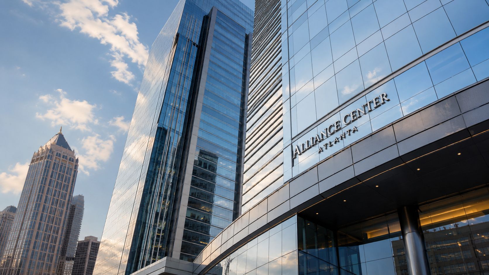
At dawn in Buckhead, the glass at Alliance Center doesn't read as a flat facade. It catches a pale edge of sky first, then starts reflecting traffic, neighboring towers, and the city waking up below. For a photographer, that short window tells you almost everything about the property. It's a campus built to perform visually, not just function as office inventory.
An Introduction to an Atlanta Icon
Alliance Center in Atlanta, GA rewards a careful eye because it sits at the intersection of corporate image, skyline identity, and everyday urban use. What many visitors first register is polish. The towers present themselves with the confidence you expect from premium Buckhead office space, but the stronger story is how the site photographs across scales. It works from a distance as part of Atlanta's northward skyline, and it also works up close in the seams where glazing, structure, entries, and plaza circulation meet.
That matters for architects, developers, marketers, and leasing teams who need more than a location snapshot. A property like this needs imagery that explains why the architecture holds attention. The visual narrative isn't only about height. It's about how the massing reads from the street, how the materials respond to weather, and how visitors move through the campus during a normal workday.
Buckhead gives the complex a strong urban backdrop. The district's mix of office towers, retail corridors, hotels, and traffic patterns creates layered frames that can either enhance a photograph or clutter it. Good coverage starts by deciding what story the assignment needs to tell. Skyline presence. Leasing polish. Street-level arrival. Interior efficiency. Each requires a different angle, different lens choice, and usually a different time of day.
For anyone planning a built-environment shoot in Atlanta, Buckhead is one of the city's most useful proving grounds. The district has the density, reflective surfaces, and mixed light conditions that force disciplined composition. That's part of why I often think about places like Alliance Center alongside other architectural landscapes in Atlanta that demand both technical control and editorial judgment.
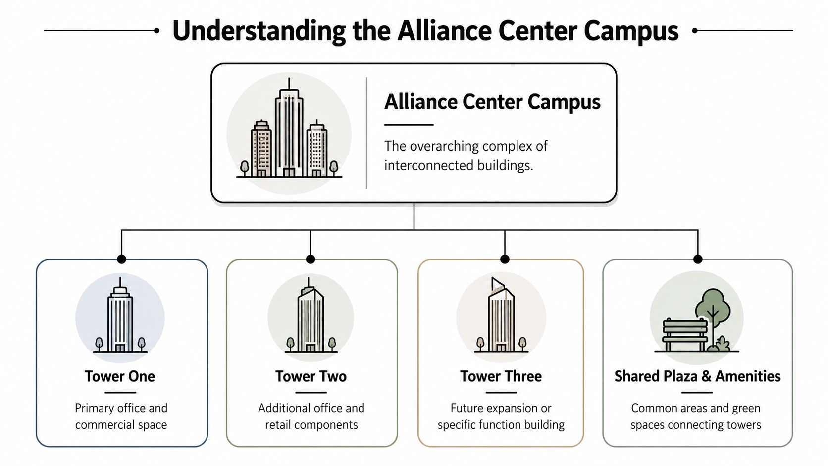
The first mistake people make at Alliance Center is treating it like a single object. It photographs better when you approach it as a system of towers, edges, and relationships.
The Architecture of the Alliance Center Complex
Alliance Center rewards precise naming before the first frame is made. The property reads as a single Buckhead landmark from a distance, but on assignment it functions as a multi-tower campus with separate identities, access points, and visual priorities. That distinction shapes the scout, the shot list, and the way final images are captioned for architects, leasing teams, or marketing departments.
Three Alliance Center completed the composition and gave the campus a clearer architectural hierarchy, as noted earlier in the article. In practical terms, that means “Alliance Center” can refer to the full complex, a specific tower, or the broader office cluster people recognize from nearby streets. A photographer who does not resolve that ambiguity early usually wastes time covering the wrong entrance sequence or the wrong facade.
Why the naming confusion matters
Each tower asks for a slightly different visual strategy.
- One Alliance Center usually needs coverage that supports tenant-facing communication, access, and day-to-day business use.
- Two Alliance Center tends to carry more of the formal architectural discussion because its facade treatment and profile read cleanly in longer views.
- Three Alliance Center often becomes the tower that clarifies the campus as a completed composition rather than a loose grouping of office buildings.
That difference matters in real deliverables. Architects need image sets that separate authorship, massing, and envelope decisions. Property teams usually need the opposite. They want the campus to read as one coherent destination, with enough specificity to support leasing, wayfinding, and brand consistency.
Reading the campus as Buckhead architecture
The complex also marks a specific phase in Buckhead's growth as a business district. You can see it in the scale, the spacing between towers, and the way the project balances skyline presence with street-level corporate polish. This is not a downtown tower dropped into a suburban parcel. It is a Buckhead office campus shaped by visibility, vehicular arrival, and the expectation that premium workspace must also photograph well from multiple distances.
From the camera's position, the key architectural question is relational rather than isolated. How do the towers sit against each other? Where does one volume terminate and another begin? Which sightlines make the campus feel intentional instead of crowded? Those are design questions, but they are also editorial ones. Good images answer them without forcing the viewer to study a site plan.
What to evaluate before a shoot
A pre-shoot review should test the campus at several scales, because no single angle explains the whole project.
| Focus | What it tells the viewer | What can go wrong |
|---|---|---|
| Campus-wide framing | Shows Alliance Center as a connected Buckhead office environment | Surrounding traffic, signage, and adjacent towers can flatten the identity |
| Single-tower isolation | Clarifies the character of an individual building | The image can support the common mistake that Alliance Center is one tower |
| Street-level approaches | Shows arrival sequence, scale, and material transitions | Parked cars, service zones, and inconsistent pedestrian activity can distract from the architecture |
| Plaza and connective spaces | Explains how the complex works as a campus | Flat midday light can make these areas feel more utilitarian than designed |
For photographers who regularly cover office building exteriors, Alliance Center is a useful case study in mixed priorities. The architecture has to read clearly for designers, but the image set also has to serve commercial use. The strongest coverage makes the campus structure obvious, gives each tower its own role, and avoids reducing the property to a generic Buckhead glass block.
A Photographer's View of Form and Light
The strongest visual trait at Alliance Center is controlled reflectivity. Glass is everywhere in Buckhead, but not all glass behaves the same way on camera. Here, the envelope can hold sky color, neighboring geometry, and shadow detail at once, which gives the towers a shifting character across the day.
According to The Beck Group's Two Alliance Center project information, Two Alliance Center features floor-to-ceiling glazing and a prominent vertical fin, and Two and Three Alliance Center are LEED Gold certified. Those are not abstract development notes. They translate directly into what the camera sees. Floor-to-ceiling glazing creates cleaner bands of reflection, while the fin gives the tower a readable gesture from low angles and longer skyline views.
What the facade does for composition
A visually effective office tower usually gives you at least one of three things. Rhythm. Contrast. A distinct profile. Alliance Center gives you all three, which is why it can support different photographic treatments without losing identity.
- Rhythm through glazing bays helps when you want a controlled, editorial frame.
- Contrast between sky reflection and structural edges works well in early and late light.
- A recognizable vertical move, especially on Two, gives the building a signature from oblique angles.
That mix is useful because corporate clients rarely need one kind of image. They usually need a set that can flex across web, leasing, editorial, and presentation use.
Practical rule: If the glass is carrying the image, expose for highlight retention first. You can open the shadows later. Blown reflections rarely recover gracefully.
Light timing at this site
Morning light usually gives the campus a clearer, cooler read. The forms feel more precise, and the surfaces tend to separate cleanly. Late-day light can be richer, but it also raises the risk of uneven contrast between towers and surrounding streetscape.
When I'm planning a technical exterior shoot, I treat this kind of site as a sequence, not a single setup. I want one set for form, one for reflection, and one for atmosphere. That means scouting not just where the sun lands, but how traffic, signage, and neighboring buildings start contaminating the frame as the day gets busy. The decision process is similar to any disciplined guide on choosing the best light for a site shoot. You're not chasing “good light” in the abstract. You're matching light quality to facade behavior.
A moving view helps clarify how the architecture reads in context.
Why performance-oriented design photographs well
High-performance office design often produces cleaner imagery because the architects have already disciplined the envelope. Repetition is tighter. Transitions are more deliberate. The facade isn't asking the viewer to ignore compromise.
At Alliance Center, that means the towers can carry both wide compositions and detail studies. You can photograph skyline presence, then turn around and frame a smaller composition where glazing lines, edge conditions, and reflections do the narrative work.
Visual Case Study Capturing the Alliance Center
A useful way to photograph Alliance Center is to build the shoot around three different stories instead of one hero image. That approach produces a set clients can use. One photograph establishes the campus in Buckhead. Another gives the towers force and verticality. A third slows down and examines surface, finish, and human approach.
Case one with morning glass
The first frame I'd chase is the clean morning exterior. This is the image that tells the client the building is sharp, current, and composed. The goal isn't drama for its own sake. It's credibility. You want the reflections active enough to show life in the facade, but not so chaotic that the tower loses edge definition.
That usually means a slightly offset angle rather than a dead-on elevation. Straight-on views can flatten the image unless the light is doing heavy lifting. An oblique frame gives the glass depth and lets the massing feel earned.
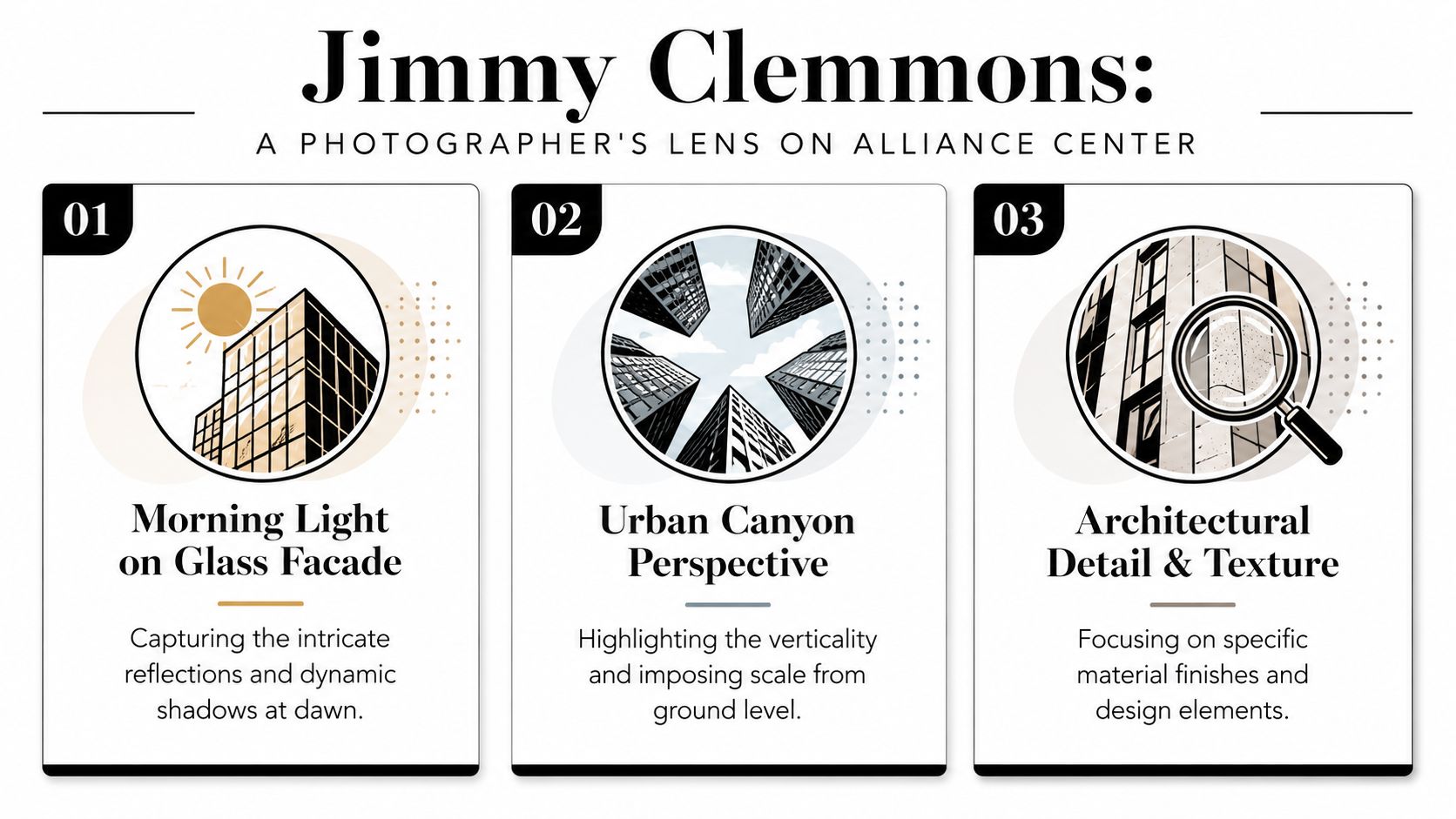
Case two with a ground-up perspective
The second image should feel more architectural than commercial. I'd work from lower to the ground and let the tower rise aggressively through the frame. That's where the campus starts speaking in terms architects appreciate. Lines converge. The vertical fin and facade bands become compositional tools instead of mere building features.
This kind of image works best when the foreground is disciplined. Random landscaping, parked cars, and curb clutter weaken the geometry fast. If the frame can't be simplified, I'd rather move and commit to a more graphic crop than pretend the street-level distractions don't matter.
The low-angle shot works when the base is clean. If the base is messy, the image becomes about street clutter instead of architecture.
Case three with detail and use
The third story is usually the one clients underestimate. Detail views and arrival-space photographs often become the most useful files in marketing decks, editorial layouts, and proposal materials. They explain quality. They show how the building is experienced rather than just how it looks from a distance.
For Alliance Center, that can mean focusing on entry sequences, reflective surfaces near the plaza, or a tighter composition where structure and curtain wall meet. A close image should still feel architectural. It shouldn't drift into random texture hunting.
Here's the practical breakdown I'd use on a real assignment:
- Hero exterior: Prioritize skyline legibility and campus polish. This is the image that carries the broad identity of the property.
- Vertical study: Use perspective intentionally. Let the building's upward movement dominate.
- Detail frame: Isolate one material relationship or one arrival moment that supports the larger brand story.
- Human-scale context: If people appear, they should clarify proportion and flow, not become the subject.
What clients usually need from the final set
Different stakeholders read the same building differently.
| Client type | What they usually respond to |
|---|---|
| Architects | Facade discipline, proportion, envelope detail |
| Developers | Marketable identity, skyline presence, premium positioning |
| Leasing teams | Arrival experience, clarity, clean brand presentation |
| Editorial clients | Strong narrative sequence and visual variety |
That's why a location like Alliance Center should never be photographed as a one-angle assignment. The site has enough architectural structure to support a layered visual story, and the final images should prove that.
Practical Guide to Photographing the Complex
The assignment usually gets won or lost before the first frame. At Alliance Center, the difference is rarely camera gear. It is whether the team has already settled access, tower priority, parking, and the exact story the images need to carry.
Smallwood's Two Alliance Center case study page notes the complex's access to GA 400 and MARTA. That helps with planning, but it does not solve production on site. A photographer still has to choose approach routes, identify clean vantage points, and avoid burning the best light while the crew figures out where to stand.
Start with the brief. A leasing team usually wants arrival clarity, recognizable frontage, and images that feel efficient and premium. An architect or design client often wants stricter geometry, cleaner facade read, and proof that the tower holds up under closer scrutiny. Those goals can live in the same shoot, but only if they are defined early.
Start with permissions and purpose
Public sidewalk coverage is usually enough for broad exterior work. Closer access changes the assignment. Lobby views, amenity areas, tenant-facing entries, and any shoot involving lighting stands or a larger crew should be cleared with property management in advance.
I treat this site like an operations job as much as a photography job. If the production includes a client team, assistants, or video coverage, the schedule needs a meeting point, load-in plan, and a clear sequence for what gets photographed first. Good logistics protect the light window.
If a client needs publication-ready coverage rather than simple documentation, Jimmy Clemmons Photographer is one Atlanta studio that handles architectural imagery, commercial brand content, scouting, lighting, on-set direction, and editing. That kind of support is useful when exterior architecture and occupied corporate space need to read as one visual system.
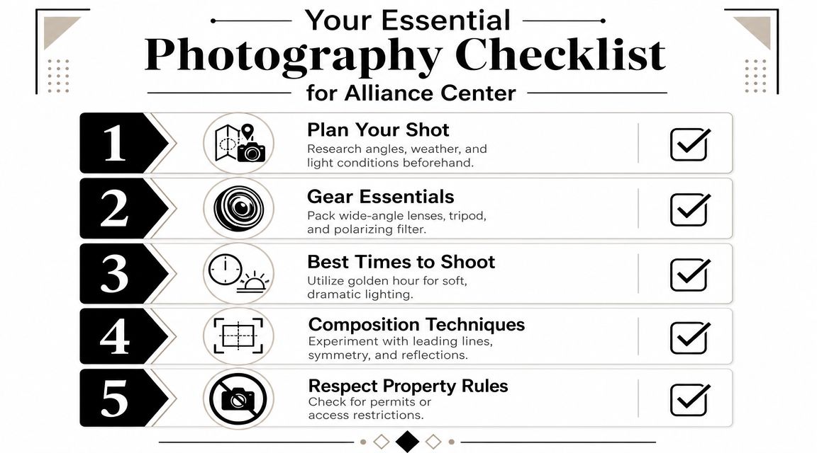
Choose the right time for the right result
Light changes the building's character more than many clients expect.
Early morning is the safest choice for controlled exterior coverage. Reflections are calmer, foot traffic is lighter, and the facade usually reads with better separation. Midday is harsher, but it can work if the goal is contrast, repetition, and tighter abstract studies of the curtain wall. Late afternoon and blue hour suit arrival images and skyline context, though the exposure range gets narrower and the pace gets faster.
A few field rules help here:
- Scout before setting the tripod: Walk the perimeter and check how adjacent towers affect reflections.
- Use a polarizer with restraint: It can clean up glazing, but too much polarization makes glass look patchy from edge to edge.
- Watch the curb lane: Parked vehicles, rideshares, and delivery traffic can ruin an otherwise strong frontage composition.
- Wait for the right human presence: A single person crossing an entry can establish scale. A cluttered crowd usually weakens the frame.
Handle access like a production problem
Alliance Center is easy to reach and easy to misread. The challenge is not finding the property. The challenge is keeping the shoot organized once everyone arrives.
For solo coverage, there is room to adapt. For a client-facing production, ambiguity costs images. Parking should be decided beforehand. The team should know which tower matters, which entrances are active, and whether the brief is selling workplace experience, documenting architecture, or doing both. The strongest sets from this complex come from crews who make logistics boring and keep their attention on light, alignment, and sequence.
Beyond the Facade Interior and Amenity Spaces
Exterior photographs may win attention first, but interiors often close the argument. They show whether the property's design quality continues after the front door. At Alliance Center, that means looking at lobbies, circulation zones, conference facilities, fitness areas, and the everyday spaces that define tenant experience.
The strongest interior images usually do two things at once. They reveal finish quality, and they explain how the plan supports work. That's especially relevant here because Peachtree Commercial Real Estate's One Alliance Center property information describes highly efficient rectangular floor plates averaging roughly 25,000 square feet per level and a parking ratio of 2.7 spaces per 1,000 RSF. Those aren't just leasing metrics. They indicate a building organized around usability, fit-out efficiency, and access.
What deserves attention inside
When photographing interior and amenity space in a property like this, I'd look for the following:
- Arrival sequence: Entry, reception, and the transition from exterior polish to interior tone.
- Material hierarchy: Stone, glass, metal, wood, and soft finishes should read as intentional, not merely expensive.
- Circulation logic: Hallways, elevator lobbies, and conference zones should feel legible in the frame.
- Occupancy potential: A room should suggest how people work there, even if it's photographed empty.
A broad lobby shot can establish scale, but the supporting frames matter just as much. A tighter image of lighting integrated with finishes, or a meeting space shown with balanced natural and interior light, often tells a more persuasive story about quality.
What doesn't work in interior coverage
The biggest failure is treating amenities as isolated inventory. A fitness center, conference room, or lounge doesn't mean much if the images don't explain connection and flow. Another common mistake is over-lighting the space until every material reads flat. Corporate interiors need shape. They need contrast. They need enough restraint that the architecture still leads.
For marketing teams, these spaces often carry the practical value proposition. For architects, they show whether the discipline visible outside continues inside.
Commissioning Your Architectural Vision
The strongest photographs of a property usually start before the camera comes out.
At Alliance Center, that means deciding what story the commission needs to carry. A leasing campaign needs clarity, access, and market position. An architect may need the frame to hold proportion, material transitions, and how the complex meets the street. A corporate brand team may care more about polish, consistency, and whether the campus feels credible to a prospective tenant or partner. Those goals overlap, but they are not the same, and the shot list should reflect that difference.
This complex rewards that level of planning. Its value on camera comes from relationships between buildings, facade rhythm, approach sequence, and the contrast between public image and working space. If those decisions are handled casually, the result is a set of attractive but generic photographs. If they are handled with intent, the images explain why the property looks the way it does and who it is built to serve.
That distinction matters in practice. Good architectural coverage gives architects a record of design judgment, gives developers a sharper marketing asset, and gives in-house teams images they can use across leasing, editorial, proposals, and brand work without rewriting the visual message every time.
For a site like Alliance Center, I would commission coverage in phases if the budget allows. Start with the hero exteriors and context views that define the campus identity. Then build the secondary set, entry conditions, circulation points, detail frames, and selected interiors that prove the quality suggested by the exterior work. That approach costs more than a quick half-day survey, but it produces a library with a longer useful life and fewer gaps.
If you need architecture, interiors, or branded built-environment imagery handled with that level of discipline, contact Jimmy Clemmons Photographer. The studio works with architects, developers, marketers, and design teams to produce visual narratives that read clearly, hold up under scrutiny, and support the goals behind the commission.