

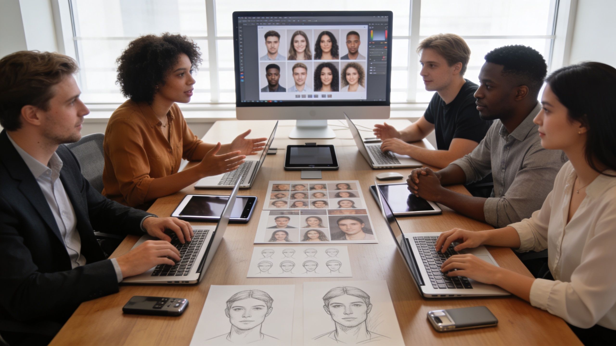
Your firm just finished a remarkable project. The interiors are refined, the detailing is precise, and the presentation deck feels considered down to the last type choice. Then a prospective client clicks your About page and finds a grid of mismatched portraits: one crop from a conference badge photo, one polished studio image from years ago, one phone snapshot against an office wall.
That disconnect matters.
For design firms, team portraits aren’t a side task for HR. They’re part of the brand system. They sit beside project photography, proposal layouts, press features, LinkedIn profiles, speaking engagements, and recruitment pages. When they feel fragmented, they weaken the same story your built work is trying to tell. When they’re consistent, they communicate judgment, rigor, and culture before a visitor reads a single line of copy.
Beyond the Headshot Crafting Your Team's Visual Identity
A strong set of Professional Headshots for Design Teams should feel like an extension of the portfolio, not a separate administrative asset. Architecture and interior firms already understand sequencing, materiality, rhythm, and restraint. The same principles apply to portraits. The frame, light, posture, wardrobe, and background all signal what kind of practice you run.
The business case is clearer than many principals expect. Companies with uniform team headshots see up to 33% more revenue, and LinkedIn profiles with professional photos get 21 times more views, according to Alex Kaplan’s roundup on business impact from professional headshots. That doesn’t mean a photo alone drives growth. It means visual consistency supports trust, and trust affects whether people keep reading, respond to outreach, and shortlist your firm.
Practical rule: If your project photography looks curated but your team photos look accidental, prospects notice the contradiction immediately.
Design buyers are especially sensitive to this. They assess proportion, palette, hierarchy, and atmosphere for a living. A patchwork team page suggests one of two things. Either the firm hasn’t prioritized its own presentation, or nobody has authored a clear visual standard. Neither message helps in a proposal, a pitch, or a recruiting conversation.
A good portrait program does more than make everyone look polished. It creates a visual language for the firm.
- It clarifies brand position. A minimalist residential studio and a bold commercial practice shouldn’t look photographed the same way.
- It strengthens recognition. Repeated use across website bios, media kits, award submissions, and social channels reinforces the brand.
- It supports individual visibility. Principals, associates, and designers all benefit when their portraits feel connected to the larger firm identity.
That’s why I treat team headshots as brand storytelling with an editorial discipline. The same thinking behind a well-composed architectural image applies here: what to include, what to omit, where to place emphasis, and how to create a unified read across a series. Firms that want a clearer sense of the business value behind that investment can look at the ROI of professional photography.
The Creative Brief Defining Your Photographic North Star
The most successful team portrait sessions are usually won before the cameras come out. The firms that get elegant, cohesive results are the ones that arrive with decisions already made about tone, use, and audience.
Start with the firm, not the camera
A creative brief should answer one core question. What should these portraits make someone feel about your practice?
That answer is rarely “professional” alone. Professional is the baseline. The more useful descriptors are things like restrained, warm, cerebral, progressive, hospitality-driven, materially rich, technically exacting, or quietly luxurious. Those words affect every photographic decision that follows.
Write down a short brand statement for the shoot. Keep it plain and direct. For example:
- Residential architecture studio: calm, intelligent, light-filled, human
- Commercial interiors firm: sharp, modern, collaborative, confident
- Heritage preservation practice: thoughtful, grounded, timeless, meticulous
Once those words exist, they become filters. If a backdrop, outfit, or lighting treatment doesn’t fit them, it’s out.
Build a brief your photographer can actually use
A useful brief isn’t a mood board alone. It needs operational detail. I like to see these points resolved before scheduling is finalized:
Audience
Are these images primarily for clients, recruits, press, speaking engagements, or investor-facing materials? A recruiting-heavy use case often wants more warmth. A luxury residential firm may want more restraint.Placement
Website bio tiles, proposal documents, LinkedIn, conference panels, and magazine contributor pages all crop differently. The shot has to survive each context.Visual references
Pull examples for lighting, color palette, crop, expression, and background treatment. They don’t need to be from headshot photographers. Editorial portraits, hospitality campaigns, and architecture magazines often provide better references than standard corporate work.Team structure
Decide who needs an individual portrait, who needs paired or leadership photos, and whether there will be a full group image.Update cadence
Outdated imagery does more damage than firms realize. A report on team headshots and talent acquisition notes that photos around eight years old can reduce perceived competence by an average of 75.93%. That’s why the brief should include a recurring refresh plan, not just a one-time shoot.
A clear brief prevents the session from drifting into “let’s just get a few options” territory. That’s usually when consistency falls apart.
Make the mood board do real work
Most mood boards fail because they collect images the team likes without identifying why they like them. Mark up your references.
Note what you’re responding to:
- Lighting quality: soft side light, open shade, bright and even, sculpted contrast
- Background logic: neutral wall, textured interior, shelving, glazing, or abstracted architectural lines
- Expression level: reserved, approachable, conversational, or more formal
- Color behavior: monochrome neutrals, earthy tones, dark tailoring, warm woods, cool concrete
If your marketing lead and firm principal don’t agree on those reads, the shoot day won’t fix it. Resolve it now, making managing client visual expectations practical, not theoretical.
Location and Light Staging Your Design Narrative
Where you photograph the team changes the meaning of the image. A studio strips things down to expression, posture, and finish. An office or completed project introduces context, material, and atmosphere. Neither choice is automatically better. The right one depends on what the firm needs the pictures to say.
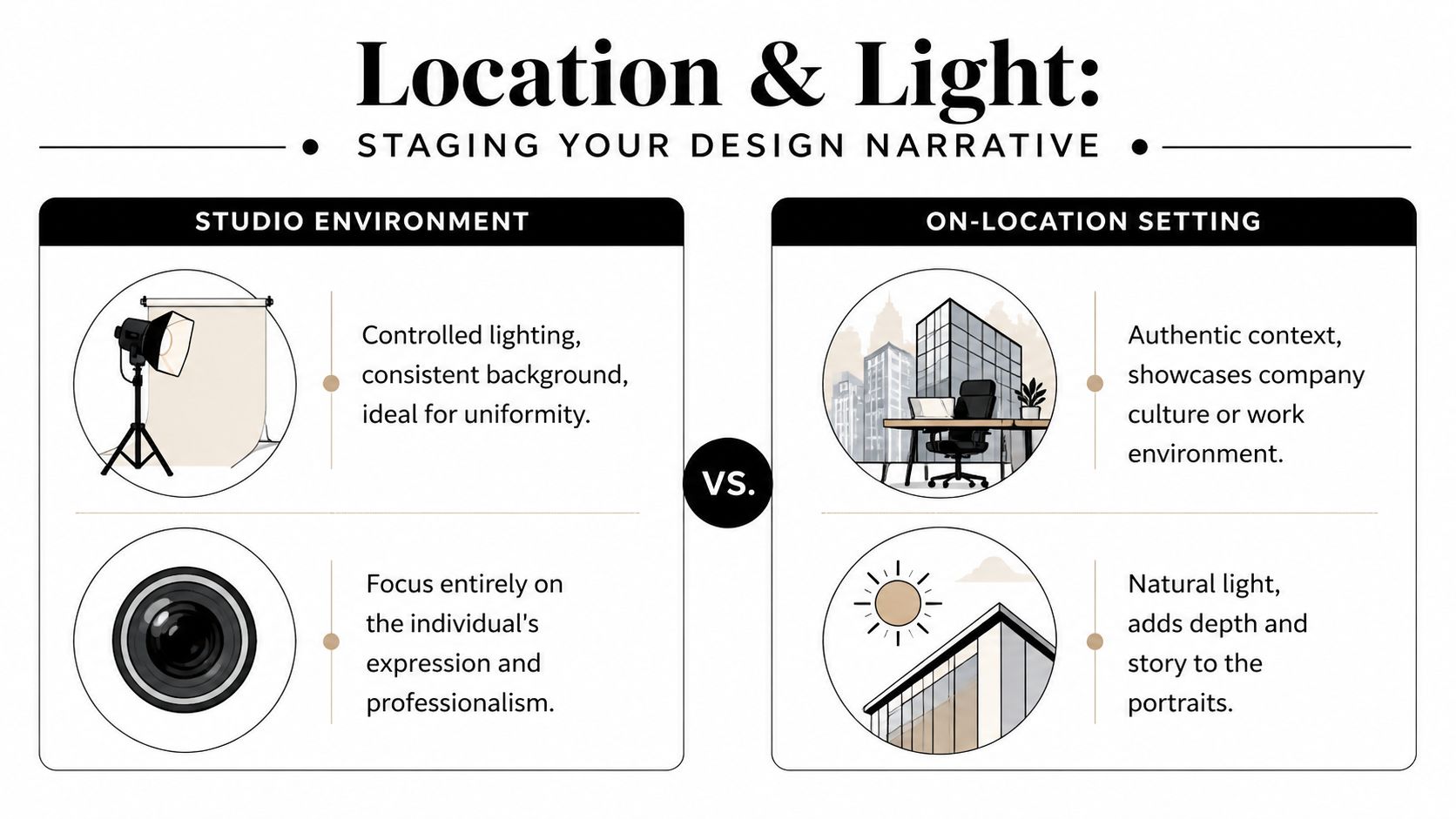
Studio gives you control
A studio is the cleanest route when consistency is the top priority. The lighting stays fixed. The background stays fixed. Everyone is photographed under the same conditions, which makes the team grid feel tight and deliberate.
That’s useful when:
- the firm has a large team and needs identical outputs
- website uniformity matters more than environmental storytelling
- the office doesn’t offer a strong visual setting
- multiple sessions may happen across different dates
Studio portraits also age well because they aren’t tied to an office renovation, furniture trend, or temporary fit-out. They tend to feel less dated if the styling is disciplined.
On-site adds authorship and context
On-location portraits can be far more specific to the practice. They can place a principal in a library of material samples, a designer near a clean wall with strong daylight, or a team within a conference room that reflects the firm’s aesthetic. When the setting is well chosen, the image says something about how the office thinks.
The risk is inconsistency. Mixed color temperatures, cluttered backgrounds, poor window orientation, and shifting daylight can make a team series look improvised fast. A photographer has to control the scene rather than only react to it.
A good on-site portrait doesn’t just prove where you work. It uses the environment the way an editorial portrait uses location, as a narrative device.
Compare the trade-offs directly
| Factor | Studio Photoshoot | On-Site Photoshoot (Your Office/Project) |
|---|---|---|
| Brand message | Emphasizes polish, clarity, and consistency | Emphasizes culture, context, and design sensibility |
| Visual control | Highest control over light and background | More variables to manage in every frame |
| Team uniformity | Easier to maintain across all subjects | Achievable, but requires tighter art direction |
| Logistics | Team travels to a single controlled setup | More convenient if everyone is already on site |
| Longevity | Less tied to a specific space or renovation cycle | Stronger sense of place, but can date faster |
| Best fit | Firms needing a clean, scalable system | Firms wanting portraits that feel embedded in their design world |
Light should match the firm’s character
Design principals understand how light shapes perception in a built environment. Portraiture works the same way. Flat light can make a team look generic. Overly dramatic light can feel theatrical or forced. The sweet spot for most design firms is directional, soft, and intentional.
For a refined architecture or interiors practice, I usually look for one of two directions:
- Bright, open, and airy for firms with a lighter, residential, hospitality, or wellness-driven sensibility
- More sculpted and dimensional for firms with a modernist, editorial, or urban commercial identity
On location, window light can be excellent if it’s stable and the room supports it. In other cases, controlled artificial lighting is the better solution because it creates repeatability across the team. That’s especially important if people rotate through the setup over several hours.
When a firm is deciding between natural and shaped lighting for a specific space, choosing the best light for a site shoot is often the key planning question. The room may be beautiful, but if the light is inconsistent, the portraits won’t carry the same discipline as the architecture.
Achieving Cohesive Wardrobe and Styling for Brand Identity
Wardrobe is where many well-planned shoots start to unravel. Not because people dress badly, but because they dress individually without a shared framework. In a design firm, that usually produces too much contrast in tone, texture, and form. One person shows up in a sharp charcoal jacket, another in a bright floral print, another in a thin knit that photographs flat, and the group suddenly feels unrelated.

Think in palette, not uniform
A firm doesn’t need everyone in matching black blazers. That usually reads stiff and overmanaged. What works better is a restrained palette with room for personality.
For most design teams, I recommend building around three or four neutrals and allowing one or two controlled accent directions. Neutrals might include charcoal, navy, cream, olive, taupe, stone, or soft black. The right mix depends on the firm’s interiors, branding, and intended background.
The point isn’t sameness. It’s harmony.
Use material and silhouette deliberately
Creative teams often respond well when wardrobe guidance is framed through design language rather than dress-code language. Fabric matters. Structure matters. Surface matters.
A few practical styling principles:
- Choose texture with intention. Crisp cotton, structured linen, fine-gauge wool, and matte knits usually photograph better than shiny synthetics or overly thin fabrics.
- Keep shapes clean. Tailoring doesn’t need to be formal, but garments should fit well through the shoulder, collar, and sleeve.
- Limit loud pattern. Small checks, busy florals, and high-contrast stripes pull attention away from the face and fight with group cohesion.
- Watch black carefully. It can look elegant, but if everyone wears a slightly different black under mixed light, the group can separate in odd ways.
- Edit accessories. Strong eyewear can be great. Distracting jewelry, novelty ties, and visible tech lanyards usually aren’t.
Wardrobe note: If the team can stand together and look like they belong in the same proposal without appearing identical, you’re close.
Send a wardrobe guide early
The best time to correct styling isn’t on shoot day. A short wardrobe PDF or email saves time and awkwardness. Include approved colors, examples of good texture, notes on neckline options, and a reminder to bring one backup look.
For leadership teams, it can help to review selections in advance. Not to police individuality, but to prevent visual collisions. Design firms already do this with materials boards and presentation palettes. Clothing for team portraits deserves the same level of review.
Directing the Shot Posing and Group Dynamics
The issue isn't generally a dislike of being photographed. It's a discomfort with feeling unmanaged in front of a camera. That’s a different problem, and it’s solvable with direction.

I’ve seen this happen in firms that care intently about aesthetics. The team arrives on time, the wardrobe is strong, the space looks good, and then everyone defaults into a rigid stance because nobody knows what to do with their hands, shoulders, or expression. The result is technically clean and emotionally lifeless.
That problem is more common than it should be. S72 Business Portraits notes that 78% of design firms update team photos annually, yet 62% report inconsistency as a top issue. In practice, that inconsistency often shows up not just in lighting and styling, but in body language. One person looks open and engaging. The next looks guarded. The third looks like they were interrupted mid-task.
Individual direction should be small and precise
Good posing isn’t theatrical. It’s incremental. A slight shift in weight, a longer neck, a relaxed jaw, or a subtle turn of the shoulders can change the entire read of the portrait.
What works:
- asking someone to lean a touch toward camera rather than away from it
- separating arms slightly from the torso to keep shape in the frame
- adjusting chin position so the face feels engaged, not withdrawn
- coaching expression through conversation instead of saying “smile”
What doesn’t work:
- over-posing hands
- forcing exaggerated asymmetry
- giving the same expression instruction to every person
- rushing through the setup because the team is busy
Some people project authority best with a reserved expression. Others look far more credible when they soften. The photographer has to read the subject, not impose one formula across the office.
Group portraits need rhythm, not a lineup
The classic shoulder-to-shoulder row is efficient, but it rarely says anything about a design practice except that everyone was available at the same time. Better group portraits create spacing, levels, and interaction without slipping into something overly casual.
Here’s a useful reference on the mechanics of directing groups and individuals with confidence:
A stronger team composition usually includes a few things:
A clear center of gravity
The eye should know where to land first. That may be a principal, but it doesn’t always have to be.Variation in stance
If every shoulder is square and every arm is parallel, the frame goes flat.Controlled proximity
Team members should feel connected, but not compressed.Expression calibration
The group doesn’t need identical smiles. It does need emotional coherence.
The best group portraits feel composed, not assembled.
For design firms, I often prefer arrangements that echo studio culture. A standing cluster near a worktable. A leadership trio with different heights and spacing. A wider team portrait that uses architecture in the background without letting it overpower the people. Those choices make the image feel authored and specific to the practice.
The Playbook Logistics Retouching and Delivery
A beautiful concept can still fail on execution. Shoot day works best when it runs like a production, not an open-ended office event. People need call times, wardrobe reminders, location notes, and a clear understanding of what they’re being photographed for. If that communication is vague, the session slows down and the team loses confidence.
Build a schedule people can follow
For most firms, staggered time slots work better than asking everyone to “drop in.” Designers are usually balancing meetings, site calls, deadlines, and client communication. A structured schedule respects that reality.
A practical workflow looks like this:
- Pre-shoot confirmation: send wardrobe guidance, timing, and intended uses
- Arrival buffer: give each person a few minutes to settle, adjust clothing, and review the look
- Selection plan: decide whether proofs are reviewed live, later by marketing, or both
- Asset ownership: identify who manages final files inside the firm
For Atlanta-based teams that want an on-location portrait workflow tied to architectural and brand photography, Jimmy Clemmons Photographer provides location scouting, lighting design, on-set direction, and edited delivery as part of a commercial assignment structure.
Retouching should refine, not rewrite
Professional retouching is part of the craft. The wrong kind of retouching makes people look synthetic. The right kind keeps attention on expression, skin tone, and presence without removing character.
That usually means correcting temporary distractions, balancing color, refining contrast, and cleaning small issues in wardrobe or background. It doesn’t mean changing someone into a different person. Design firms need portraits that feel polished and believable, especially when clients meet those people in person a week later.
AI is useful, but it isn't art direction
AI headshots are getting more acceptable as a convenience tool. PhotoPacksAI reports that 44% of Americans would consider using AI for professional headshots. For a fast profile image, that interest makes sense.
But high-end team portraiture asks for something AI still doesn’t solve well: live direction, expression coaching, wardrobe judgment, environmental control, and consistency across a real group of people. That’s the difference between an image that merely looks polished and one that feels trustworthy in a proposal, press feature, or client introduction.
Final production note: Delivery is part of the service, not an afterthought. If the files arrive disorganized, the shoot isn’t finished.
A strong final handoff includes clearly named files, web-ready crops, higher-resolution versions for print or proposal use, and a storage structure your marketing team can access quickly. If a principal needs a square LinkedIn file, a website bio crop, and a press-ready version, those assets should be easy to find on day one.
If your firm is ready to replace a patchwork of outdated portraits with a cohesive visual system, Jimmy Clemmons Photographer works with design-driven teams in Atlanta to create headshots and brand imagery that align with the same care, clarity, and authorship your projects already communicate.