

A strong portfolio usually starts falling apart before the first frame is made. The problem isn’t talent. It’s sequence. You have a finished project, a limited shoot window, a client who wants everything, and a gallery that risks feeling like a random pile of attractive images instead of a coherent point of view.
A powerful portfolio does more than display your best work. It argues for how you see. It shows technical control, editorial judgment, and your ability to translate a designer’s intent into images that feel inevitable. In a market saturated with polished photography, the portfolios that hold attention are the ones built with discipline, where every frame earns its place.
That approach comes from editorial thinking. Working for demanding publications teaches you quickly that a beautiful image isn’t enough if it doesn’t move the story forward. The same standard applies to architecture, interiors, hospitality, commercial branding, and portraiture. Every shot needs a role. Some establish scale. Some reveal craft. Some humanize the space. Some create tension, release, or memory.
The list below is the framework I return to when building 10 Must-Have Shots for Your Next Portfolio. Treat it less like a formula and more like a visual thesis. Each image type answers a different question a client is already asking, often in their own mind: Can this photographer show the full concept, the fine detail, the lived experience, and the value of the work without losing the plot?
1. The One-Point Perspective Hero Shot
This is the anchor image. If the project has a strong central axis, use it. Hallways, symmetrical lobbies, long gallery walls, formal dining rooms, colonnades, and carefully structured facades all reward one-point perspective because the geometry does the heavy lifting for you.
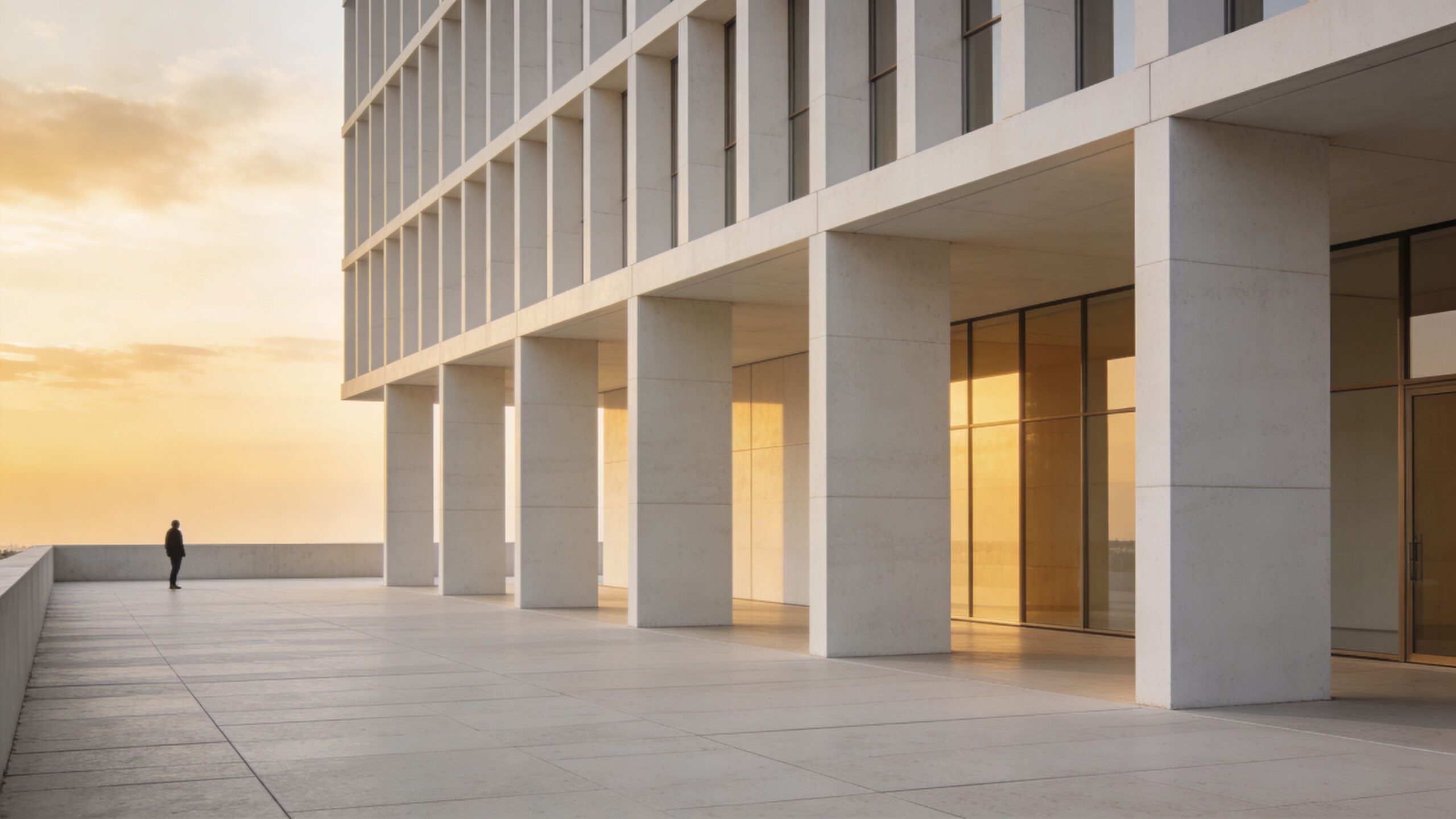
A good hero shot creates order. A great one creates conviction. It tells an architect, developer, or editor that you understand how the space wants to be read, and that you can translate structure into emotion without resorting to gimmicks.
What makes it work
The trade-off is obvious. Centered compositions can feel majestic, but they can also feel dead if the space itself doesn’t have enough rhythm. If the room is cluttered, asymmetrical, or visually weak at the far end, forcing a one-point frame often exposes those flaws instead of elevating them.
I’ll usually refine three things before committing to this shot:
- Vanishing point discipline: Keep verticals clean and decide whether the central axis is exact or intentionally offset by a fraction for tension.
- Foreground restraint: Don’t let a chair leg, plant, or table corner drift into frame unless it strengthens depth.
- End-point clarity: Give the eye somewhere to land, whether that’s a fireplace, sculpture, reception desk, window wall, or artwork.
For a deeper look at how compositional structure shapes the final image, The Science of Architectural Composition breaks down the decisions that separate a dramatic frame from a merely symmetrical one.
Practical rule: If the one-point perspective isn’t the strongest expression of the room within a few setup changes, abandon it. Symmetry isn’t a virtue by itself.
2. The Detail Vignette
The portfolio that only shows wide shots usually feels expensive but impersonal. The detail vignette fixes that. It isolates the decisions that make a project specific: the radius on a millwork edge, the patina of unlacquered brass, the seam where plaster meets oak, the way daylight skims a stone counter.
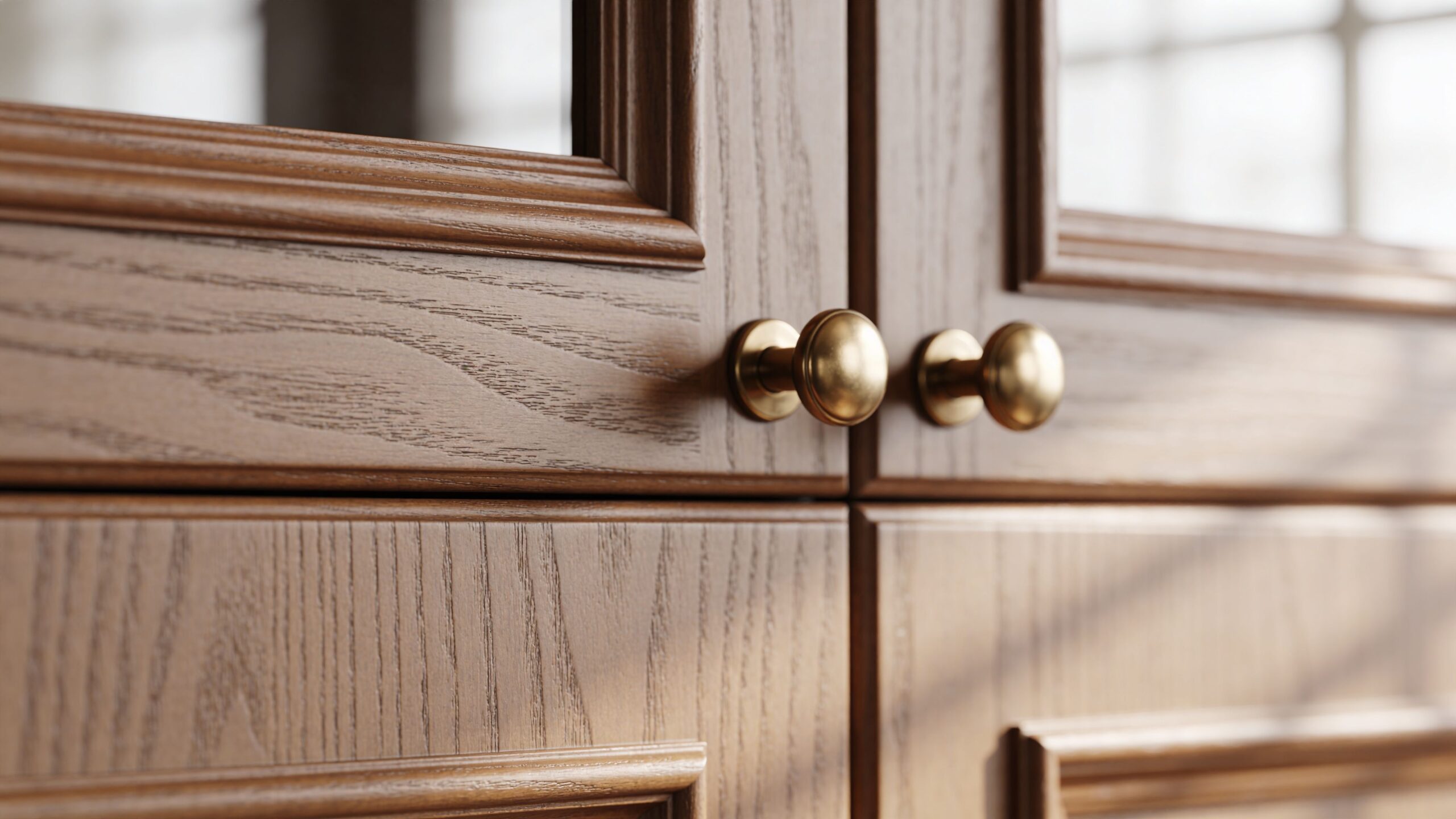
This isn’t just a close-up. It’s a micro-story. It tells the viewer that someone cared enough to choose, fabricate, align, finish, and place each element with intent.
Small frame, high stakes
Detail images fail when they become product catalog scraps detached from the larger narrative. A faucet floating in space, a pillow corner, or random decor on a side table won’t carry weight unless the image says something about the larger design language.
The strongest vignettes usually depend on preparation more than camera settings. Before shooting, I want the site polished at the level of joints, surfaces, and styling. Smudged hardware, crooked lampshades, wrinkled linens, and stray cords don’t look “real.” They look careless. How to Prepare Your Project Site for a Professional Photoshoot is required reading for clients because tiny distractions become enormous when the frame gets tight.
A few pairings work especially well:
- Material contrast: Matte plaster against polished metal.
- Craft evidence: Joinery, stitching, custom fabrication, hand-finished surfaces.
- Light behavior: Shadow lines across ribbed glass, veined stone, fluted wood, textured textiles.
Good detail photography proves the design wasn’t assembled. It was authored.
3. The Environmental Portrait
A finished space can look flawless and still feel anonymous. The environmental portrait fixes that. Put the architect in the lobby they shaped, the chef in the dining room they run, or the designer in the residence they resolved, and the portfolio gains authorship, scale, and point of view.
This frame carries a specific job in the story. The hero shot establishes the project. The detail vignette proves craft. The environmental portrait answers a different question: who is this space for, and who gives it character?
Build the portrait around role, not performance
Subjects rarely need to do much. They need the right placement, clean posture, and a believable relationship to the room. I look for lines that support the person without cutting through them. A doorway can frame authority. A worktable can suggest process. Window light can separate the face from the background while keeping the architecture legible.
The trade-off is simple. Show too much room and the subject shrinks into real estate photography. Crop too tight and the image loses context, which turns it into a standard portrait that could have been made anywhere.
Light decides whether the frame feels intentional or incidental. If the face dies into shadow or the background goes flat, the story breaks. The best results come from planning the exposure around both priorities, which is why I often send clients to guidance on choosing the best light for a site shoot before portrait day.
I usually judge the frame in three layers:
- First layer: face, expression, posture
- Second layer: architectural structure around the subject
- Third layer: cues that locate them in the brand or project story
Those cues should be specific. A chef near the pass tells a different story than a chef standing against a blank wall. A designer beside a custom stair or millwork detail says more than a generic office setup. The portrait works when the viewer reads the person first, then understands why this room belongs to them.
4. The Twilight Exterior
There’s a reason this image keeps showing up in award submissions, hospitality decks, and developer presentations. A twilight exterior compresses mood, architecture, and aspiration into one frame. It can make a project feel calm, luminous, and fully resolved.
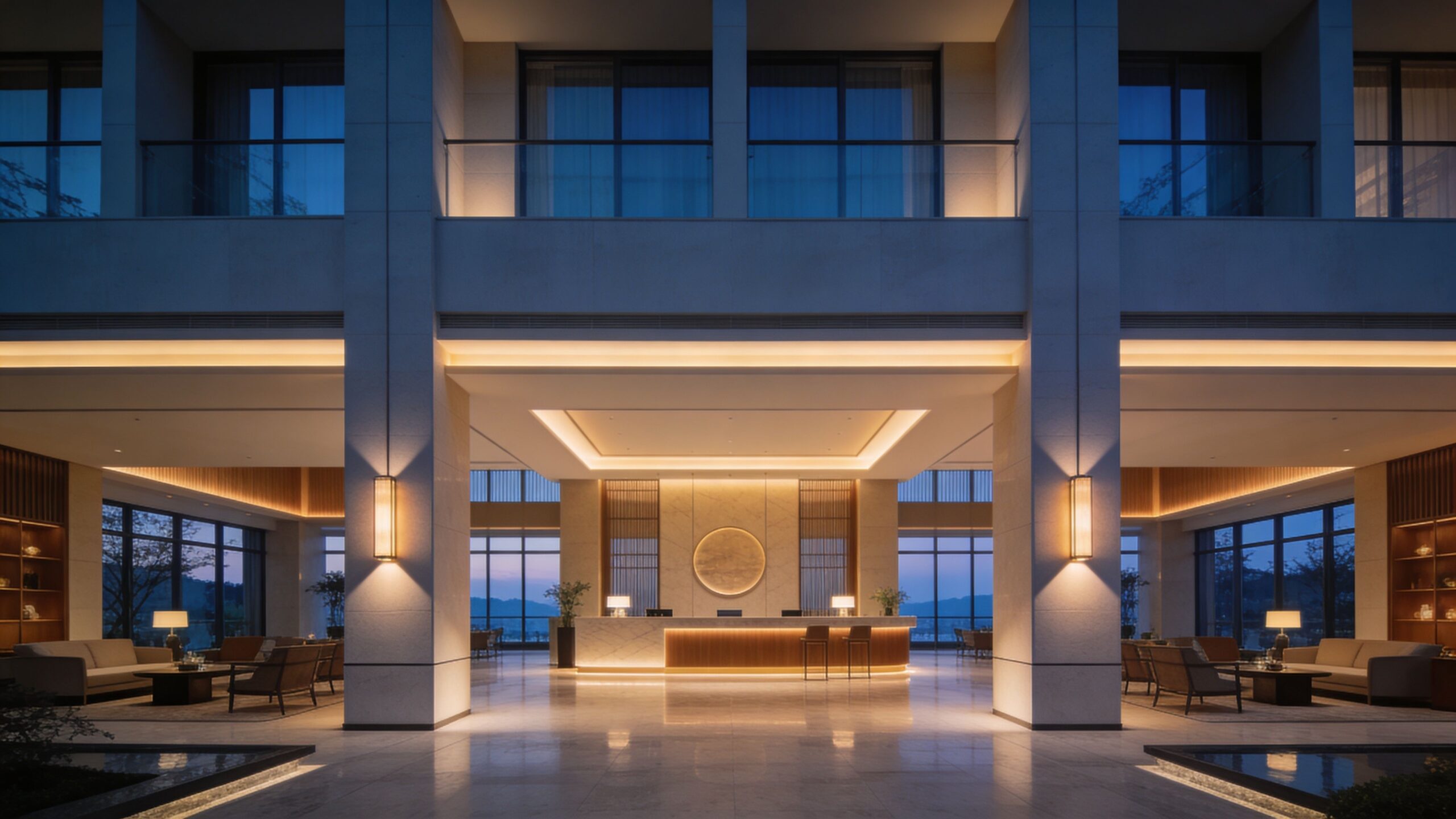
The challenge is timing. Twilight is brief, and the margin for error is narrow. If interior lighting is too bright, windows blow out and the building looks harsh. Too dim, and the structure disappears into the background.
Timing beats heroics
You can’t fix indecision during blue hour. Scout your angle early, know which fixtures need to be on, and confirm that every visible bulb works before the sky turns. The shot is won in prep, not in post.
When clients ask why light planning matters so much, I point them to Choosing the Best Light for a Site Shoot. The right light doesn’t just flatter the project. It reveals hierarchy, texture, and intent.
What works:
- Warm interior glow against cool sky: This gives the frame depth and hospitality.
- Clean exterior lighting: Path lights and uplights should support the architecture, not create hotspots.
- Stable composition: Twilight isn’t the time for experimental framing if the image has to carry a campaign.
What doesn’t work is treating twilight as a rescue mission for a weak exterior. If the composition is unresolved in daylight, dusk won’t save it. It will just hide the problem more elegantly.
5. The In-Use or Lifestyle Shot
Empty spaces can be beautiful, but they often stop short of persuasion. Clients don’t just need proof that a place looks good. They need proof that it works. That’s where the in-use shot earns its keep.
A conference room with a leadership team in conversation, a hotel lounge with a guest reading near a window, a university commons with students circulating through the frame, or a homeowner moving naturally through a kitchen can turn a static environment into a lived proposition.
Direct the activity, don’t fake it
The trap here is over-direction. People laughing at salads, executives pointing at blank laptop screens, perfectly staged “candid” moments with no believable interaction. Viewers spot that immediately.
I prefer giving subjects a simple task with a real endpoint. Pour the coffee. Review the plans. Walk to the stair landing and pause. Adjust the sample board. Look out the window, then turn back into the conversation. The action should fit the brand and the space.
The best lifestyle frame feels observed, even when it was carefully directed.
When this shot works, it helps future clients imagine occupancy. For hospitality groups, that means atmosphere. For corporate brands, it means culture. For designers, it means proving their decisions support behavior, not just aesthetics.
A useful internal check is whether the people improve the architecture. If they block the best lines, flatten circulation, or pull attention away from the room’s purpose, remove them and rebuild the setup.
6. The Abstract Graphic Shot
Every portfolio needs at least one frame that behaves more like a design object than a document. That’s the abstract graphic shot. It isolates line, repetition, shadow, curvature, or color into something almost autonomous.
A stair railing can become a study in rhythm. Curtainwall reflections can become a grid. A ceiling cove can read like sculpture. Sunlight on a brutalist facade can turn concrete into pure tone and pattern.
Where photographers usually miss
The mistake is thinking abstract means random. It doesn’t. The image still needs structure. It just shifts the subject from “room” or “building” to “form.”
Try these approaches:
- Crop aggressively: Remove identifying context if the geometry becomes stronger without it.
- Watch edge tension: Abstract work dies when a line nearly touches the frame edge without intention.
- Simplify color: If one stray accent color disrupts the composition, either reposition or wait for different light.
This shot is especially useful in a portfolio edit because it changes pacing. After a run of descriptive, client-serviceable images, a graphic frame shows taste. It tells art directors and design teams that you don’t just record projects. You recognize visual intelligence when it appears.
Used sparingly, it enhances the entire sequence. Overused, it makes the portfolio feel self-indulgent. One or two strong abstractions are enough to signal range.
7. The Contextual Wide Shot
A building doesn’t exist in isolation, even when the design team wishes it did. The contextual wide shot shows the project in relation to its site, neighborhood, topography, or skyline. Without it, the viewer never fully understands what the architecture is solving.
For a mountain residence, context may mean slope, tree cover, and horizon. For a school campus, it may mean circulation and adjacency. For an urban mixed-use project, it may mean street presence and how the facade participates in the block.
Show the relationship, not just the distance
Going wide isn’t enough. Distance alone doesn’t create context. The frame has to explain something. Why was this material palette chosen here? How does the massing respond to neighboring structures? Where does the entry sit relative to public movement?
I often look for one dominant relationship to clarify:
- Building to its setting
- Building to street
- Interior volume to exterior envelope
- Project scale relative to surrounding fabric
If you can’t identify that relationship before you shoot, the final image usually feels like a drone screenshot or a generic establishing view.
A strong contextual image is especially valuable for developers, schools, hospitality groups, and civic clients because it demonstrates planning intelligence. It shows the project belongs somewhere, not just that it photographs well up close.
8. The Transitional Space Shot
Some of the most elegant images in a portfolio happen in the spaces clients initially overlook. Corridors, thresholds, vestibules, stairs, framed doorways, and interior-to-exterior connections often reveal how well a project flows.
These shots matter because architecture is experienced in sequence. People don’t teleport from the hero room to the next perfect angle. They move through openings, compression points, reveals, and changes in light.
Photograph the journey
The transitional frame should imply motion without becoming blurry or theatrical. A doorway that frames a second room, a stair that leads the eye to a landing, or a glazed wall that pulls exterior light deep into an interior can create a sense of narrative progression.
A few cues help:
- Use framing elements: Doors, arches, mullions, and stair rails can guide the eye naturally.
- Preserve depth: Transitional shots flatten quickly if foreground and background aren’t clearly separated.
- Let one area dominate: Don’t give equal visual weight to both spaces unless symmetry demands it.
This image type is often what separates a true editorial set from a broker-style gallery. It communicates how the project unfolds over time. For interior designers and hospitality teams, that’s often where true sophistication lives.
A project isn’t remembered room by room. It’s remembered as a sequence of transitions.
9. The Unconventional Angle
Every portfolio needs one image that breaks expectation without breaking trust. The unconventional angle does that. Shot from low to the ground, straight up a facade, directly overhead, or from a viewpoint few would instinctively select, it injects energy into the edit.
Here, style shows up most clearly. It’s also where discipline matters most, because bold angles can become empty tricks fast.
Earn the risk
The angle has to reveal something standard coverage can’t. Looking straight up might dramatize structural repetition. A low angle may make a reception desk feel monumental. An overhead shot could clarify a furniture plan or table composition better than any eye-level frame.
Use it when one of these is true:
- Scale improves
- Pattern becomes legible
- Movement feels stronger
- The project’s personality sharpens
Don’t use it just because the portfolio needs “something creative.” That usually reads as insecurity.
I’ve found that unconventional angles work best after the viewer already trusts you. In a sequence, they should arrive after you’ve established that you can cover a project cleanly and professionally. Then the risk feels intentional. It reads as authorship, not rebellion for its own sake.
10. The Before-and-After Diptych
This is the most direct storytelling device in the set, and one of the most persuasive. A before-and-after diptych, shot from the same vantage point, collapses time and makes the project’s value immediately legible.
For renovation architects, contractors, developers, schools, hospitality groups, and real estate repositioning teams, few visuals work harder. You’re not asking the viewer to infer change. You’re showing it plainly.
Precision matters more than drama
The “after” frame may be gorgeous, but the diptych only works if the vantage point matches with near-clinical precision. Lens choice, camera height, and framing need to align. Otherwise the comparison feels sloppy, and the transformation loses credibility.
This is one place where restraint is your friend:
- Keep styling consistent with the story: Don’t over-stage the after image so heavily that it feels like a different reality.
- Maintain honest light: Similar lighting conditions make the comparison cleaner.
- Choose meaningful locations: Entry sequences, kitchens, facades, lobbies, classrooms, and shared spaces usually tell the strongest transformation stories.
The diptych also answers a business question quickly. What changed, and why should anyone care? That’s useful in pitches, proposals, awards submissions, investor decks, and portfolio presentations where attention is short and clarity matters.
10 Must-Have Portfolio Shots Comparison
| Shot | 🔄 Complexity | ⚡ Resources | ⭐📊 Expected Outcomes | Ideal Use Cases | 💡 Key Advantages |
|---|---|---|---|---|---|
| The One-Point Perspective Hero Shot | High, precise alignment & perspective correction | Tripod, 24–50mm or tilt‑shift, bubble level, post‑correction | ⭐⭐⭐⭐, Strong hero image; conveys scale and discipline | Project covers, website banners, gallery openers | Conveys symmetry and authority; anchors a portfolio |
| The Detail Vignette | Low–Medium, styling and micro‑lighting control | 50/85mm or macro, natural light, reflector, RAW capture | ⭐⭐⭐, Highlights materiality and craft | Design firm portfolios, supplier lookbooks, social posts | Validates workmanship; performs well on small screens |
| The Environmental Portrait | Medium, balance subject and context lighting | 85mm or 70–200mm, softbox/off‑camera flash, single subject | ⭐⭐⭐⭐, Humanizes brand; builds trust and authority | About pages, press features, LinkedIn, annual reports | Connects person to project; adds personality and leadership |
| The Twilight Exterior | High, timing, mixed light balancing & long exposures | Sturdy tripod, 16–35mm, remote release, bracketing/HDR | ⭐⭐⭐⭐, Dramatic, magazine‑quality hero images | High‑end real estate, hotels, corporate HQ branding | Communicates luxury and prestige; strong visual impact |
| The "In‑Use" / Lifestyle Shot | Medium, directing action + motion control | 24–70mm, models/occupants, assistant, tethering useful | ⭐⭐⭐, Conveys function, atmosphere, and relatability | Hospitality, corporate marketing, editorial features | Adds energy and human scale; helps viewers envision use |
| The Abstract Graphic Shot | Medium, find patterns and control contrast | 70–200mm, polarizer, selective framing | ⭐⭐⭐, Artistic, design‑forward imagery | Portfolios, fine art prints, social teasers | Reveals geometry and rhythm; breaks up wider shots |
| The Contextual Wide Shot | Medium–High, scouting vantage & legalities (drone) | Drone (Part 107) or long lens from elevation, planning time | ⭐⭐⭐⭐, Shows site relationship and scale | Urban planning, landscape projects, award submissions | Demonstrates integration with surroundings and place |
| The Transitional Space Shot | Medium, frame through openings; balance exposures | 35/50mm, tripod, HDR/composite when needed | ⭐⭐⭐, Communicates flow and spatial narrative | Portfolio sequences, real estate, hospitality tours | Shows circulation and relationships between spaces |
| The Unconventional Angle | Medium, creative risk, access and composition | Ultra‑wide (14–24mm) or drone, experimental time | ⭐⭐⭐⭐, High attention‑grabbing potential | Covers, social media, standout portfolio images | Differentiates work; showcases unique creative vision |
| The Before‑and‑After Diptych | Medium–High, precise repeatability & documentation | Tripod, fixed focal length, detailed notes, staging | ⭐⭐⭐⭐, Clear demonstration of transformation/ROI | Renovation marketing, contractor portfolios, case studies | Powerful proof‑of‑work; highly persuasive marketing asset |
From Shots to Story Building Your Narrative
A client opens your portfolio and decides within a few frames whether you understand the assignment. The decision rarely comes from a single beautiful image. It comes from sequence, judgment, and whether the work answers the underlying brief behind the project.
These ten shots are strongest when they work together as an editorial system. The hero shot establishes authority. The detail vignette proves restraint and material awareness. The environmental portrait introduces authorship. Context, transition, use, and abstraction fill in the rest of the story so the viewer can understand not only what the space looks like, but why it was designed this way and who it serves.
Editing matters as much as shooting. A strong portfolio has pace. It opens with a frame that holds attention, then shifts scale and tempo so the work does not flatten into repetition. I usually build a set the way I build a magazine feature: entry point first, supporting evidence next, then a frame or two that adds surprise before the close. That structure helps a client read the project with confidence instead of working to decode it.
Different clients need different proof. A hospitality group needs atmosphere, guest experience, and a sense of aspiration. An architecture firm needs proportion, circulation, material relationships, and clarity of intent. A corporate client needs culture, leadership presence, and spaces that feel purposeful. The portfolio earns trust when the edit reflects those priorities instead of treating every project the same way.
That is also why shot balance changes from job to job. A private residence often benefits from stronger detail coverage and quieter transitional views. A campus project usually needs more context, movement, and spatial hierarchy. A renovation portfolio gets real value from before-and-after pairings because they show decision-making and transformation in plain terms.
As noted earlier, the same editing principle applies across portfolio-driven fields: a tighter selection usually reads as stronger judgment. A smaller group of precise, well-sequenced images will do more for your reputation than a long gallery full of near-duplicates.
That is the shift from coverage to authorship. Build a set that makes a case. Ask what the client is selling, what the designer intended, what the user experiences, and which frames prove each point with clarity. If every image has a job, the portfolio stops reading like a folder of good shots and starts reading like a story told by someone who knows exactly where to point the camera.
If you need a portfolio that reads with editorial clarity instead of visual noise, Jimmy Clemmons Photographer brings architectural precision, brand awareness, and portrait expertise into one cohesive shoot strategy. From design-forward interiors and exteriors to leadership portraits and commercial lifestyle imagery, the studio creates image sets that help firms present their work with authority.