

You’re usually here for one of two reasons. The building is complete and the marketing team needs exterior photographs that preserve the value of the design. Or the facade package is still being selected, and the question is which exterior systems deserve emphasis because they carry the project’s identity.
That difference changes how the work should be shot and how the examples in this article should be read.
Commercial building exteriors communicate scale, tenant profile, operating intent, and construction quality before anyone enters the lobby. A distribution center should project efficiency and footprint. A healthcare facility needs clarity, order, and trust. A glass-heavy office tower has to balance presence, reflectivity, and context. One visual approach will not serve all three.
From behind the camera, the mistakes are predictable. Glass goes dull because the angle ignores the sky. Metal panels flatten out when light hits them at the wrong time of day. A rainscreen system with careful detailing reads like commodity cladding because the frame never gets close enough to show joints, depth, and finish. A large campus can even feel undersized if the composition lacks a foreground element or street context.
Those problems affect more than aesthetics. They weaken leasing packages, award entries, investor presentations, product marketing, and the story a brand is trying to tell about the property.
This article takes a more useful angle than a gallery roundup. It is a strategic breakdown of seven companies tied to commercial building exteriors, including Jimmy Clemmons Photographer and major envelope manufacturers. Each example is examined for a specific client challenge and the photographic choices that solve it, whether that means showing scale, controlling reflections, separating materials, or making build quality visible. I’m judging each one through the same filter I use on assignment. What does this exterior contribute to the brand story, what does it demand from the camera, and where does it create tangible trade-offs in the field?
1. Jimmy Clemmons Photographer
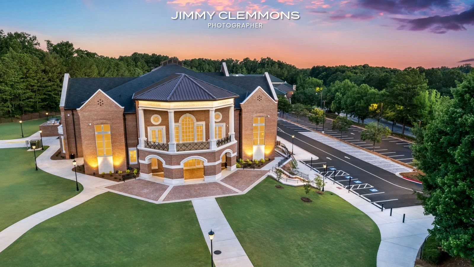
A developer needs images before leasing goes live. The building is strong in person, but the first scout reveals the usual problems. Glass is picking up flat reflections at noon, the entry sequence feels compressed from the curb, and the brick and metal panel transitions disappear unless the camera gets close and the light stays controlled. That is the kind of assignment Jimmy Clemmons handles well, because the work starts with the client problem, not with a generic shot list.
Jimmy Clemmons Photographer belongs in this comparison because the studio approaches commercial exteriors as business assets. The value is not just clean documentation. It is deciding what the exterior has to communicate, then building a shoot plan around that goal. On some projects, the assignment is scale. On others, it is material quality, brand tone, tenant appeal, or a clearer story for investors and award juries. The commercial architectural photographer services page reflects that broader role.
The film background matters here. Production experience trains photographers to solve fast-changing conditions without losing the frame. In exterior work, that usually shows up in better timing, firmer control of perspective, and more deliberate choices about when to supplement ambient light and when to let the building read naturally. Those decisions affect whether curtain wall looks crisp or muddy, whether masonry keeps depth, and whether a facade feels substantial instead of flat.
This section is not about portfolio beauty. It is about method.
Jimmy’s strongest work uses editorial judgment to explain why a building looks the way it does. A wide frame can establish street presence and show how the property holds its corner. A tighter composition can isolate panel joints, brick coursing, or glazing transitions that matter to architects, manufacturers, and owners who need proof of build quality. That range is useful because exterior sets often have to serve several audiences at once, and each audience looks for something different.
A practical rule applies on every exterior assignment: start with business intent, then choose the camera position. Leasing teams need approach, access, and identity. Architects need hierarchy, massing, and detail. Brand teams need a consistent visual tone across web, social, print, and PR use. If those needs are not sorted before the shoot, the final set can look polished and still miss the mark.
Publication experience adds another layer of confidence. Work for outlets such as Sports Illustrated, Football Weekly, Condé Nast, and Atlanta magazine suggests a team that understands visual standards, deadlines, and how to produce a set that feels coherent across multiple uses. For clients, that often reduces friction during review because the images arrive with a stronger sense of selection and finish.
Best fit and trade-offs
Jimmy Clemmons Photographer is a strong choice for projects where exterior architecture carries brand weight. That includes office development, hospitality, education, and design-forward commercial properties that need more than a record of the facade.
What works well:
- Strategic framing: Compositions are built around the client’s use case, whether that is leasing, editorial coverage, investor presentation, or awards.
- Production discipline: Scouting, scheduling, lighting control, and post-production are handled as part of one visual system.
- Material storytelling: The work can move from broad hero views to detail shots that show finish quality, depth, and craft.
- Cross-channel consistency: Exteriors, interiors, portraits, and branded imagery can share the same visual logic.
Trade-offs to consider:
- Regional concentration: Atlanta and the surrounding market are the natural base, so travel assignments need earlier planning.
- Quote-based pricing: Teams with tight budgets need scope defined early because there is no public rate sheet.
- Higher production standard: This approach fits clients who need images to perform across several business functions, not teams looking for the lowest-cost documentation package.
2. Kawneer
A project team finishes a polished office facade with aluminum framing, large glazed openings, and a tight corporate palette. On site, the building reads organized and precise. In photographs, that same restraint can either communicate confidence or fall flat if the framing rhythm, reflections, and scale are not handled with intention. That is the true test with Kawneer.
Kawneer is usually selected for practical reasons first. The product range covers curtain wall, storefront, entrances, and window wall, which helps architects and contractors keep the exterior language consistent across different conditions without forcing awkward substitutions late in the job. That matters in the field, and it matters in the final images, because consistency in profile, sightlines, and finish gives the facade a cleaner story.
From a photographer’s standpoint, Kawneer projects are less about spectacle and more about control. The challenge is to show why a restrained facade works. I look for long, clean verticals, repeatable mullion spacing, and vantage points that let the framing establish order across the elevation. If the client needs leasing or investor-facing images, wider compositions usually do the heavy lifting. If the goal is to support product marketing or design review, tighter frames on corner conditions, entrance transitions, and mullion depth do more to explain material quality.
That strategic shift matters on office building exterior photography projects where the building has to signal reliability, performance, and brand discipline all at once.
Where it performs best
Kawneer fits offices, healthcare, higher education, and civic buildings where tested assemblies and broad installer familiarity carry real weight. Those are projects where delays, substitutions, or detailing surprises can cost more than a bolder facade system is worth.
There is a trade-off. The visual language can read conservative unless the design team builds in contrast through glass selection, cap profiles, adjacent materials, lighting, or canopy design. For photography, that means the shot list cannot rely on one hero angle. The work benefits from a sequence. One frame for overall massing, one for pedestrian approach, one for entry experience, and one or two details that prove the facade has substance beyond a clean grid.
Clean curtain wall photography depends on timing, reflection control, and accurate vertical lines more than dramatic weather.
For teams planning exterior imagery around these systems, commercial architectural photography considerations for facade-driven projects are worth thinking through early.
The trade-offs
- What works: Broad product families, strong technical credibility, and installer familiarity.
- What doesn’t: The aesthetic range can feel restrained without project-specific customization.
- Where it photographs well: Institutional facades, atriums, canopies, and elevations where order, proportion, and finish quality are the message.
The company site is Kawneer.
3. Oldcastle BuildingEnvelope OBE
A project team is pushing toward a glass-forward exterior, and the risk is clear before fabrication starts. If the glazing, framing, and accessory package come from too many directions, small coordination misses show up at full scale. OBE is compelling in that situation because it lets teams keep more of the facade package under one roof.
That matters in photographs. This is not a portfolio-gallery question. It is a coordination question that shows up visually. On camera, inconsistent glass makeups, uneven reflectance, muddy edge conditions, or mismatched hardware read as indecision. A more unified facade package gives the photographer a cleaner building to interpret and gives the client a stronger brand story in the final images.
OBE’s range is the practical advantage. Insulated glass, laminated glass, specialty glazing, storefront, curtain wall framing, and CRL accessories give architects and contractors more control over how the exterior is assembled and how it ultimately reads. The trade-off is familiar. More options can improve the result, but they also demand discipline during specification and submittals. If the team keeps changing coatings, interlayers, or sightlines late, the system breadth stops helping.
From behind the camera, OBE projects usually need two different kinds of coverage. One set establishes scale and facade order from a distance. The other proves craftsmanship up close, especially at corners, entry conditions, sealant lines, transitions, and moments where transparency shifts to reflection. That second set is where material quality becomes believable.
Glass can make a building look expensive or unresolved.
For office work in particular, office building exterior photography examples and planning ideas are useful early, before anyone assumes one sunset hero shot will explain the whole project.
Practical fit
- Best for: Teams that want glazing and framing decisions coordinated more tightly across the exterior package.
- Strong advantage: Better visual consistency when multiple facade components need to read as one system.
- Common challenge: Specialty coatings, performance demands, and custom detailing can put pressure on budget and lead times.
With glass-heavy exteriors, pre-shoot sun study is a technical step, not a styling choice. The hour you choose determines whether the facade reads as transparent, reflective, or flat.
The company site is Oldcastle BuildingEnvelope.
4. CENTRIA
A developer wants the building dried in fast, but the architect still needs the exterior to look intentional at 200 feet and convincing at 20. CENTRIA is often the system that gets shortlisted for that assignment. Its insulated metal panels, rainscreen options, and MetalWrap backup panels give teams a way to build a clean commercial exterior without giving up enclosure discipline behind the finish.
From a photography standpoint, this is not portfolio wallpaper. CENTRIA projects are useful case studies because the camera can test whether the facade logic holds up. I look for three things first. Panel alignment, joint consistency, and how the shadow lines behave once the sun gets low. If those are right, the building reads precise. If they are loose, the images expose it immediately.
Metal facades reward discipline.
They also punish careless technique. Side light can make profile depth look excellent, but it can also exaggerate oil-canning, waviness, and small installation irregularities that barely register in person. The fix is not to hide the material. The fix is to choose angle, focal length, and time of day so the photos describe the assembly accurately, without turning one surface condition into the whole story.
CENTRIA is especially strong on projects where the client wants the exterior to communicate speed, durability, and technical competence. That tends to show up in logistics, manufacturing, schools, sports facilities, and commercial buildings that need a sharper metal expression than standard utility construction. In those shoots, wide frames establish the panel rhythm across the full facade. Then the close details do the selling work by proving finish quality, corner execution, fastener control, and transition points around openings.
The business trade-off is straightforward. These systems can help teams move quickly and maintain a high-performance envelope, but broad flat areas still need design restraint. If the facade lacks profile variation, color contrast, or clear scale breaks, the building can photograph as oversized and generic even when the enclosure package is technically sound.
Practical fit
- Best fit: Projects that need fast dry-in, disciplined metal detailing, and a facade that reads clean from long range.
- Visual strength: Panel rhythm, crisp reveals, and shadows that give the exterior structure.
- Common challenge: Large uninterrupted elevations need enough relief and hierarchy to avoid a blank industrial look.
The company site is CENTRIA.
5. Kingspan Insulated Panels North America
A Kingspan project usually starts with a clear client problem. The building needs to go up fast, hit demanding thermal targets, and still present a finished exterior that feels deliberate rather than purely utilitarian. That combination changes how I shoot it.
Kingspan’s insulated metal panel systems, including KarrierPanel, KingRib, and QuadCore-based assemblies, tend to collapse several enclosure priorities into one package. For the photographer, that means the facade is doing more than one job at once. It is carrying brand perception, construction discipline, and part of the building performance story in the same frame.
That matters because panelized exteriors are unforgiving on camera. If the design team has coordinated module size, joint layout, corners, and openings with intent, the building reads clean and confident. If those decisions were treated as secondary, the photos expose it fast. Misaligned joints, awkward terminations, and inconsistent spacing pull attention away from the architecture and toward the install.
Where the photography has to work harder
Kingspan is often strongest on industrial, logistics, cold storage, data-adjacent, and other schedule-sensitive commercial projects where speed and envelope performance carry real business weight. The challenge is that the same efficiency that makes the system attractive can also make the exterior feel repetitive if the architect does not create hierarchy.
My approach is to use perspective with restraint. A straight-on elevation can turn the facade into pure striping. A slight angle usually gives the joints depth, lets the profiles separate, and shows how the panel system handles corners, parapets, docks, or recessed entries. On projects where sustainability or energy performance is part of the client message, I frame the hero shots so the building looks efficient and credible, then support that story with tighter images of transitions and enclosure detailing. That is the same logic I use in photographing LEED-certified buildings for marketing and brand storytelling.
Practical fit
- Strong fit: Industrial, logistics, cold storage, controlled environments, and commercial projects where construction speed and thermal performance are part of the brief.
- Photographic advantage: Repetition, profile depth, and long sightlines can create strong compositions that communicate scale and order.
- Common limitation: If the facade lacks variation in massing, color, or entry emphasis, the finished building can photograph as efficient but generic.
The company site is Kingspan Insulated Panels North America.
6. Nichiha USA
Nichiha sits in a useful middle ground. The panels offer more texture and finish variety than many people expect from a rainscreen product, and that makes them valuable on commercial building exteriors that need warmth, pattern, or material character without moving into the cost and weight profile of stone or more complex metal solutions.
Healthcare, education, multifamily, and retail are where I see this approach make the most visual sense. Those sectors often need a facade that feels approachable, durable, and well detailed rather than aggressively high-tech.
Why it photographs well
Fiber-cement panels can carry texture in a very honest way. Stone looks, masonry references, wood-grain effects, and minimalist flat finishes all respond differently to light, so the photographer gains a distinct creative advantage. Early morning or late afternoon side light usually helps these panels far more than broad overhead daylight.
Nichiha’s drained and back-ventilated rainscreen approach also gives architects a technically credible story to pair with the look. If a project is pursuing sustainability messaging, that narrative becomes stronger when the exterior photography shows both the facade field and the detail logic. A good reference point is the performance focus seen in LEED-certified building photography strategy, where the image set needs to support more than aesthetics.
The caveats
- What works: Design versatility, non-combustible panels, and a cost position that can be attractive relative to some premium facade materials.
- What needs discipline: Installer execution. Gapping, flashing, and ventilation details have to be right.
- What it won’t mimic: It won’t give you the metallic depth or deep-gloss finish of ACM.
Material-rich facades need closer frames than most clients initially request. Wide shots sell scale. Detail shots sell quality.
The company site is Nichiha USA.
7. ALUCOBOND USA
ALUCOBOND is the high-control option for teams that want very flat surfaces, formed geometry, crisp edges, and an intentionally premium exterior language. On camera, that flatness matters. It gives the facade a cleaner read and helps color hold more consistently across broad expanses.
This is one of the systems that can make a building feel expensive even before you know what the tenant mix or fit-out looks like. That’s useful for headquarters projects, flagship retail, institutional work with a civic identity, and commercial properties where the facade itself is part of the brand.
Where it excels visually
ACM panels are strongest when the design depends on precision. Tight radii, sharp returns, and carefully controlled joints all photograph well because they create obvious evidence of craftsmanship. You don’t need to force drama. The facade often provides it.
There’s also a code and assembly side that teams can’t ignore. ALUCOBOND’s documented tested assemblies matter because panel choice alone doesn’t determine acceptability. The full wall assembly does. That’s not just a specification issue. It affects photography too, because the visible facade can look unbroken while the actual story sits in how the system is detailed and supported.
Adaptive facade trends are also pushing teams to think beyond static appearance. One emerging discussion is the difficulty of integrating sun-responsive systems with smart-building requirements, including claims around energy savings and installation complexity described in the adaptive facade overview from Access Doors & Panels. I’d treat those claims cautiously in decision-making, but the broader point is valid: advanced facades now carry operational expectations as well as aesthetic ones.
Best use and caution
- Best for: Premium exteriors that need flatness, formability, and color control.
- Main advantage: Strong visual finish with broad design flexibility.
- Main caution: Assembly selection and code compliance need close attention, and poor detailing can still create a panelized look that feels less refined than intended.
The company site is ALUCOBOND USA.
7-Company Commercial Exterior Comparison
| Service / Product | Implementation Complexity 🔄 | Resource & Lead Time ⚡ | Expected Outcomes ⭐ / Impact 📊 | Ideal Use Cases 📊 | Key Advantages & Tips 💡 |
|---|---|---|---|---|---|
| Jimmy Clemmons Photographer | High, full production coordination, art direction | Moderate, studio crew, location access; regional availability | ⭐⭐⭐⭐, publication-ready, editorial-quality imagery | Brand campaigns, architectural portfolios, executive portraits | Use for narrative-driven, magazine-standard visuals; request quote for scope and travel |
| Kawneer | Low–Medium, standard curtain wall/shop coordination | Moderate, fabricator-dependent lead times, broad installer base | ⭐⭐, reliable, code-aligned facade systems | Offices, healthcare, education, civic buildings | Broad spec coverage simplifies approvals; expect conventional profiles unless customized |
| Oldcastle BuildingEnvelope (OBE) | Low–Medium, single-source glazing coordination | Moderate, glass lead times vary by type/coating | ⭐⭐⭐, extensive glazing options with strong documentation | Projects seeking integrated glass/framing solutions | Leverage SystemSelect tools and literature; monitor regional fulfillment impacts |
| CENTRIA | Medium, panelized systems require precise detailing | ⚡ Fast enclosure, fewer trades, nationwide support | ⭐⭐⭐, crisp metal aesthetics and robust envelope performance | Fast-track commercial buildings, metal-clad facades | Speeds dry-in; watch oil-canning risks and extended finish lead times |
| Kingspan Insulated Panels | Medium, panel coordination and thermal continuity | ⚡ Fast enclosure, North American manufacturing footprint | ⭐⭐⭐⭐, superior thermal performance and airtightness | Aggressive schedules, energy targets, cold storage | Early coordination to avoid industrial appearance; custom finishes may add time/cost |
| Nichiha USA | Medium, rainscreen detailing and strict installer practices | Moderate, installation skill critical, mid-range cost | ⭐⭐⭐, versatile aesthetics, non-combustible performance | Healthcare, education, multifamily, retail | Follow strict gapping/flashing/venting protocols to ensure long-term performance |
| ALUCOBOND USA | Medium–High, assembly selection for fire compliance and formwork | Moderate, fabrication precision and NFPA 285-validated assemblies | ⭐⭐⭐⭐, best-in-class flatness, formability, color consistency | High-end exteriors requiring formed features and strict code compliance | Confirm NFPA 285 assemblies early; control detailing to minimize oil-canning |
Final Thoughts
A developer is about to send a project deck to an investor. An architect needs images for an awards submission. A manufacturer wants proof that its material reads the way the spec promised on a finished building. In each case, the exterior image is doing a job, not filling space.
That is the right way to judge commercial building exteriors. Start with the business objective, then choose the facade system and the photographic approach that make that objective visible. The strongest projects in this roundup work because the material choice and the image strategy support the same message.
Kawneer and OBE fit projects where glazing, framing, and coordination carry the story. CENTRIA and Kingspan suit teams chasing speed, enclosure efficiency, and a disciplined panel rhythm. Nichiha brings texture and warmth when the brand needs to feel accessible without losing technical credibility. ALUCOBOND works best where flatness, formed detail, and finish consistency have to hold up under close scrutiny.
Photography determines whether those decisions read clearly. Light angle, lens choice, camera height, and timing all change how scale, reflectivity, joint lines, and surface quality come across. I have seen a well-resolved facade look ordinary with flat midday coverage, and I have seen the same building gain authority once the framing, shadows, and material contrast were handled with intent.
That is the key takeaway. This is a strategic breakdown, not a gallery.
Each example points to the same standard. Good exterior photography solves a client problem. It can make a headquarters feel established, show a school as durable and welcoming, or help a product team prove that a finish performs on a real building, not just in a sample binder. The image set should match the use case, whether that means hero shots for marketing, detail frames for sales, or a broader edit for PR and recruiting.
If I were advising a client at the start of a project, I would ask three questions. What should the building communicate at first glance? Which exterior decisions support that message? Where will the images be used once the shoot is complete? Those answers usually clarify both the facade priorities and the shot list.
Jimmy Clemmons Photographer is relevant here for that reason. The studio’s role is to translate design intent into images that support marketing, sales, awards, and brand positioning. The difference shows up in how the work handles scale, material character, and the relationship between the building and the client’s story.
If your project needs exterior photography built around those goals, reach out to Jimmy Clemmons Photographer. The studio approaches commercial building exteriors as business assets, with editorial discipline, production support, and framing choices tied to how the images will be used after the shoot.