

The renovation is finished. Cabinets are installed, the punch list is nearly closed, and everyone on the team wants the same thing next. They want the project seen.
That’s the point where many strong renovations lose momentum. The work gets documented, but it doesn’t get shaped into a story. A phone gallery, a quick walkthrough, and a handful of wide shots might be enough for record keeping. They’re rarely enough for publication.
Turning Renovations into Magazine Features requires a different mindset. The camera isn’t just recording what was built. It’s selecting what matters, establishing hierarchy, and showing an editor why this project deserves pages instead of a passing scroll.
From Punch List to Publish A Magazine Editor's Mindset
A finished space is not yet a feature. It’s raw material.
Editors don’t respond to square footage, permit headaches, or how many weekends a contractor spent solving trim details. They respond to a clear visual argument. What is this renovation really about? Why does it deserve attention now? Which image tells that story in one glance?
The market pressure behind that question is real. The 2023 U.S. Houzz & Home Study reported a 22% year-over-year median increase in renovation spending, with 87% of homeowners hiring professionals according to the AIA summary of the study. More firms are doing polished work. More teams are competing for the same editorial attention. Better design alone doesn’t separate a project anymore. Better presentation does.
Think like an editor, not an archivist
Documentation asks, “What’s here?”
Editorial photography asks, “What should a reader notice first, second, and last?”
That shift changes everything:
- A record shot shows the room.
- A feature image gives the room a point of view.
- A gallery lists spaces.
- An editorial sequence creates movement, contrast, and payoff.
A magazine spread needs rhythm. It needs an opening image that stops the page turn, supporting frames that explain the design decisions, and detail shots that reward a closer look. The renovation has to read as a complete package.
Practical rule: If every frame carries equal importance, none of them feels important.
The three questions that shape a publishable story
Before a camera comes out, the team should be able to answer three things clearly.
What is the central idea?
Maybe it’s daylight reclaimed in a dark bungalow. Maybe it’s a disciplined material palette. Maybe it’s a careful contrast between old structure and new intervention.What does the reader feel?
Calm, surprise, warmth, precision, intimacy. Editorial stories land better when the visual tone is intentional.What makes this project specific?
Not “beautiful kitchen.” Not “modern bathroom.” Specificity wins. Rift white oak millwork, shadow-gap detailing, a rebuilt threshold that ties the interior to the courtyard.
What doesn’t work
Magazine-minded photography isn’t the same as listing photography, and teams get in trouble when they confuse the two.
Common misses include:
- Too many safe wide shots that flatten the project
- No visual hierarchy between hero images and secondary images
- Overstyled rooms that feel borrowed instead of lived in
- Zero narrative context about what changed and why it matters
A renovation becomes publishable when the team treats completion as the beginning of editorial packaging, not the end of the job.
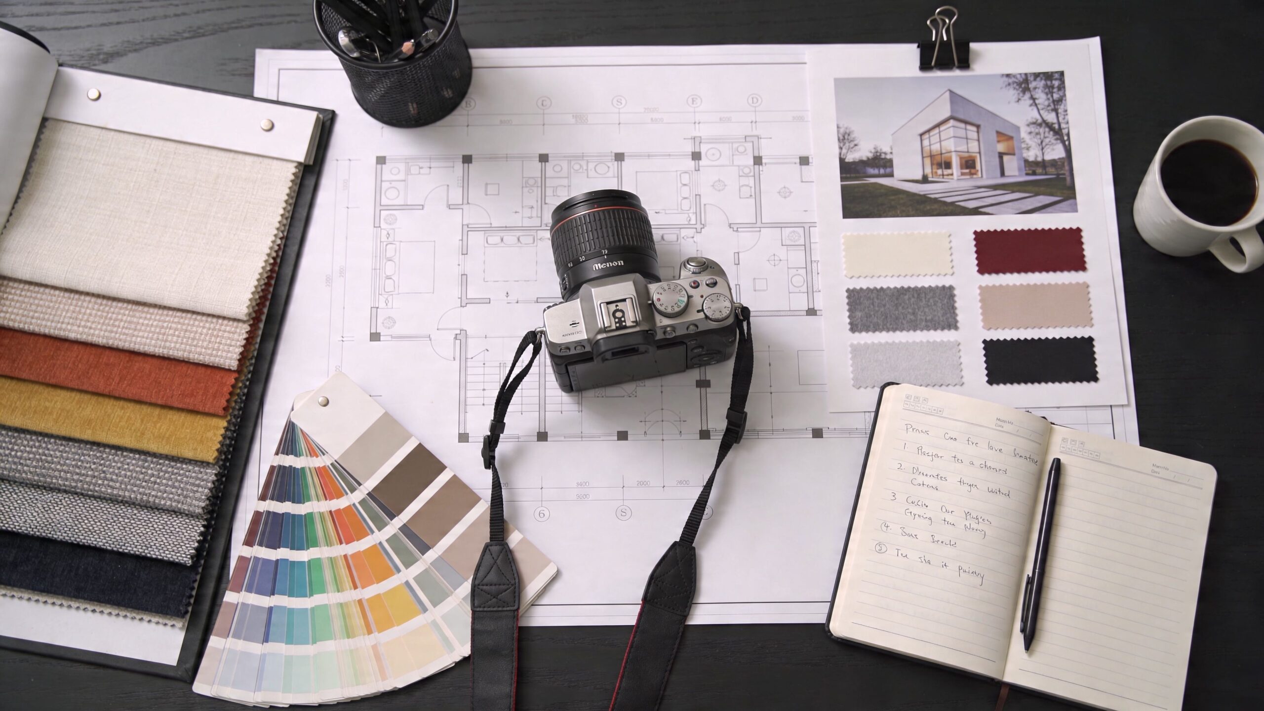
Develop Your Pre-Shoot Editorial Strategy
A strong shoot usually looks easy from the outside. It isn’t. The work starts in conversation, not on a tripod.
I’ve seen the difference in the first planning call. One client says, “We need photos of the house.” Another says, “The entire project was about opening a narrow footprint to the garden, and the stair became the hinge.” The second project already has a story spine.
Start with a narrative audit
The best pre-shoot meetings feel part design review, part editorial planning. I want drawings, finish schedules, and the plainspoken version of what almost went wrong.
Ask questions like these:
What was the problem before renovation?
Tight circulation, poor light, no connection between rooms, outdated envelope, awkward additions.Where did the design team make the hardest decisions?
Those moments often produce the most interesting images.Which details are easy to miss in person?
Joinery, thresholds, custom lighting, unusual stone transitions, concealed storage.What’s the one image the architect or designer already has in mind?
That usually reveals the intended hero shot, even if we end up refining it.
This process is less about making a checklist and more about identifying the project’s editorial angle. A renovation can support several stories, but a submission package should lead with one.
Scout for story, not just sun
Location scouting isn’t only about where the light falls at 9:00 a.m. It’s about understanding how the story unfolds physically.
I look for:
The approach
What does the first exterior frame say about the project before anyone steps inside?The reveal
Is there a threshold, corridor, stair, or framed opening that creates a sense of arrival?The anchor spaces
Which rooms carry the renovation’s strongest ideas?The supporting moments
Smaller corners often hold the emotional texture of the story.
Projects with strong resale logic often deserve extra attention on the exterior. The Cost vs. Value Report summary notes that garage door replacement can yield up to 336.6% ROI and manufactured stone veneer 200.7% ROI. If those are part of the renovation, they aren’t throwaway shots. They’re editorially and commercially important images.
Exterior upgrades with strong return deserve the same compositional care as a signature kitchen or stair.
Build the shot list in layers
A useful shot list doesn’t read like a property inventory. It reads like a pacing document.
Hero frames
These are the images that could carry a pitch email, lead a spread, or anchor a portfolio page. There usually aren’t many.
A hero frame needs:
- a clear subject
- clean edges
- intentional depth
- a reason for the eye to stay in the frame
Transitional images
These connect one space to another. They help editors understand flow, proportion, and sequence.
Think of:
- hallways that frame destination spaces
- doorways that reveal contrast in material or light
- stair views that explain circulation
Vignettes and details
These aren’t filler. They prove craftsmanship.
Good editorial details often include:
- hardware interacting with light
- countertop edges and backsplash transitions
- custom millwork corners
- fabric, stone, timber, and plaster in relation to each other
People and lifestyle cues
Even when a project is shot without talent, editorial imagery benefits from signs of life. A chair slightly pulled away from the table. A book left open. Curtains with a hint of movement. These choices should be subtle, not theatrical.
For site readiness, this preparation guide on how to prepare your project site for a professional photoshoot is useful because it handles the practical cleanup that supports the narrative work.
What pre-production gets wrong
Teams waste time when they enter shoot day without deciding what matters.
That usually shows up as:
- chasing every room equally
- discovering styling needs too late
- arriving at the wrong time for key elevations
- treating details as optional
Editorial strategy saves time because it removes indecision. By the time the first exposure is made, the project should already have a storyline.
Styling the Scene for Authentic Storytelling
A space can be beautifully designed and still photograph flat. Most of the time, the problem isn’t the architecture. It’s the styling.
Editorial styling is different from real estate staging. Real estate staging removes friction and broadens appeal. Editorial styling adds character and focus. One aims for neutrality. The other aims for a believable point of view.

Style for presence, not volume
The first mistake is adding too much. More objects don’t make a room feel richer. They make the frame harder to read.
Use props that do one of three jobs:
- Add scale through seating, books, vessels, or a single branch arrangement
- Support palette with textiles or objects that echo the materials already in the room
- Suggest use with restrained signs of life, such as a tray, folded throw, or cup placed where a person might leave it
A styling pass should make the architecture easier to see, not harder.
Do this, not that
| Approach | What works | What falls flat |
|---|---|---|
| Living room | One or two tonal textiles, edited surfaces, visible negative space | Pillows everywhere, overfilled shelves, large decor clusters |
| Kitchen | A few ingredients, a board, restrained countertop styling | Full fruit displays, too many appliances, staged meal scenes |
| Bedroom | Smooth bedding with light variation and one lived-in cue | Hotel-tight symmetry with no softness |
| Bath | Folded towels, one vessel, clean reflections | Product overload and cluttered vanity tops |
Let the room keep some silence
Designers sometimes worry that a minimally styled frame will feel empty. Usually the opposite is true. Empty space gives strong architecture room to speak.
If a room has expressive millwork, stone, or daylight, pull props back. If the architecture is spare and tonal, a carefully chosen object can keep the frame from feeling cold.
Some of the best styling decisions happen when you remove the last two things you added.
A short visual reference helps clients understand the difference between staged and editorial presentation:
Use inconsistency on purpose
Perfect symmetry can make a room feel dead on camera. Editorial images often benefit from slight asymmetry.
That might mean:
- one dining chair turned a few degrees
- a curtain edge relaxed rather than pulled flat
- a book stack offset instead of centered
- a stool placed where it creates depth in the foreground
These details need restraint. If the viewer notices the styling before the design, the styling is too loud.
Know when not to style
Some spaces need almost nothing.
I’d keep styling very light in:
- highly detailed stair halls
- rooms with exceptional natural light
- spaces where texture is the story
- compact areas where every added object competes with the composition
The goal isn’t to make the room look occupied. It’s to make it feel believable. That’s a different standard, and it’s the one editors respond to.
On-Set Execution Mastering Light and Composition
Shoot day is where planning gets tested. A sharp concept won’t save weak execution, and good execution starts with coverage.
Editorial coverage needs range. You need the broad frame that explains the architecture, the middle-distance image that shows how people move through it, and the close shot that proves the design team cared about the details.
Build coverage like a story editor
I structure most renovation shoots in layers. The camera moves from orientation to intimacy.
Here’s a simple working model.
| Shot Type | Subject & Angle | Purpose |
|---|---|---|
| Establishing wide | Exterior front three-quarter view or primary room from strongest corner | Introduces the renovation and sets tone |
| Spatial mid-shot | Kitchen to dining, stair to landing, bath to vanity zone | Explains flow and adjacency |
| Framed transition | Through doorway, hall, or millwork opening | Creates movement and narrative sequence |
| Detail vignette | Hardware, material junction, custom built-in, lighting | Shows craftsmanship and specificity |
| Closing image | Quiet corner, exterior dusk, or signature detail | Leaves a memorable final impression |
A list like this keeps the day disciplined. It also prevents the common mistake of spending all your energy on the first two rooms.
Light is problem-solving first
Natural light is usually the starting point, not the full solution. Good daylight gives shape, but it also creates problems fast. Bright windows clip. Deep interiors fall apart. Mixed color temperatures fight each other.
The job on set is to decide what the light should do in each frame.
When daylight carries the frame
Use natural light when:
- window orientation gives soft direction
- the room already has tonal separation
- shadow helps the architecture read
- reflective surfaces aren’t creating chaos
In those cases, less intervention often looks more editorial. The frame stays believable.
When added light earns its place
Bring in supplemental light when:
- millwork or wall texture needs separation
- a dark corner is swallowing spatial depth
- exterior and interior exposure need balancing
- a feature element needs gentle emphasis
Good lighting for architecture usually shouldn’t announce itself. It should feel like the room happened to look its best at that exact moment.
For a more detailed breakdown of timing and natural-light decision making, this article on choosing the best light for a site shoot is a practical reference.
The cleanest architectural lighting doesn’t look dramatic on set. It looks inevitable in the final frame.
Handle awkward angles without making the room feel fake
Renovations often leave you with difficult geometries. Sloped ceilings, narrow baths, offset corridors, and additions stitched onto older structures rarely give you easy camera positions.
The practical answer is not to force every room into a flat, standard composition. According to the referenced Magnolia-related source summary, wide-angle lenses in the 14-24mm range, perspective correction, and strategic lighting are common professional solutions, and 40% of architectural photographers are adopting AI-assist tools for angle correction in post workflows, as noted in the YouTube source provided for this claim.
What works in tight or irregular spaces
Use width carefully
A wide lens can solve coverage problems and create new ones. It’s useful when the frame needs breathing room, but if you push too far or tilt carelessly, cabinetry, walls, and door frames start to feel rubbery.
Keep the camera position motivated. If the viewer can sense why the camera is where it is, the perspective feels intentional.
Correct perspective, but don’t sterilize it
Verticals usually need discipline. That doesn’t mean every image should be flattened into technical neutrality.
A little depth and convergence can keep a frame feeling human. Too much correction can strip out energy.
Light for structure
In awkward rooms, light often matters more than angle. A slight lift on one wall plane, a controlled highlight on a ceiling slope, or separation at the back of the room can clarify geometry faster than a new lens choice.
Direct the frame, not just the camera
Good composition is less about where the camera stands than about what the eye does next.
On set, I’m watching for:
- where the frame enters
- where it pauses
- whether a bright object pulls attention off subject
- whether foreground helps or clutters
- whether edges are clean enough for print
That last point matters more than many realize. Editors reject images for edge mess constantly. Crooked lamp shades, clipped furniture, stray cords, and reflections in glazing all make a frame feel unresolved.
Keep enough variety for a spread
A renovation feature falls apart when every image is made from the same height with the same focal length and the same emotional temperature.
Before leaving a room, I want at least:
- one room-defining wide
- one image that explains a zone within it
- one detail that could live small on a spread
- one alternate composition in case the editor’s layout needs a different orientation
That variety is what gives the project editorial flexibility later.
Post-Production The Art of the Editorial Spread
Editing is where the renovation becomes legible as a feature. A folder full of strong images is still just inventory until someone decides what leads, what supports, and what gets cut.
That decision matters because editors don’t experience a project all at once. They experience it in sequence. Post-production is where you control that sequence.
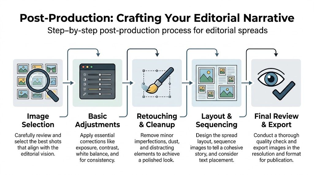
Edit for narrative before perfection
The first pass is not about pixel-level cleanup. It’s about identifying which images belong to the story.
I’d rather keep a frame with narrative value and slight technical compromise than a perfect image that says nothing. Most projects don’t need every good room. They need the right progression.
A useful sequence usually includes:
- an opener with immediate pull
- a second image that expands understanding
- a run of supporting spaces with contrast in scale
- details that slow the pace at the right moment
- a final image that leaves tone behind, not just information
Build the spread with visual rhythm
A portfolio gallery can tolerate repetition. An editorial spread can’t.
The strongest selections usually vary across three axes:
Scale
Don’t stack five wides in a row. A broad exterior, a medium interior, and a close material shot create breathing room.
Orientation
Verticals, horizontals, and tighter crops give a layout team options. If every image is composed the same way, the spread feels rigid.
Intensity
Not every frame should shout. One hero image can carry a lot of drama. The next image may need to quiet the pace and let the reader settle in.
A publishable set feels edited by subtraction. If you’re attached to every frame, the final package is probably too long.
Technical polish still matters
The story comes first, but the file quality has to hold up in print and digital use.
The editorial redesign guidance in the provided source states that organizing visual flow, experimenting with lighting and angles, and calibrating images to P3 color space can improve feature acceptance, while weak storytelling is associated with a 55% failure rate, according to the m3 magazine redesign article. That lines up with what happens in real submissions. Editors forgive little. Muddy color, inconsistent white balance, or sloppy retouching signals that the package isn’t ready.
Basic correction should be invisible
At minimum, every selected image should have:
- consistent white balance across the set
- controlled highlight and shadow detail
- straightened architecture where needed
- crop decisions that respect layout flexibility
Retouching should support credibility
Clean dust, minor distractions, outlet covers when appropriate, sensor spots, and temporary site issues. Don’t rewrite the architecture.
If a structural line is off, the correction should restore what the eye experienced, not invent a room that never existed. That’s where thoughtful work in tools like Lightroom, Photoshop, and perspective controls earns its keep. For teams evaluating what post can and can’t responsibly fix, this guide on using post-production to fix structural photos is a practical reference.
Deliver like an editor will open it tomorrow
The final package should feel organized before anyone asks a question.
That means:
- filenames that make sense
- a clear selects folder
- captions tied to room names or design moments
- collaborator credits gathered and checked
- both high-resolution and web-ready exports prepared
A polished set doesn’t just look finished. It tells the editor that the team behind it understands publication workflow.
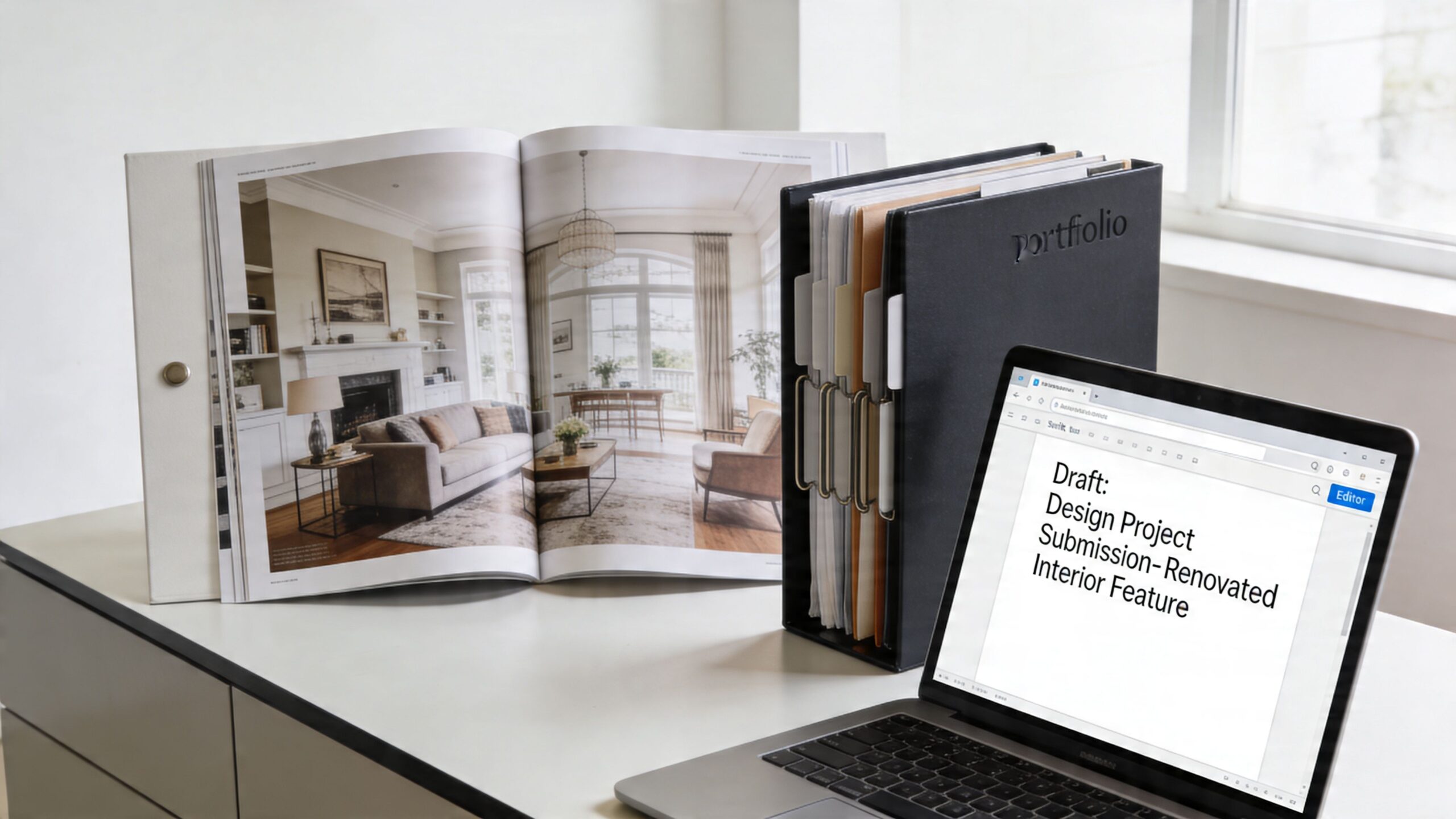
Pitching Your Project How to Get an Editor's Attention
An editor opens your email between meetings, gives it fifteen seconds, and decides whether the project is worth another click. That decision usually happens before the full gallery is ever seen.
Many renovation pitches fail for preventable reasons. The subject line is generic. The angle is buried under biography and adjectives. The sender includes images, but no clear reason the project belongs in that publication.
A strong pitch works like a clean photo edit. It removes friction, establishes the story fast, and gives the editor enough material to say yes without asking basic follow-up questions.
Match the project to the publication
Editors assign stories that fit their readership, not only projects with good finishes and polished images. A regional shelter magazine may want local context and livability. A design title may care more about the renovation logic, material restraint, or how the team solved an existing structural constraint. An architecture publication often wants a sharper conceptual frame and cleaner documentation.
That means the same renovation may need three different pitches.
Before sending anything, answer a few editorial questions:
- Does this outlet regularly feature renovations at this scale and price point?
- Is the story strongest as lifestyle, design process, or technical transformation?
- Does the publication rely on visual storytelling, written reporting, or both?
- Will prior social posting create a problem for exclusivity?
If the fit is wrong, even a strong image set has a hard time getting traction.
What an editor needs immediately
Editors scan for clarity. They are looking for a usable story package, not a scavenger hunt.
Send:
- a concise pitch email
- 5 to 8 preview images
- a short project summary
- project location, completion date, and full credits
- a link to a larger gallery or full set
- exclusivity status, if relevant
The package should show that the team has already done the editorial sorting. That matters. Editors are much more responsive when the narrative, credits, and image hierarchy are already in place, as noted earlier.
A pitch email that gets read
Keep it tight. A pitch should identify the project, frame the angle, and show why the renovation belongs to that specific outlet.
A practical structure looks like this:
Subject line
Project name plus story angle.
Examples:
- Renovated Atlanta bungalow organized around daylight and courtyard access
- Adaptive reuse residence with restored masonry and restrained interiors
- Compact kitchen renovation built around custom oak millwork
Opening sentence
State the project in plain language. Name the type, location, and what makes it editorially relevant.
Middle
Use two or three sentences to explain the design problem, the key move, and what the renovation contributes to a broader conversation. That broader conversation might be small-footprint living, preservation, regional craft, family reconfiguration, or reuse of an existing shell.
Closing
Offer the assets cleanly.
“We have a full image set, captions, floor plan, and confirmed credits ready if this project fits your editorial calendar.”
What weak pitches have in common
Weak submissions usually break down in familiar ways.
They oversell.
Editors do not need “stunning,” “breathtaking,” and “luxury” repeated across every sentence.They under-explain.
“Recently completed renovation” says nothing about why the project deserves coverage.They send too much too early.
A crowded inbox with large attachments creates work, not interest.They bury the lead.
If the strongest image and the clearest angle are not obvious in the first few seconds, the project loses momentum.
I see this often with solid renovations that were photographed well but packaged poorly. The problem is rarely the work itself. The problem is that nobody translated the renovation into an editorial story with a clear point of view.
Protect the project while pitching it
Publication has logistics behind it. Get those right before outreach starts.
Discuss exclusivity first
Some editors want work that has not appeared publicly. Others will accept limited posting if the project still feels new to their audience. Set that rule with the client and design team before the images start circulating.
Align credits internally
Confirm the architect, interior designer, exterior design team, builder, fabricators, and product credits in advance. Credit confusion slows approval and makes editors cautious.
Prepare follow-on assets
If a project is accepted, the requests often come quickly. Portrait crops, alternate selects, room captions, team bios, and a short project description should already be organized. Magazine thinking does not stop at the shoot or the retouch. It continues through delivery and into publication support.
Follow up like a professional
A good follow-up is short, spaced reasonably, and useful. Send it because you have something to add, not because a week passed.
Useful follow-ups tend to include:
- a one-line reminder of the project angle
- one or two preview images, if the first note was text-heavy
- a timely reason to review, such as seasonal relevance or an upcoming local event
- a simple option to request more material or pass
Editors remember senders who are clear, prepared, and easy to work with. That reputation helps on the next project too.
Common Questions about Magazine Features
How many images should a submission include
Lead with a tight preview set, then have a fuller gallery ready. Editors want enough to judge the project quickly, but not so much that they have to sort the story for you.
Should the project be styled differently for editorial than for listings
Yes. Listing imagery usually favors broad clarity and universal appeal. Editorial imagery needs more point of view, stronger sequencing, and more careful detail selection.
Can a project still be pitched if it has already been posted online
Sometimes, yes. It depends on the outlet and how widely the project has been distributed. Ask before assuming. Some editors care about exclusivity. Others mainly care whether the work still feels fresh to their audience.
Who should send the pitch
Usually the architect, interior designer, publicist, or photographer can send it. What matters is that one person owns the package and that all credits, permissions, and image access are already coordinated.
Do all renovations have feature potential
No. Some projects are excellent for client marketing but not strong enough for editorial. A publishable renovation usually has clear design intent, visual coherence, and at least one angle that feels specific rather than generic.
What rights should be clarified before submission
Confirm image licensing, publication permissions, contributor credits, and whether any products, artwork, or occupants need approval for editorial use. Sorting that out early prevents headaches after an editor says yes.
If your team has finished a renovation and wants images shaped for publication instead of simple documentation, Jimmy Clemmons Photographer works with architects, designers, contractors, developers, and editorial teams to create narrative-driven architectural photography for Atlanta and regional assignments.