

You know a professional photograph when you see one. The problem is that most buyers, marketers, and project leads still evaluate images at the level of taste. They ask whether a photo feels polished, dramatic, modern, or expensive. That's useful, but it isn't enough.
A professional image earns its keep because it does a job. It clarifies a space, shapes trust, supports a sales process, gives a brand a visual point of view, or makes a subject look credible without looking staged. That's the difference between a nice picture and a visual asset.
That distinction matters because photography isn't cheap. Professional photographers in the United States typically charge premium rates, with hourly fees commonly ranging from $100 to $300 and per-image pricing from $75 to $350, while top-tier professionals can command $200 to $500 per hour or more, according to StudioPod's photography industry statistics roundup. If you're commissioning work at that level, you need to know what you're paying for.
These professional photography examples go past surface-level inspiration. Each one shows how experienced photographers use composition, light, timing, and editorial judgment to make images that work for clients in practical environments.
1. Jimmy Clemmons Photographer
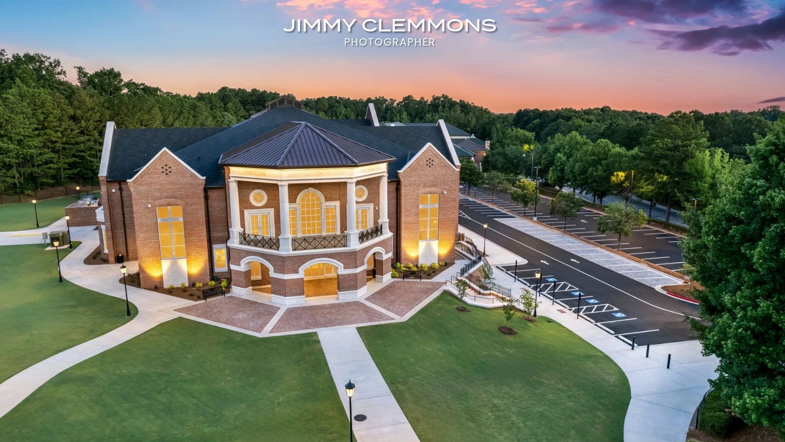
Jimmy Clemmons Photographer is the clearest example here of editorial discipline applied to commercial needs. The work is grounded in architecture, brand content, and portraits, but the bigger differentiator is judgment. The frames don't just record a building or a person. They tell you where to look, what matters, and how the client wants to be perceived.
That's harder than it sounds. A lot of commercial photography fails because it confuses coverage with communication. You can shoot every room, every facade, every executive, and still end up with a gallery that says nothing. Clemmons' portfolio avoids that by working with hierarchy. Hero image first. Supporting details second. Human context only where it strengthens the story.
Why the work reads as professional
The strongest architectural images from this studio balance precision with atmosphere. Vertical lines stay controlled. Interiors feel open without looking flattened. Exteriors carry a sense of presence rather than just scale. That's the tell of a photographer who understands that architecture needs both factual accuracy and emotional persuasion.
The same applies to portraiture. Corporate and editorial portraits often swing too far in one direction. They become either stiff and overlit or loose and under-directed. Clemmons' approach sits in the middle. Subjects look composed, but still believable.
Practical rule: If an image makes a space look better than it feels in person, it may win applause and lose trust. The better strategy is to heighten the real strengths of the environment without breaking credibility.
There's also a real business case for photography at this level. Homes with professional photos can sell for up to $11,000 more and receive 118% more views than listings with amateur images, according to 360Booth's roundup of professional photography statistics. While that figure comes from real estate, the principle carries into architecture, development, and hospitality marketing. Strong images reduce hesitation.
Trade-offs and fit
This is a custom-quote studio, not a commodity provider. That's a plus if you need location scouting, lighting design, on-set direction, and a coherent visual system across multiple deliverables. It's less ideal if you want a quick, low-cost shoot with minimal planning.
A few practical trade-offs stand out:
- Best for design-led clients: Architects, interior designers, developers, hospitality brands, and corporate teams benefit most from the studio's editorial sensibility.
- Less suited to bargain shopping: Pricing isn't published, and the work clearly sits in the premium commercial category.
- Strong trust signals: Commissions for Sports Illustrated, Football Weekly, Condé Nast, and Atlanta magazine matter because editorial clients are unforgiving about consistency and craft.
The contact process is direct, which I like for serious buyers. If you already know the job matters, custom quoting makes sense. If you don't yet know what you need, this kind of studio usually delivers most value when brought in early, before the shoot list gets locked.
2. Esto Photographics
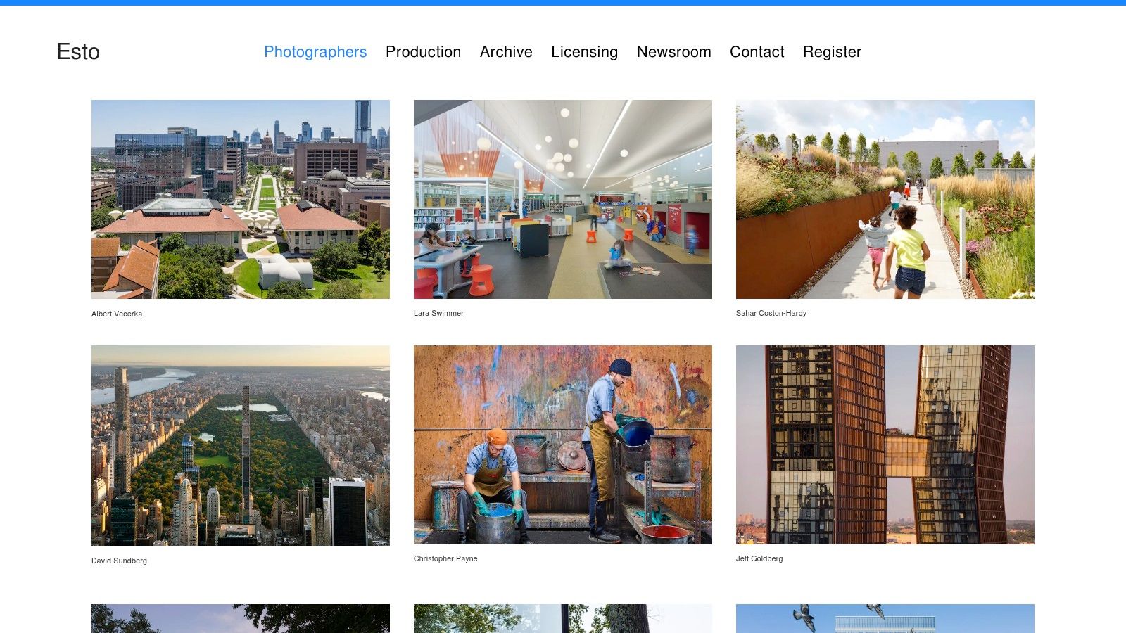
Esto Photographics sits at an interesting intersection of assignment photography and archive value. That matters because architecture clients often need both. They need fresh images of a current project, but they also need a benchmark for what top-tier architectural photography looks like over time.
The Ezra Stoller legacy is the obvious headline. The practical takeaway is consistency. Esto's portfolio shows what happens when architectural photography is treated as serious visual authorship, not just project documentation.
What to study in the imagery
The best Esto work has structure. Foreground, midground, and background all do something. The compositions rarely feel accidental, and they rarely rely on gimmicks. That's one reason the archive is so useful as a reference point for teams still learning what architectural photography is. It teaches you to look at massing, rhythm, circulation, and human scale.
There's also a useful restraint in the color and light. Many newer portfolios overprocess architecture. They push skies too hard, clean surfaces too aggressively, and remove the life from a space. Esto's standard is more editorial. The image serves the design rather than overpowering it.
A serious architectural image doesn't just say, “This building exists.” It says, “This building was designed with intent, and the photograph understands that intent.”
Where Esto excels and where it doesn't
If you're in architecture, design publishing, or brand licensing, Esto is a strong benchmark and a practical resource. The archive makes it especially valuable for editorial teams and brands that need licensed architectural imagery with historical and aesthetic depth.
Its limits are straightforward:
- Excellent for architecture and design: The specialization is the advantage.
- Less useful for lifestyle-heavy campaigns: You wouldn't go here first for a personality-driven portrait program.
- Inquiry required: Licensing and assignment pricing aren't public, so procurement takes a conversation.
I'd treat Esto less as a simple vendor pick and more as a quality bar. If your commissioned work doesn't hold up against archives like this, the brief probably needs refinement.
3. OTTO (OTTO Archive)
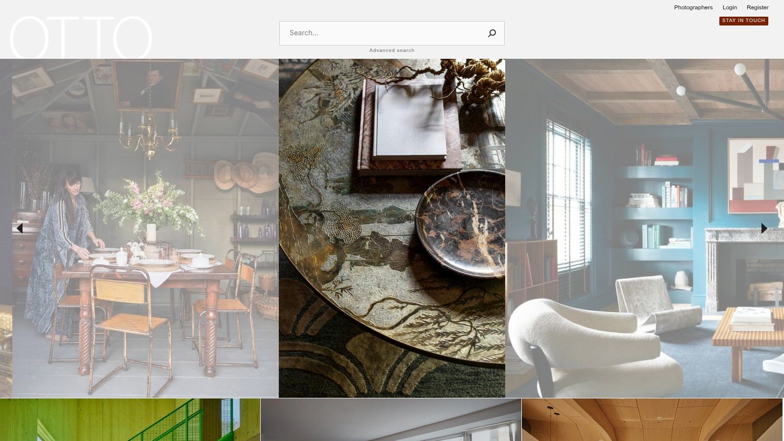
OTTO Archive is less about hiring a single authorial voice and more about accessing a tightly curated visual standard. That's a different kind of usefulness. When clients search for professional photography examples, they often need to compare not just photographers, but image ecosystems. OTTO gives you that.
The roster is oriented toward design, architecture, and interiors. That niche focus is a strength because it removes noise. You're not wading through unrelated categories or mixed-quality submissions.
The value of curation
A curated archive teaches pattern recognition. You start seeing what publication-ready interiors photography consistently gets right. Camera height is deliberate. Styling supports the frame but doesn't scream for attention. The light feels shaped, even when it appears natural.
This matters for interior designers and hospitality brands in particular. Interiors fail on camera when photographers chase atmosphere without maintaining clarity. OTTO's roster tends to avoid that trap. Materials stay legible. Spaces keep their geometry. Texture reads.
Here's the trade-off in simple terms:
- Strong for image research: If you need a visual reference for a creative brief, this is efficient.
- Strong for licensing workflows: Enterprise-facing support makes it easier to source precisely.
- Weaker for full production visibility: It reads more like a licensing and client-services platform than a public-facing booking system for custom campaigns.
Why clients use archives like this
Not every project starts with a shoot. Many start with a mood board, a deck, a pitch, or a design narrative that needs visual proof. OTTO is good at that stage because the curation is disciplined.
That discipline can save clients from a common mistake. They pick references based on style alone and ignore whether those references are repeatable for their own space, budget, or timeline. Archives like OTTO help separate taste from craft because the quality threshold is consistently high.
4. Mike Kelley (mpkelley)
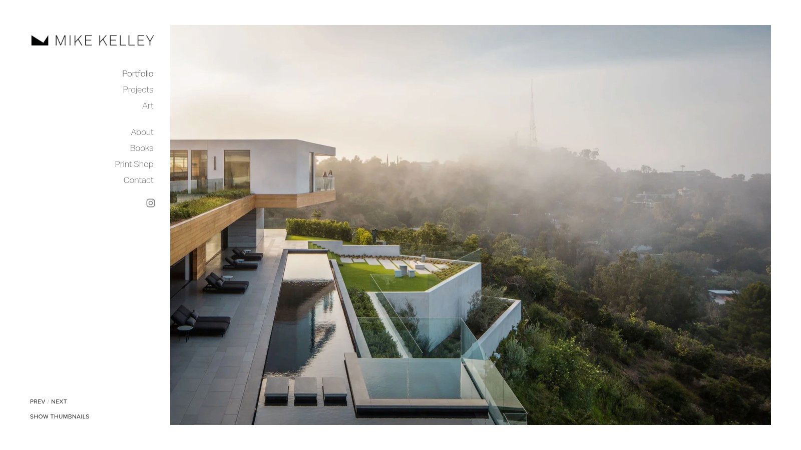
Mike Kelley is a good example of technical precision that still feels alive. That's not easy in architecture. A lot of technically correct work ends up emotionally dead. Kelley's galleries show control, but they also show sequencing, mood, and a strong sense of when a space reveals itself best.
His portfolio is especially useful for procurement teams because the approach is legible. You can see the building types, the client caliber, the publication history, and the visual consistency without guessing.
What works in the approach
The images handle difficult architectural conditions well. Glass, mixed materials, broad facades, and deep interiors all require different decisions about exposure and perspective. Kelley's work suggests a photographer who plans for those variables instead of fixing everything later.
That's where many project teams underestimate the craft. Site prep and pre-production do more for image quality than frantic post-production ever will. If you're commissioning a serious shoot, this guide on how to prepare your project site for a professional photoshoot is the kind of operational thinking that improves final images before the camera comes out.
On set reality: The cleanest architectural photograph often starts with moving furniture, killing stray reflections, waiting for the right exterior balance, and removing visual clutter no one noticed in person.
Client fit and limitations
Kelley is a strong fit for firms that need architectural imagery to function across marketing, editorial submission, and awards contexts. The work is polished enough for publication, but clear enough for stakeholder review and portfolio use.
A few trade-offs are worth noting:
- Best for complex architecture: Large-scale residential, institutional, and commercial work benefit most.
- Custom quoting only: No public rates, which is normal at this tier.
- Availability can tighten: Established photographers with national reputations often need more lead time, especially when travel is involved.
If your project needs images that can live in multiple channels without looking overworked, Kelley is a smart benchmark.
5. Adrian Gaut
Adrian Gaut photographs the kind of interiors that can fall apart the moment the photographer tries too hard. Luxury apartments, refined hospitality spaces, and design-led residences depend on control, but they also depend on ease. Gaut understands that tension, and the portfolio benefits from it.
His work sits closer to editorial storytelling than overt promotion. That distinction matters. Editorial images ask the viewer to stay with the frame long enough to notice material, proportion, and mood, while promotional images often push for instant impact. Gaut consistently chooses the first path.
Why the restraint works
The strongest frames are deliberate without feeling over-directed. Lines stay clean, but the compositions rarely feel clinical. Light is handled with enough discipline to preserve texture and tone, especially in rooms where reflective surfaces, soft shadow, and layered neutrals can easily turn muddy or overprocessed.
That restraint serves the subject.
In good interior photography, style should support the designer's intent instead of competing with it. Gaut's images leave room for details to do their job. Stone, fabric, joinery, and negative space all read clearly because the photograph is not straining for effect. For clients, that has direct value. The work feels premium, current, and usable across editorial placement, brand storytelling, and project portfolios without locking the images into a single trend cycle.
There is a trade-off. Quiet photography asks for a more attentive viewer, and it tends to appeal most to clients who already understand the difference between polished taste and generic luxury.
What to expect as a buyer
Gaut's website is sparse, which shapes how you evaluate the work. The images carry the sales burden, and practical details often sit behind representation or an inquiry process rather than on a highly explanatory site. Experienced design clients usually handle that well. First-time buyers may need more conversation to understand scope, production, licensing, and how the shoot will be structured.
That setup tends to mean a few things:
- Strong fit for design-forward brands: Especially residential, hospitality, and editorial-facing projects that need sophistication without visual excess.
- Less self-serve information: Buyers looking for rates, process breakdowns, or detailed FAQs will not get much from the site alone.
- Representation can improve production flow: For larger assignments, agent support often helps with scheduling, estimates, and usage negotiations.
If the brief calls for images with quiet control, material sensitivity, and an editorial point of view, Gaut is a useful benchmark. The lesson is practical. Strong professional photography does not always announce itself in the first second. Sometimes the best image earns trust by showing just enough, and no more.
6. Peter Molick
A museum hires a photographer to document a new building. The brief sounds simple until the first scout. The facade matters, but so do circulation, daylight, neighborhood context, and the way the structure behaves across a full day. Peter Molick works well in that territory because his images read like they were made by someone who understands what the architect was trying to solve.
That changes the pictures. Instead of treating architecture as a polished object, Molick photographs it as a system of relationships between form, material, site, and use. Clients in commercial, institutional, and cultural sectors usually need that level of reading. A pretty frame can win attention. A frame that explains the project has more long-term value.
The architect-trained advantage
Molick's strength is control without sterility. The compositions preserve geometry, but they also leave room for weather, scale, and traces of human occupation. That balance is the strategy. Push too far toward pure form and the work becomes detached from experience. Push too far toward lifestyle storytelling and the building stops being the subject.
His portfolio shows how that strategy adapts across project types. Educational spaces ask for clarity about circulation and program. Cultural work often needs more sensitivity to atmosphere and public presence. Exterior commissions live or die on timing, because the wrong light can flatten surfaces or break the hierarchy of the design. Molick adjusts for those demands without losing consistency.
Post-production matters here, but it should never be the main story. Strong architectural photography is built first through camera position, lens discipline, time of day, and a clear decision about what the image needs to explain. Retouching then refines color, perspective, and distractions. It does not rescue weak intent. That is the same broader argument behind the ROI of professional photography for brands and commissioned work. The value comes from making images with a job to do.
Where Molick fits best
Molick is a strong reference for clients who need architectural photography that feels informed, measured, and useful in presentations, awards submissions, fundraising materials, and editorial placement.
- Good fit for architects, museums, schools, and institutions: The work explains design choices instead of decorating them.
- Effective across multiple building types: That helps firms that need one visual standard across very different projects.
- Commission-based quoting: Standard for custom shoots where scope, usage, travel, and production vary by assignment.
If the brief calls for material clarity, site awareness, and images that support the architect's intent, Molick's portfolio gives a strong model to study.
7. Miller Mobley
Miller Mobley shifts the conversation from architecture to portraiture, and that's useful because many buyers need both. A brand may need polished space photography and executive portraits in the same quarter. The evaluation standard changes. In portraits, technical competence is only the baseline. Direction becomes everything.
Mobley's portfolio is built around public figures, editorial commissions, and campaign-grade portraiture. The lesson isn't celebrity. The lesson is control. Every frame communicates a distinct relationship between subject, light, wardrobe, expression, and brand narrative.
What strong portrait direction looks like
A weak portrait session puts all the burden on the subject. A strong one builds the conditions for a believable performance. That includes set design, lens choice, pacing, and how the photographer manages energy on set.
Mobley's work shows that a portrait can be highly produced without feeling lifeless. That's the threshold executive teams often struggle to hit. They want authority but not stiffness. Polish but not vanity.
For teams weighing budget, this broader argument matters. Original photography helps marketers hit goals more effectively than stock imagery, according to the ROI discussion on Jimmy Clemmons Photographer, which aligns with the wider industry pattern that authentic imagery tends to outperform generic visual substitutes.
The best executive portrait doesn't flatter first. It establishes credibility first, then flatters within that framework.
The trade-offs are real
This level of portraiture usually comes with more production complexity. Creative direction, grooming, set decisions, usage discussions, and scheduling all become part of the brief.
That brings clear pros and cons:
- Excellent for high-visibility portrait campaigns: Leadership teams, editorial covers, brand storytelling.
- Less ideal for quick headshot days: The production value is part of the offer, and that raises cost and lead time.
- Bicoastal advantage: Helpful for brands operating across major media markets.
If your portraits need to carry brand authority, not just fill an about page, Mobley is one of the stronger professional photography examples to study.
7-Photographer Portfolio Comparison
| Service | Implementation complexity 🔄 | Resource requirements ⚡ | Expected outcomes 📊⭐ | Ideal use cases 💡 | Key advantages ⭐ |
|---|---|---|---|---|---|
| Jimmy Clemmons Photographer | High, full-production shoots with on-set direction | Crew, custom lighting, location scouting; travel for regional work | Magazine‑ready, narrative-rich architectural and portrait imagery | Architects, hospitality/interior designers, corporate marketing, editorial features | Film-trained compositional eye; end-to-end production for cohesive visual identity |
| Esto Photographics | Medium, archive management + commissioned assignments | Licensing budgets, archive access; photographer teams for new shoots | Deep, benchmark-quality architectural imagery and licensed assets | Editorial licensing, research, brand licensing, archival benchmarks | Extensive US archive plus active assignment production; recognized industry standard |
| OTTO (OTTO Archive) | Low–Medium, licensing and research-focused workflow | Licensing fees, research support; limited direct production services | Consistent, publication-ready architecture/interiors imagery for editorial use | Clients needing curated licensed imagery and research for editorial/brand use | Curated roster and research/client services; enterprise-ready licensing |
| Mike Kelley (mpkelley) | Medium, project-based architectural productions | Project crews, travel, and production budgets; scheduling for demand | Technically precise, design-sensitive architectural imagery with editorial reach | Large architectural firms, design-centric publications, firm portfolios | Recognized high-end architectural style, clear case studies and publication credits |
| Adrian Gaut | Medium, agent-coordinated editorial productions | Representative coordination (EDGE REPS), production support for shoots | Understated, editorially refined interiors and travel/design imagery | High-end residential, hospitality, Condé Nast–level editorial assignments | Editorial polish aligned with premium design media; NYC access to top clients |
| Peter Molick | Medium, architect-educated approach to shoots | Standard production needs, travel for national assignments; accessible contact | Form- and material-focused imagery suited to commercial/institutional projects | Commercial, institutional, cultural projects and firm portfolios | Architect-trained perspective with award recognition and active project updates |
| Miller Mobley | High, high-production portrait and campaign direction | Talent coordination, high budgets, motion + stills production resources | Magazine-grade portraits and campaign imagery that communicate leadership/brand | Executive portraits, celebrity shoots, integrated motion/stills campaigns | Proven ability with high-profile talent and cohesive director/photographer capabilities |
The Common Thread From Vision to Visual Asset
A client sits down to review a gallery after a shoot. The question is rarely whether the photos look professional. The true test is whether the images do a job. Do they make a building feel worth visiting, a brand feel credible, or a person feel trustworthy within a few seconds of attention?
Across these seven portfolios, the common thread is disciplined intent. The photographers are making clear decisions about point of view, lens choice, light quality, timing, styling, and edit control to serve a specific outcome. That is the difference between attractive photography and useful photography.
Clients are not paying for camera ownership. They are paying for judgment.
That judgment matters most when the assignment gets difficult. Tight production windows, reflective materials, mixed color temperatures, small rooms, unrehearsed subjects, conflicting stakeholder opinions, and the need for one image set to work across web, print, PR, and sales all force trade-offs. Strong photographers handle those trade-offs on purpose, not by instinct alone.
The examples in this article show how that works in practice. In architectural work, control often means managing verticals, preserving material accuracy, and deciding whether human presence adds scale or weakens the design read. In portrait and campaign work, the priority shifts to expression, posture, wardrobe, set design, and lighting ratios that shape how authority, warmth, or ambition reads on the page. Different genre, same discipline. Every choice either supports the brief or pulls against it.
That is why photography remains a serious line item in a marketing or brand budget. Strong images reduce hesitation. They help firms look established before the first call, help hospitality brands sell atmosphere before arrival, and help leadership teams communicate competence before anyone reads a bio.
A weak buying process usually starts with a checklist. Exterior views. Interior vignettes. Team portraits. Detail shots. Web crops. The shot list may be complete, but the image set still fails if no one has defined what the work needs to communicate as a group.
A better process starts earlier and gets sharper. What should the audience understand immediately? Where will each image appear? What objections does the image need to answer? How polished should the work feel for this market? Which reference images reflect the right intent, and which ones only look achievable because they were produced with more time, crew, budget, or access than this assignment allows?
Those are commissioning questions, not aesthetic trivia.
They turn photography into a business asset.
The value of the seven examples above is not just that they show strong finished work. They reveal standards a client can evaluate before hiring. Perspective control. Lighting that matches the subject. Clear hierarchy inside the frame. Sequencing across a gallery. Production choices that support the intended use. Those standards travel well across architecture, interiors, editorial, portraiture, and branded campaigns.
Study the decisions, not just the style. A striking portfolio gets attention. Reliable visual thinking gets images that keep working after the launch, the pitch, and the first round of approvals.
If you need that combination, the studio discussed earlier stands out for clients who need architectural precision, editorial discipline, and commercial clarity in the same body of work. That mix is especially useful for architects, developers, hospitality brands, and corporate teams that need images to build trust and carry a narrative across multiple channels.