

A lot of studio owners are stuck in the same place right now. The room needs to impress clients the minute they walk in, but it also needs to survive carts, C-stands, rolling wardrobes, tether cables, quick resets, and the demands of back-to-back production days.
That tension is where most studio design either gets expensive or gets sloppy. One path creates a space that photographs beautifully but fights you every time you change a set. The other creates a functional shell that works hard and feels forgettable. Good interior design for photo studio work sits in the middle. It looks edited, calm, and intentional, while every surface, outlet, light control, and storage move is doing a job.
The best studios I've seen don't confuse decoration with design. They're built like tools. Clean sightlines. Predictable light. Durable finishes. Furniture that can move without looking temporary. Client areas that feel composed without stealing square footage from production. If the room can't shift from portrait session to product setup to interior vignette without friction, it isn't finished.
Your Studio From Vision to Blueprint
Dream big, but plan bigger. A mood board is useful, but it won't solve the practical failures that ruin shoots. Before paint colors, lounge chairs, or branded signage, the room has to perform as a photographic instrument.
For interior design for photo studio planning, I start with space, light, and power. If those three are wrong, every later decision becomes a workaround. If they're right, the studio can carry both its public identity and its production load.
Space has to work in motion
A studio isn't measured only by square footage. It's measured by turning radius, background depth, ladder clearance, gear parking, and whether two people can move a cart past a set without stopping production.
The room should support at least these conditions:
- A main shooting field that doesn't force your tripod into a wall
- A reset edge where props, apple boxes, and stands can wait off-camera
- A client line that lets visitors observe without stepping into the work path
- A clean arrival sequence so first impressions don't begin at a pile of cases
Light must be controlled, not merely available
Big windows sound great until the sun drifts, color shifts, and one wall blows out by midday. Uncontrolled daylight makes a studio feel airy, but controlled daylight makes it useful.
That means planning for blackout, diffusion, negative fill, and fast transitions between ambient and shaped light. A room that can go soft, flat, dramatic, or daylight-balanced without a rebuild is worth more than a pretty room with one good corner.
Practical rule: Design for the worst lighting condition you'll face, not the best one you hope for.
Power is part of the design
Studios often treat electrical planning like a finish trade issue. It isn't. It determines where you can place lights, charge batteries, tether cameras, power monitors, run steaming equipment, and hide cords.
A polished studio with extension cords crossing the floor never feels editorial. It feels unfinished.
For deeper planning references on production-ready spaces and professional setups, it helps to review professional photo resources in Atlanta and compare your room against working standards, not just inspiration images.
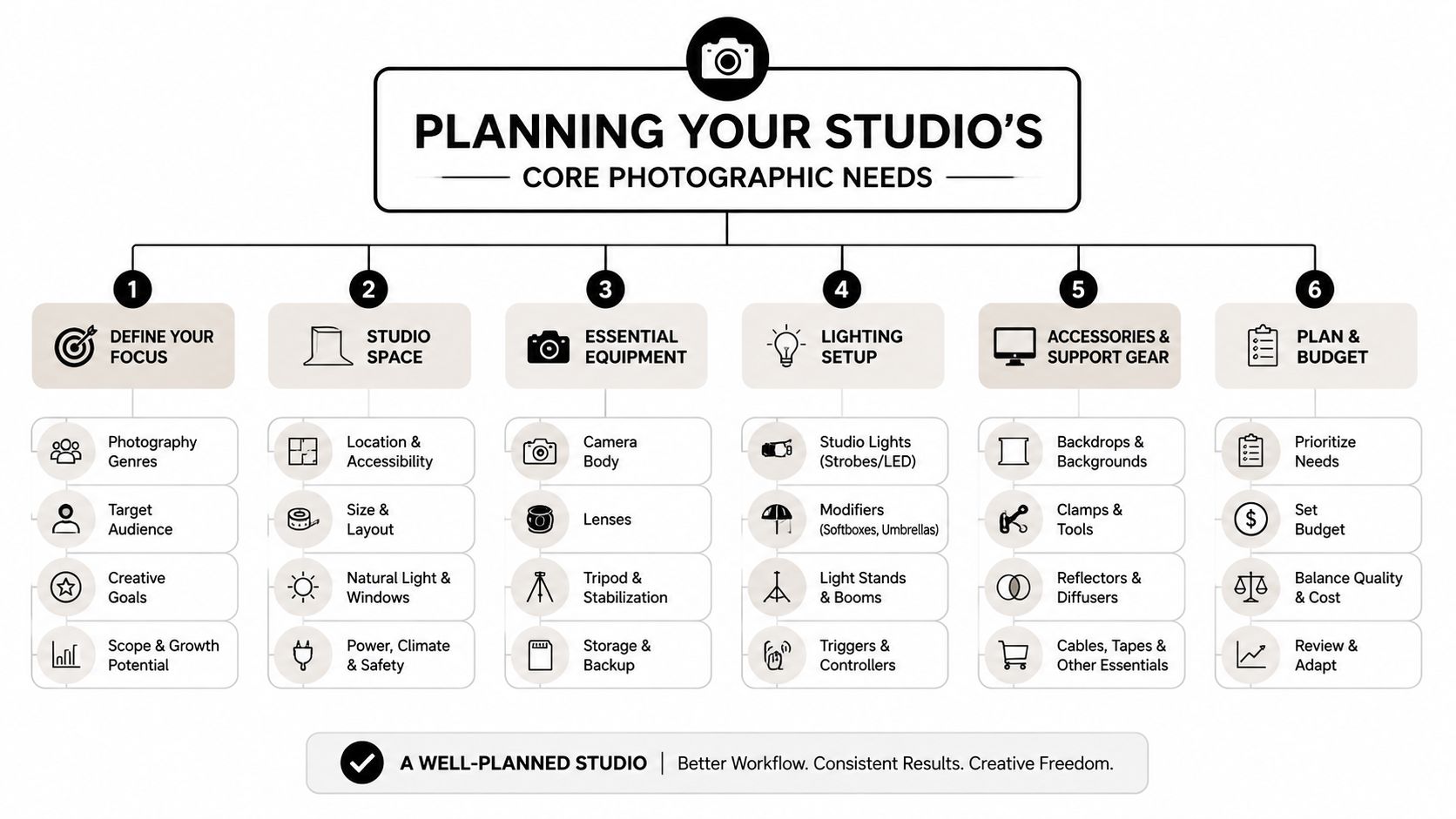
Planning Your Studio's Core Photographic Needs
The shell comes first. Before furniture, branding, or decorative styling, the room needs to support the way photographs are made. Most problems people blame on “bad light” or “tight space” are layout problems that should have been solved in the blueprint stage.
I like to plan a studio by zones, not by objects. Cameras move. Clients drift. Assistants stage gear. Hair and makeup spill into adjacent space. If the room isn't organized around those movements, every setup takes longer than it should.
Start with the camera path
The camera path determines more than your framing. It affects where backgrounds live, how far subjects stand off the wall, and whether you can switch from wide environmental shots to tighter portraits without rebuilding the room.
Think of the floor in bands rather than empty open space:
| Zone | What it needs to do | Common mistake |
|---|---|---|
| Shooting band | Hold tripod, camera operator, and subject movement | Filling it with decorative furniture |
| Lighting band | Allow stands, modifiers, flags, and boom arms | Leaving no side clearance |
| Support band | Store active gear within reach | Turning it into dead clutter |
| Client band | Give observers a clean, safe view | Positioning it inside the work lane |
When these bands are clear, you save time without making the room feel industrial.
Ceiling height matters, but control matters more
Higher ceilings give you more freedom with overhead modifiers, boomed lights, suspended backdrops, and cleaner shadow control. But I'd take a room with better light control over a taller room with uncontrolled spill.
That's especially true for studios that shoot interiors. A professional standard in interior photography is to shut off artificial interior lighting and work with a single color temperature. In the transcript from a professional interior photographer, 90% of professional sessions rely on natural light, and using a single color temperature can reduce mixed lighting errors by over 85%. The same source notes that 60 to 70% of professional interior shots are captured with flash added to natural light to maintain clean color and depth. That guidance appears in this interior photography lighting discussion on YouTube.
What that means for studio design is simple. Don't just ask for bright windows. Build for control:
- Blackout layers so daylight can disappear when needed
- Diffusion at window level to soften hard directional sun
- Neutral wall and ceiling choices so reflected color stays predictable
- Space for flags and cutters without blocking circulation
A studio with total control over one window wall is often more valuable than a studio with windows on every side.
Put outlets where work actually happens
Electrical planning should follow behavior. If your tether station always ends up in one corner, that corner needs power and data support. If hair and makeup travel, you need outlets that don't force cords across walkways. If your main set wall changes often, place access points so light placement doesn't become a cord puzzle.
A few practical decisions make a major difference:
- Place wall outlets at regular intervals so rolling set pieces can land almost anywhere.
- Support workstation clusters where monitors, chargers, and laptops live together.
- Keep floor paths clean by reducing reliance on temporary extensions.
- Separate clean client areas from messy charging zones so the room reads intentional.
Lens choice also affects how much room you really need. A wide lens can rescue a tight setup, but it can also distort a space if you lean on it too hard. If you're still deciding how much depth your main set wall needs, review practical framing options in this guide to the best lens for interior design photography.
Build around change, not around one backdrop
Studios fail when they're designed around a single “hero” wall. It looks great in photos of the studio itself, then starts limiting every client who wants something different.
A better approach is to create a room with:
- One anchored architectural side that feels editorial and finished
- One neutral side that can disappear
- One service side for carts, prep, and quick swaps
- One flexible corner for temporary vignettes, product tables, or interviews
That balance is what makes interior design for photo studio projects work over time. The room doesn't need more decoration. It needs more usable variety.
Designing for an Efficient Studio Workflow
The studio that feels calm on set usually has a ruthless floor plan behind it. Efficiency isn't about stripping character out of the room. It's about making sure every movement has a place, and every delay has been designed out before call time.
A lot of people treat the client zone like a decorative afterthought. That's a mistake. Clients read the room long before they read your estimate, and they use that experience to decide whether your rates, your process, and your taste make sense together.
The client area sells the production
When a client has nowhere to sit except an apple box, they don't think, “This team is efficient.” They think the studio wasn't ready for them. A polished client-facing area changes the perceived value of the entire production, even if the footprint is modest.
The most effective client zones usually share a few traits:
- Durable upholstery in materials that clean easily and still photograph well
- Side tables with actual function, not just styling value
- Controlled ambient light so the waiting area feels composed
- Clear visual separation from charging cables, cases, and prep clutter
That separation matters because production always has a messy phase. The goal isn't to eliminate the mess. The goal is to keep it from becoming the brand experience.
Workflow should reduce friction at every turn
An efficient studio doesn't make people ask basic questions on set. Where does the stylist steam garments? Where do extra props wait? Where do hard cases go once the shoot starts? If those answers change every session, the design hasn't done its job.
I prefer to think in terms of traffic patterns:
| Movement | Best design response | What goes wrong without it |
|---|---|---|
| Gear in | Wide clear route from entry to storage | Cases clog the shooting floor |
| Client arrival | Direct path to seating or viewing area | Visitors drift into setup space |
| Styling support | Prep surface near, but off, camera | Tools pile onto set furniture |
| Shot review | Dedicated monitor station | Team crowds around the camera |
The room should subtly steer people. Good design reduces verbal directing.
The fastest studio isn't the emptiest one. It's the one where each job has a home before the first cart rolls in.
Storage should rise vertically
Floor space disappears fast. Stands, V-flats, backdrop paper, clamps, sandbags, and folding tables will swallow a room if you let them. Vertical storage keeps the floor open and the walls useful.
Practical solutions tend to outperform fancy custom cabinetry here:
- Wall-mounted stand racks near the shooting area
- High shelves for low-frequency grip gear
- Rolling bins for styling tools and expendables
- Labelled drawers for clamps, tape, batteries, and small hardware
Acoustics and climate control deserve the same seriousness. If you shoot video, hard surfaces can turn a beautiful room into an echo chamber. If the HVAC blasts directly onto a set, you'll see it in hair, wardrobe, paper sweeps, and comfort levels.
A short walkthrough of live studio movement often helps owners see these issues more clearly than a floor plan does. This behind-the-scenes studio workflow video example is a useful reminder that production design is really movement design.
Why hospitality belongs in a working studio
Studios that retain clients repeatedly tend to feel organized, but not cold. That doesn't require luxury for its own sake. It requires thought. Water within reach. A private place to take a call. Hooks for bags and garments. A clean restroom. Good coffee if your market expects it.
Those choices don't slow production down. They support it. A comfortable client stays out of the crew's lane because the room gives them somewhere better to be.
Crafting the Ultimate Client Experience
Clients don't separate aesthetics from competence. They assume the room reflects the work. If the studio feels visually unresolved, they start to question whether the production will feel unresolved too.
That's why the strongest client experience is never just hospitality. It's alignment. The room should tell the same story your final images tell. Precise, edited, calm, and dependable.

Editorial style has to earn its keep
A common design failure is building a studio that looks impressive in a tour photo but becomes fragile in real use. Overscaled furniture blocks moves. Decorative shelving becomes dust storage. Precious finishes start dictating production instead of supporting it.
A better standard is adaptability. One of the most underserved questions in this category is how to make a studio feel editorial without losing production flexibility. Practical guidance points toward adaptable zones and movable elements that can create different visual narratives in one session, especially for commercial and architectural clients. That gap is outlined well in this discussion of photographing small spaces and tight interiors.
That principle translates directly into design choices:
- Use furniture with clean lines and light visual weight so pieces can shift between sets
- Choose modular seating rather than one oversized statement sofa
- Keep decorative layers swappable with art ledges, moveable plants, and freestanding screens
- Build backgrounds in depth, not just color, using plaster, painted wood, linen drape, or textured panels
Where to spend and where to stay lean
Not every investment carries the same long-term value. Some features enhance both image quality and client confidence. Others only photograph well on opening day.
Here's a practical comparison:
| Investment | Strength | Weakness | Best use |
|---|---|---|---|
| Permanent architectural wall treatment | Gives the studio a signature identity | Harder to reinvent quickly | Reception, meeting zone, hero set wall |
| Modular backdrop system | Fast set changes and multiple looks | Can feel technical if exposed poorly | Main shooting area |
| Built-in banquette or bench | Efficient use of footprint | Less flexible than loose seating | Waiting and review zones |
| Rolling furniture and movable flats | High adaptability | Requires disciplined storage | Commercial, portrait, and product studios |
Field note: If a design feature can't survive being moved, leaned on, relit, and restyled, it belongs in a showroom, not a studio.
Technical investments shape the client experience too
Clients may not ask what backdrop system you chose, but they feel the result. A motorized roll system reads as smooth and professional because changes happen cleanly. A portable support system can be the better choice when the room serves multiple functions, but it demands disciplined setup and teardown or the space quickly looks temporary.
Lighting infrastructure works the same way. If every shoot requires visible improvisation, the room starts feeling reactive. If the lighting can shift quickly between clean daylight balance, portrait mode, and product work, clients experience that as confidence.
The best editorial-feeling studios don't hide their working nature. They refine it. The room says, “We know exactly how this day is going to run,” and that message is part of the design.
Integrating Technical Systems and Future-Proofing
A finished studio should still have room to evolve. Cameras change. Client expectations shift. Hybrid productions become normal. If the technical backbone is rigid, the design ages faster than it should.
That's why future-proofing matters most in the parts clients barely notice. Power routing, backdrop support, lighting control, data handling, and safety planning are what keep the studio useful after the first round of build-out excitement fades.
Choose systems that support more than one shoot type
A studio that handles interiors, portraits, and products in the same footprint needs infrastructure that changes modes quickly. That usually means combining permanent systems with mobile ones.
A smart backbone often includes:
- A backdrop system that doesn't consume the whole room when idle
- Layered lighting control so ambient and active lighting can be adjusted separately
- Wired work points for tethering, monitor review, and file transfer
- Storage near the set for the tools used every day, not buried in back rooms
Why controllable LED systems matter now
Studios used to frame lighting choices as a fight between available daylight and flash. That's too narrow now. Controllable LED infrastructure has become a serious operational asset, especially in mixed-use studios.
The market signals support that shift. The global smart lighting market was valued at about USD 15.1 billion in 2024, and LEDs account for roughly 50% of global lighting electricity use, which strengthens the case for controllable, efficient LED systems in studio environments. That context appears in this smart lighting and interior shooting discussion.
For studio owners, the takeaway isn't “replace everything with LED.” It's this:
- Use controllable LEDs for repeatable ambient states
- Keep strobes for power, punch, and certain still-image needs
- Design fixtures and controls so color consistency stays predictable
- Reduce reliance on improvised floor lamps or household bulbs
That combination supports image consistency, operating efficiency, and faster transitions between set types.
A tactical pre-shoot checklist that starts with the room
Future-proofing isn't only about installed systems. It's also about repeatable habits. Before a shoot, the room should be reset in a way that supports composition immediately.
A proven checklist includes the following rules from professional interior photography guidance:
- Set the camera near a 4-foot height. Shooting from roughly 4 feet mimics eye level and can improve spatial accuracy by 40%. That guidance comes from this interior photography basics article.
- Start with less on every surface. Removing one-third of on-site clutter has been shown to increase photo engagement by 35% in the same source.
- Check orientation early. The same guidance notes a 60/40 split between vertical and horizontal finals, so the room should support both without awkward furniture pivots.
- Compose with intention. The article also notes the use of the grid and balanced composition in professional interior work.
Don't forget the unglamorous systems
Studios rarely regret adding better cable management, safer egress routes, clearer labeling, and a proper place for backups. They do regret ignoring them.
Good infrastructure disappears during the shoot. Bad infrastructure becomes the shoot.
The most durable interior design for photo studio projects feel polished because the hidden systems were planned as carefully as the visible ones.
Staging and Styling Your Studio for the Shoot
Once the room is built properly, styling becomes a lighter touch. That's where many studios finally get the balance right. The permanent design holds the brand. The temporary styling shapes the story for that day's assignment.
A useful prop library doesn't need to be huge. It needs to be restrained. Neutral ceramics, simple books with clean spines, folded textiles, stems with believable scale, a few trays, a stool or ladder, and tabletop pieces with texture usually go further than trend-driven decor. The point is to give the set life without giving it noise.
Use subtraction as the first styling move
Most sets improve when something is removed, not added. Professional interior photography guidance recommends removing one-third of on-site clutter, a step associated with 35% higher photo engagement in the cited article on staging and composition basics. That rule is useful because it's concrete. When a room feels close but not clean, subtract a third and reassess.
A quick styling pass usually works best in this order:
- Clear surfaces first so the architecture reads
- Return only the objects that support the frame
- Group small items instead of scattering them
- Leave negative space so the room can breathe on camera
Hold the camera at a disciplined height
The same guidance recommends shooting from roughly 4 feet to mimic natural eye level and improve spatial accuracy by 40%. That sounds simple, but it changes the whole feel of a studio image. Rooms feel less distorted, verticals are easier to manage, and furniture proportions stay believable.
If your studio has been designed with multiple usable zones, this consistent camera height also helps tie varied setups into one coherent portfolio. A plaster wall vignette, a portrait corner, and a product table can all feel like they belong to the same brand when the spatial language stays disciplined.
For a more refined approach to styling before high-end interiors are photographed, this resource on staging for high-end interior shoots is worth reviewing alongside your own set checklist.
The studio itself becomes a business asset
This is the part many owners miss. Styling isn't just cosmetic. It's where photographic precision, client perception, and workflow efficiency all meet in one frame. If the studio can style up quickly, reset quickly, and still look authored, it stops being just overhead.
It becomes a working portfolio, a sales environment, and a reliable set all at once.
Your Studio Is Your Strongest Asset
The best studio isn't the one with the most furniture, the biggest windows, or the trendiest finishes. It's the one that works hard without showing strain. It photographs cleanly, moves efficiently, and makes clients feel they're in capable hands the moment they enter.
That's what strong interior design for photo studio work delivers. Not decoration alone, and not utility alone. A room with a dual identity that holds up under real production pressure and still looks editorial on camera.
If you need a studio partner who understands how architecture, workflow, and brand perception come together in the frame, Jimmy Clemmons Photographer brings an editorial eye and production discipline to architectural imagery, commercial content, and portraits.