

In a visual-first market, the images you use are your most powerful sales tool. While iPhones offer incredible convenience, relying on them for professional marketing is a critical misstep that can quietly erode your brand, deter high-value clients, and ultimately, depress your bottom line. We see it constantly: ambitious architecture firms, innovative interior designers, and leading construction companies invest millions in their projects, only to showcase them with quick phone snapshots that fail to communicate their true value.
These images don't just look unprofessional; they actively undermine the expertise, precision, and quality your firm represents. This article moves past the obvious and breaks down the technical and strategic divide between amateur and professional imagery. We'll provide a detailed, evidence-backed analysis of the 5 reasons iPhone photos cost your firm clients, complete with visual comparisons and expert insights.
You will learn not just why these photos fall short, but how they directly impact client perception and business opportunities. We will examine specific technical failures in areas like:
- Poor lighting and exposure control
- Lack of professional optics and depth
- Inaccurate color and white balance
- Limited resolution for large-format use
- No control over professional post-processing
More importantly, we will outline the professional solutions that bridge this gap, ensuring your visual identity is as strong and intentional as the work you do. By the end, you'll have a clear roadmap for elevating your brand's visual strategy from a liability to a powerful asset for growth.
1. Poor Lighting Control and Exposure Inconsistency
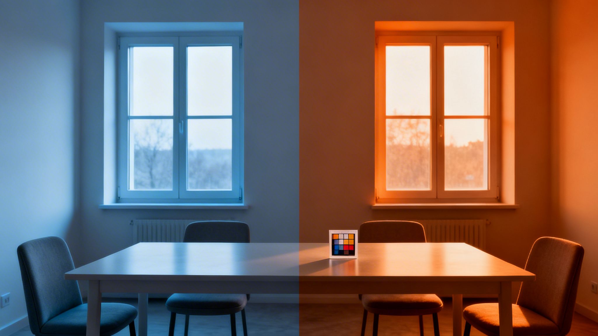
The first and most significant reason iPhone photos cost your firm clients is their inherent inability to manage complex lighting. While modern smartphone cameras are remarkable for everyday snapshots, they fail spectacularly when capturing the nuanced interplay of light and shadow that defines professional architecture, interiors, and commercial spaces. Their automated systems simply cannot replicate the deliberate control required to produce compelling, accurate, and high-impact images.
At its core, the problem lies in a limited dynamic range and a lack of manual control. Dynamic range is a camera's ability to capture detail in both the brightest highlights and the darkest shadows of a single scene. An iPhone, faced with a bright window and a dimmer interior, must make a choice. It either exposes for the view outside, plunging the room into darkness, or it exposes for the room, blowing out the window into a sheet of pure white light. Either outcome misrepresents the space and fails to communicate the full design intent.
Where the iPhone Fails: Real-World Scenarios
This technical limitation has direct financial consequences for your business. Consider these common scenarios where an iPhone photo actively works against your goals:
- Architectural Portfolios: An architect photographs a stunning new build with dramatic skylights. The iPhone camera, unable to balance the intense daylight with the subtle interior materials, renders the skylights as glaring white voids. The texture of the reclaimed wood beams and the color of the slate flooring are lost in deep, muddy shadows. A potential client sees an image that feels amateurish and fails to showcase the very details that prove design sophistication.
- Commercial Real Estate Listings: A leasing agent snaps photos of a premier office space featuring floor-to-ceiling windows with a city view. The resulting images show a properly lit interior, but the view is completely washed out. The key selling point-the connection to the vibrant urban environment-is lost. The listing appears dim, uninviting, and less valuable, leading to fewer inquiries and a longer time on the market.
- Interior Design Showcases: An interior designer tries to capture a project that balances warm, artificial lighting with soft natural light from a window. The iPhone’s auto-exposure averages the scene, creating an image with neither the cozy warmth of the lamps nor the crispness of the daylight. The mood is destroyed, and the carefully selected materials and colors look flat and unappealing.
Key Takeaway: An iPhone's "point-and-shoot" simplicity becomes a critical weakness in professional settings. It makes automated decisions that rob a scene of its depth, texture, and emotional impact, directly undermining the perceived quality of your work.
The Professional Solution: Control and Precision
Professional photographers overcome these challenges by moving beyond automated guesswork. At Jimmy Clemmons Photographer, we view light as a tool to be shaped, not an obstacle to be overcome. Achieving a perfect exposure in a complex environment isn't about luck; it's about a methodical process and specialized equipment.
Here is how a professional approach creates superior results:
- Incident Light Metering: Instead of letting the camera guess, we use external light meters to measure the light falling on the subject. This technique guarantees a precise, accurate exposure for the most important elements in the room, regardless of bright windows or dark corners.
- Exposure Bracketing: We capture multiple images of the same scene at different exposure levels. One shot captures the details in the dark shadows, another captures the mid-tones, and a third captures the information in the bright highlights (like the view outside a window).
- Advanced Post-Processing: These bracketed exposures are meticulously blended together in post-production. This process, often called HDR (High Dynamic Range) imaging or digital blending, allows us to create a single, seamless photograph that is rich in detail from the darkest corner to the brightest window. The final image is a true-to-life representation of the space as the human eye perceives it.
- Supplemental Lighting: Sometimes, natural light isn't enough. We use carefully placed strobes, flashes, and reflectors to gently lift shadows, highlight textures, and balance the color temperature between artificial and natural light sources. This ensures every material and design choice is rendered beautifully and accurately.
The difference isn't just technical-it's strategic. When you present a potential client with an image that is perfectly balanced, detailed, and visually engaging, you are communicating a standard of excellence that reflects on your entire firm. You are showing them you value quality, precision, and a professional result-the very qualities they are looking for in a partner. For a deeper dive into how timing and light selection can make or break a shoot, you can learn more about choosing the best light for a site shoot and see how preparation is key to success.
2. Lack of Professional-Grade Optics and Depth Control
The second reason iPhone photos are a liability for your firm is their fundamental optical limitation. A smartphone camera is a marvel of miniaturization, but it achieves this by using a tiny sensor and a small, fixed lens. This design simply cannot replicate the precision, control, and creative flexibility of professional-grade optics, leading to images that distort reality and fail to highlight the most important aspects of your work.

At the heart of the issue are distortion, focal length, and depth of field. The fixed wide-angle lens on an iPhone is prone to barrel distortion, making straight lines appear curved, especially near the edges of the frame. Furthermore, it offers no way to control depth of field-the plane of focus within an image. This means you can't intentionally blur a background to isolate a key detail, nor can you ensure everything from the foreground to the distant horizon is perfectly sharp. The result is an image that feels flat, distorted, and uncontrolled.
Where the iPhone Fails: Real-World Scenarios
This lack of optical control directly translates into misrepresentation and lost opportunities, costing you clients who see a flawed portrayal of your work.
- Architectural Photography: An architect documents a new skyscraper, but the iPhone's wide lens causes the vertical lines of the building to curve inwards, creating a distorted "funhouse mirror" effect. The architect's precise, intentional design for a powerful, straight-edged tower is compromised, looking amateurish and structurally unsound in the photograph.
- Interior Design Shoots: A designer wants to feature a bespoke light fixture or a piece of custom furniture. With an iPhone, the wide, deep focus renders the background just as sharp as the subject. The cluttered background competes for attention, and the intended focal point is lost. The image fails to tell a story or guide the viewer's eye.
- Real Estate Marketing: An agent photographs a spacious room, but the lens distortion makes the walls appear bowed and the dimensions feel "off." A potential buyer looking at the listing online cannot get an accurate sense of the space and may dismiss the property, assuming the photos are hiding flaws or that the room is smaller than advertised.
Key Takeaway: An iPhone's fixed lens forces a one-size-fits-all approach onto every scene. It lacks the optical tools to correct perspective, manage focus, and frame a subject properly, resulting in images that warp reality and diminish the perceived quality and value of your designs.
The Professional Solution: The Right Lens for the Job
A professional photographer arrives on-site not with one lens, but with a case of specialized tools, each chosen to solve a specific optical challenge and tell a specific story. At Jimmy Clemmons Photographer, we select our optics with the same intentionality you put into your designs. Correcting distortion and controlling focus isn't an afterthought; it's a foundational part of the image-making process.
This is how a professional optical approach produces images that are true to your vision:
- Tilt-Shift Lenses: These are the gold standard for architectural photography. They allow us to correct perspective distortion in-camera. By shifting the lens vertically, we can capture a tall building while keeping the camera perfectly level, ensuring all vertical lines remain straight and true to the architect's design.
- Prime and Telephoto Lenses: We use a variety of lenses with different focal lengths (e.g., 35mm, 50mm, 85mm) to control perspective and focus. A telephoto lens can compress a scene to create dramatic architectural abstracts, while a prime lens can be used to isolate a specific design detail with a beautifully soft, out-of-focus background (shallow depth of field).
- Precision Tripods and Levels: Every shot is set up on a heavy-duty tripod with integrated bubble levels. This guarantees the camera is perfectly aligned with the horizon and perpendicular to the ground, forming the stable foundation needed to prevent distortion and create clean, professional compositions.
- Strategic Focal Length Selection: Instead of relying on a single wide-angle view, we choose the right focal length to accurately represent a space. Sometimes a tighter shot that focuses on a key relationship between two rooms is more powerful than a distorted wide shot that tries to show everything at once.
Ultimately, using the right lens is about respecting the design. When a client sees an image with perfectly straight lines, a clear focal point, and an accurate sense of space, they are seeing your work as you intended it to be seen. It communicates a commitment to precision and quality that builds immediate trust and sets your firm apart. For an in-depth look at our technical approach, you can explore how we go about photographing architecture and interiors to achieve these results.
3. Inadequate Color Accuracy and White Balance Problems
The third reason iPhone photos cost your firm clients is their profound weakness in managing color. Your brand identity, the materials you specify, and the mood you create are all communicated through color. When your photography fails to represent those colors accurately, it actively misrepresents your work, creates brand confusion, and signals a lack of professional polish that clients can spot immediately. An iPhone's automatic white balance, while convenient for casual photos, is simply not built for the precision required in professional visual marketing.
An iPhone’s automated system attempts to find a neutral gray or white in the scene and adjust all other colors relative to that point. In a simple, evenly lit environment, it does an adequate job. However, in the complex mixed-lighting scenarios common to architecture and interior design-where warm indoor lamps compete with cool daylight from a window-the system gets confused. It produces inconsistent color from one shot to the next, resulting in a portfolio or marketing campaign that feels disjointed, amateurish, and untrustworthy.
Where the iPhone Fails: Real-World Scenarios
This inability to control color has direct and damaging effects on how potential clients perceive your firm’s work and brand.
- Corporate Branding: A company invests heavily in defining its brand colors, using a specific shade of blue in its logo, wall paint, and office furniture. When marketing photos are taken with an iPhone, the automatic white balance renders that signature blue as a dull teal in one photo and a purplish hue in another. The visual brand identity is shattered, communicating a lack of attention to detail across all client-facing materials.
- Interior Design Portfolios: A designer builds a portfolio to showcase their work. One project features warm, inviting tones, but the iPhone photo has a sterile, blue cast. The next project, intended to be crisp and modern, appears yellow and dated. The lack of color consistency makes the entire body of work look unprofessional and fails to convey the designer's true vision.
- Real Estate Marketing: A real estate agent photographs a property with beautiful, warm-toned hardwood floors. The iPhone, attempting to balance the daylight from the windows, gives the entire image a cool, bluish tint. The floors now look gray and lifeless, and the home feels cold and uninviting, deterring potential buyers who are looking for a warm, welcoming space.
Key Takeaway: Color is not a secondary detail; it is a primary communication tool. An iPhone's automatic and inconsistent color rendering actively undermines brand consistency, misrepresents materials, and destroys the intended mood of a space, costing you credibility and client trust.
The Professional Solution: Absolute Color Fidelity
At Jimmy Clemmons Photographer, we treat color with scientific precision. Achieving accurate and consistent color is a non-negotiable part of our process, ensuring that every image faithfully represents your design choices and brand standards. This is not left to the camera's automated guess; it is managed through a meticulous, multi-step workflow.
Here is the professional approach to guaranteeing perfect color:
- Custom White Balance & Color Calibration: Before the first shot is taken, we set a custom white balance on our professional cameras based on the specific light sources in the scene. More importantly, we photograph a color reference card (like an X-Rite ColorChecker) in the actual lighting of the space. This card provides a set of objective color standards used in post-processing to remove any color cast and guarantee 100% accurate hues.
- Professional RAW Workflow: We shoot in RAW format, which captures the complete, uncompressed data from the camera's sensor. Unlike an iPhone's default JPEG format, which discards color information, a RAW file provides the maximum flexibility in post-production to perfect white balance and fine-tune every color with absolute precision.
- Corrective Lighting Gels: In mixed-lighting environments, we often apply corrective color gels to our supplemental lights. This allows us to match the color temperature of our strobes to the ambient light (whether it's warm tungsten or cool daylight), creating a single, harmonious color temperature across the entire scene for a clean, natural look.
- Calibrated Post-Production Environment: All editing is performed on color-calibrated monitors. This ensures that the colors we see on our screens are the exact colors that will be reproduced on a high-quality print or a client's display, eliminating any guesswork from the final output.
By implementing this rigorous process, we deliver a set of images where your brand’s blue is your brand's blue, and the warmth of a designed space is felt exactly as you intended. This level of color fidelity communicates an uncompromising commitment to quality that builds immediate trust and reinforces the value of your work.
4. Limited Resolution and Detail Capture for Large Format Use
The fourth reason iPhone photos cost your firm clients is their profound limitation in resolution and detail capture. While the megapixel count on smartphones has improved, it remains fundamentally insufficient for the demands of professional marketing. An image that looks sharp on a five-inch screen quickly dissolves into a soft, pixelated mess when enlarged for print, signage, or high-resolution web displays, directly damaging your brand's credibility.
At the heart of the issue is data. An iPhone's 12-48 megapixel sensor, combined with aggressive file compression, captures a finite amount of visual information. This is adequate for social media but creates an inflexible final product. Professional applications demand not just a photo, but a robust digital asset that can be printed large, cropped creatively, and repurposed across multiple formats without any loss of quality. Relying on an iPhone image for these tasks is like building a skyscraper on a residential foundation; it simply cannot support the weight.
Where the iPhone Fails: Real-World Scenarios
This lack of resolution has immediate and costly consequences for firms that need their visual assets to perform in diverse, high-stakes environments.
- Architectural Firm Lobbies: A firm wants to install a stunning 4-by-8-foot print of their flagship project in their office lobby to impress prospective clients. The iPhone photo, stretched to this size, becomes blurry and pixelated. The crisp lines of the building become soft, textures look flat, and the entire piece screams "amateur," undermining the firm's message of precision and quality.
- Commercial Real Estate Billboards: A developer needs to advertise a new luxury property on a large billboard. An iPhone photo lacks the necessary detail to be rendered at such a scale. The image appears fuzzy and unprofessional to thousands of potential buyers driving by, weakening the campaign's impact and cheapening the perception of a high-value property.
- Interior Design Portfolios: A designer's work is featured in a glossy magazine. The editor needs to crop the photo to fit a specific layout. Because the original iPhone shot has so little extra data, the crop magnifies its flaws, resulting in a low-quality image that does a disservice to the designer's work and the publication's standards.
Key Takeaway: Resolution is not just a technical spec; it is a measure of an image's flexibility and longevity. An iPhone photo is a disposable snapshot, while a high-resolution professional image is a permanent, versatile asset that can be deployed across any medium, at any size, now and in the future.
The Professional Solution: Future-Proofing with High Resolution
Professional architectural photographers prioritize capturing the maximum amount of data possible to ensure images are not only beautiful but also infinitely adaptable. At Jimmy Clemmons Photographer, our process is built around creating future-proof visual assets for your firm.
This is how a professional high-resolution workflow protects your investment:
- High-Megapixel Cameras: We use full-frame cameras with sensors that capture 45 megapixels or more. This massive amount of detail ensures images remain razor-sharp whether they are viewed on a website or printed to cover an entire wall.
- RAW File Capture: Unlike the compressed JPEGs from an iPhone, we shoot in RAW format. A RAW file is a "digital negative," containing all the uncompressed data from the camera's sensor. This provides enormous latitude in post-processing for color correction, detail recovery, and artistic adjustments, ensuring the final image is perfect.
- Flexible Cropping: High resolution gives you options. A single horizontal shot can be cropped to create a powerful vertical image for a magazine cover, a wide panoramic for a website banner, and a tight square for social media, all without any perceptible loss of quality. This repurposing capability saves you from needing multiple, costly photoshoots.
- Archival and Asset Management: Your final, high-resolution images are delivered as master files, ready for any future application. This creates a valuable library of brand assets that can be used for years to come in marketing campaigns, award submissions, and new business proposals, providing a continuous return on investment.
When your firm invests in high-resolution photography, you are acquiring more than just pictures. You are building a powerful and flexible marketing arsenal that communicates excellence at every touchpoint, from a small web icon to a building-sized banner.
5. Lack of Professional Workflow Control and Post-Processing Capability
The final reason iPhone photos cost your firm clients is perhaps the most subtle yet most impactful: the complete absence of a professional workflow. Taking the picture is only half the process. The real artistry and brand alignment happen in post-processing, an area where smartphone photography's automated, one-size-fits-all approach is a critical failure. The iPhone’s internal pipeline makes irreversible decisions for you, applying artificial sharpening, aggressive noise reduction, and pre-set color profiles that often create a generic, unnatural look.
This automated processing fundamentally robs you of control. A professional photographer shoots in a RAW file format, which is like a digital negative. It captures all the unprocessed sensor data, providing maximum flexibility for editing. In contrast, an iPhone primarily produces a processed JPEG or HEIC file. It has already decided how to interpret the color, contrast, and sharpness, locking you into an aesthetic that is often harsh and at odds with the sophisticated visual language your clients expect.
Where the iPhone Fails: Real-World Scenarios
This lack of post-capture control means the final image is a result of Apple's programming, not your firm's artistic direction. This directly impacts brand perception and client trust.
- Interior Design Showcases: A designer meticulously selects high-end, matte-finish cabinetry and subtle textiles. The iPhone's automatic sharpening algorithm misinterprets these soft textures as "blurry" and artificially enhances the edges. The result is a harsh, grainy image that makes elegant finishes look cheap and unrefined, completely misrepresenting the designer's work.
- Architectural Photography: An architect wants to showcase the beautiful morning light filtering into a commercial atrium. The iPhone’s tone mapping crushes the delicate gradations of light into flat, posterized bands of color. The final photo looks artificial and digitally manipulated, losing the authentic, organic feel the architect worked so hard to create.
- Corporate Brand Imagery: A company invests in a new office space designed to reflect its unique brand identity. iPhone photos, processed with the same algorithms as millions of other users' photos, produce images that look generic and undifferentiated. The visual content fails to communicate the brand's unique values and blends in with the noise online.
Key Takeaway: The image an iPhone produces is not a neutral starting point; it's a finished product based on mass-market aesthetic preferences. This lack of control prevents the creation of a consistent, signature style that builds brand recognition and communicates a high standard of quality.
The Professional Solution: Intentional and Refined Post-Processing
A professional workflow is deliberate from start to finish. At Jimmy Clemmons Photographer, post-processing is a meticulous craft where raw data is shaped into a powerful visual asset that aligns perfectly with your brand. We don't accept the camera's automated interpretation; we build the image from the ground up.
Here is how our professional post-processing workflow delivers superior, brand-aligned results:
- RAW File Capture: Every shot is captured in RAW format to retain the maximum amount of information. This gives us complete control over every variable, from exposure and white balance to color and tone, ensuring the final image is a perfect representation of the scene.
- Custom Color Grading: We don't rely on pre-set filters. We perform detailed color grading to ensure that brand colors are rendered with perfect accuracy and that the mood of the image aligns with your strategic goals. This creates a cohesive and recognizable look across all your visual assets.
- Selective Adjustments and Retouching: Unlike a phone that applies global changes, we can selectively adjust different parts of an image. We can brighten a dark corner without affecting the rest of the room, enhance the texture of a specific material, or remove distracting elements like exit signs or stray power cords. This refinement creates a clean, polished, and focused composition.
- Developing a Signature Aesthetic: Through consistent, intentional post-processing, we help you develop a visual identity. Whether your brand is warm and inviting or modern and minimalist, our editing process reinforces that message in every single photograph, building recognition and trust with your target audience.
This level of control is not a luxury; it's a necessity for any firm that wants its visual marketing to be as professional as the services it provides. When your images are intentionally crafted to reflect your brand's unique identity, you move beyond simple documentation to strategic communication. To see how a consistent visual style can elevate a brand, you can explore our work with brand photography services and see the difference a professional workflow makes.
Client Impact Comparison: 5 iPhone Photo Shortcomings
| Issue | Implementation Complexity 🔄 | Resource Requirements ⚡ | Expected Outcomes ⭐ | Ideal Use Cases 📊 | Key Advantages & Tips 💡 |
|---|---|---|---|---|---|
| Poor Lighting Control and Exposure Inconsistency | High — requires controlled lighting, metering, bracketing to mitigate | High — external lights/reflectors, light meter, tripod, RAW-capable camera | Low ⭐ — blown highlights or crushed shadows without intervention | Quick documentation; informal site notes, social posts | Convenient for snapshots; use bracketing, fill light, and incident metering to improve results |
| Lack of Professional-Grade Optics and Depth Control | High — needs lens selection and perspective tools (tilt-shift, primes) | High — varied lenses, full-frame sensor, tripod, leveling gear | Low–Moderate ⭐⭐ — distortion and limited DOF control on small-sensor devices | Overviews, rapid surveys, non-critical marketing images | Wide coverage and portability; use primes and perspective correction to restore accuracy |
| Inadequate Color Accuracy and White Balance Problems | Moderate — requires color management workflow per scene | Moderate — color checker, calibrated monitor, gels or controlled lighting | Moderate ⭐⭐ — inconsistent color casts in mixed light | Casual imagery, internal memos; avoid for brand-critical deliverables | Newer models improved WB; use color cards, custom WB, and RAW capture for consistency |
| Limited Resolution and Detail Capture for Large Format Use | Low (to shoot) but high to meet large-format needs — requires high-res capture strategy | High — high-megapixel cameras, RAW files, storage, archival practices | Low ⭐ — pixelation or softness when enlarged beyond small prints | Web, social, small prints (≤8x10); not suitable for large displays | Small files are easy to share; invest in high-res capture for future-proofing and cropping flexibility |
| Lack of Professional Workflow Control and Post-Processing Capability | High — professional aesthetic requires RAW workflow and skilled retouching | High — editing software, calibrated monitors, experienced retoucher, storage | Low ⭐ — automatic pipelines produce inconsistent, over-processed results | Quick edits, social media; avoid for portfolio or branded campaigns | Intuitive for casual users; shoot RAW and apply consistent color grading and selective edits for professional output |
From 'Good Enough' to Unforgettable: Make Your Visuals Your Advantage
The convenience of a smartphone camera is its greatest strength and its most profound weakness. Throughout this article, we’ve examined the specific, measurable ways that relying on an iPhone for your firm’s visual assets can actively damage your business. These aren't abstract theories; these are 5 reasons iPhone photos cost your firm clients, each with a direct impact on your bottom line and brand perception.
From the muddy shadows and blown-out highlights caused by poor lighting control to the distorted, unprofessional look of buildings with converging vertical lines, the technical limitations are clear. These issues go beyond simple aesthetics. They signal a lack of attention to detail and undermine the very premium quality your architecture, design, or construction firm promises.
The True Cost of 'Good Enough'
We have seen how inadequate optics create flat, uninspiring images that fail to communicate the depth and dimension of your work. We explored how inconsistent color accuracy can misrepresent your material choices and design intent, creating a disconnect between what a client sees online and what exists in reality. Furthermore, the limited resolution of smartphone images restricts their use, making you look unprepared when a magazine requests a high-resolution feature image or a conference asks for a large-format print for their event.
Each of these shortcomings contributes to a portfolio that feels amateur, not authoritative. When a potential high-value client compares your iPhone-shot project gallery to a competitor’s professionally curated portfolio, the choice becomes clear. They aren't just seeing better pictures; they are seeing a more credible, professional, and trustworthy firm.
Key Insight: The difference between a smartphone photo and a professional architectural image is the difference between documenting a space and selling an experience. Professional photography builds the emotional connection and perceived value that persuades discerning clients.
Making the Strategic Shift to Professional Imagery
Moving away from smartphone photography is not about adding an expense; it is about making a strategic investment in your client acquisition process. The solution lies in partnering with a professional who understands how to translate three-dimensional excellence into a two-dimensional medium that commands attention.
This involves a deliberate, controlled process that addresses every weakness of the smartphone:
- Mastering Light: Using external strobes and advanced blending techniques to create images that are bright, clear, and true to life.
- Perfecting Perspective: Employing specialized tilt-shift lenses to ensure every vertical line is perfectly straight, conveying stability and professionalism.
- Ensuring Color Fidelity: Shooting in RAW format and using meticulous post-processing to guarantee that every color is rendered with perfect accuracy.
- Delivering Maximum Detail: Capturing images with high-resolution, full-frame cameras that produce stunning detail, even when magnified on a billboard.
These are not just technical details; they are the foundational elements of visual storytelling. They are the tools that allow a photographer to capture the soul of a project, the quality of the craftsmanship, and the vision of its creators. Your firm works tirelessly to deliver exceptional results. It’s time your photography did the same, turning your visual portfolio from a liability into your most powerful marketing advantage.
Ready to build a visual portfolio that attracts high-value clients and reflects the true quality of your work? Partner with Jimmy Clemmons Photographer to translate your architectural and design excellence into powerful, persuasive imagery. Visit Jimmy Clemmons Photographer to see how our methodical, editorial-honed approach can close the gap between 'good enough' and unforgettable.